There was a nice piece from Buttonword in the Economist where he concluded that despite all the indicators of the equity market being overvalued that “investors are reluctant bulls; there seems no alternative”. This seems like a rationale explanation for the relatively irrational behaviour of current markets.
He highlighted indicators like the high CAPE, figures from the Bureau for Economic Analysis (BEA) on the profit dip in Q1, high share buybacks, figures from SocGen’s Andrew Lapthorne that the ratio of corporate debt to assets is close to its 2009 peak, and a BoA Merrill Lynch poll which shows that 48% of institutional investors are overweight equities whilst a net 15% believe they are overvalued.
Despite the bearish indicators everywhere, investors seem frozen by central bank indecision on whether economies still need help by remaining accommodative or that the recovery has taken hold and monetary policy needs to start to tighten.
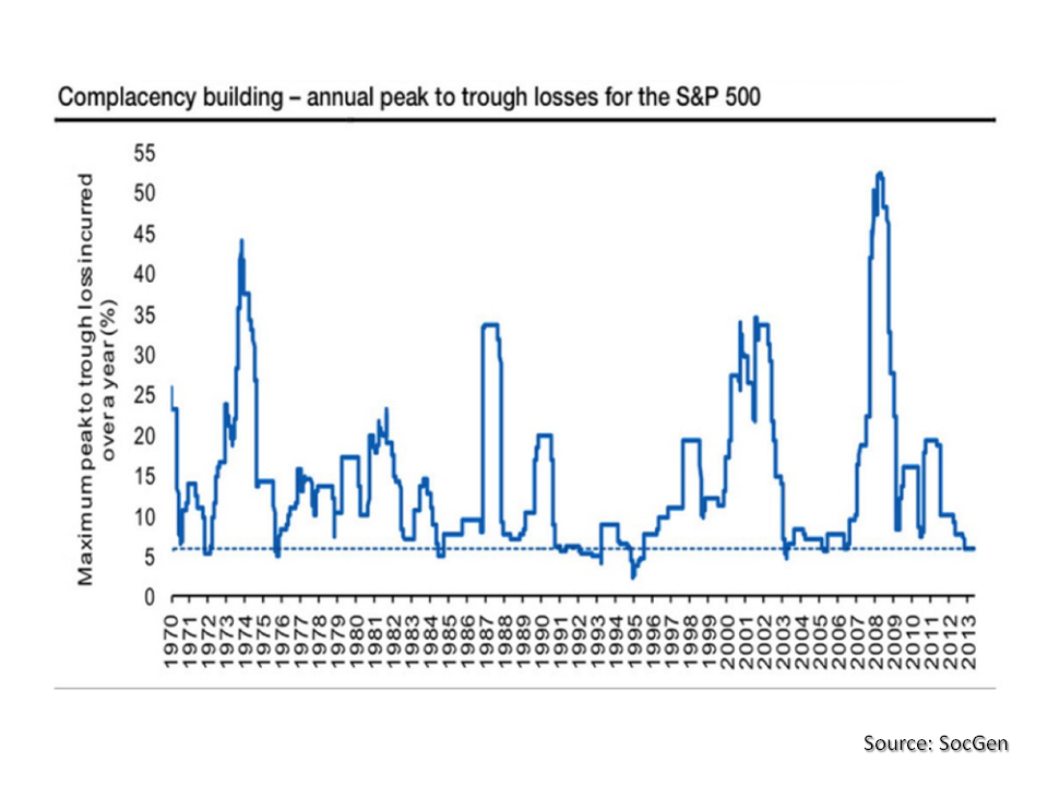
Andrew Lapthorne released some analysis earlier this month highlighting that a significant amount of the previous year’s earnings growth was down to M&A from Verizon and AT&T and concluded that EPS growth by M&A and from share buybacks is a classic end of cycle indicator. Lapthorne produced the graph below of historical peaks and troughs in the S&P500 and noted that the average historical 1% down days is 27 per year since 1969 an the S&P500 has only had 16 in the past 12 months and that we have gone through the 4th longest period on record without a market correction of 10% or more.
click to enlarge
Albert Edwards, also at SocGen, points to the difference in the BEA profit statistics and those reported being down to the expiration of tax provisions for accelerated depreciation and he concludes that “the bottom line is that the U.S. profits margin cycle has begun to turn down at long last“.
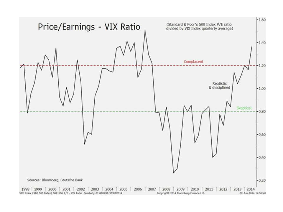
Even the perma-bull David Bianco of Deutsche Bank has cautioned against overvaluation calling the market complacent and moving into mania territory using their preferred measure of sentiment, namely the PE ratio divided by the VIX. The graph below from early June illustrates.
click to enlarge
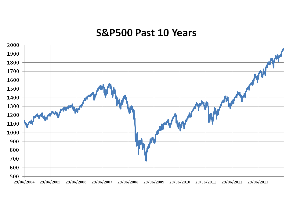
From my point of view, I think the chart of the S&P500 for the past 10 years tells its own story about where we are. As Louis Rukeyser said “trees don’t grow to the sky“. Nor do equity markets.
click to enlarge