Tag Archives: solvency ii

More ILS illuminations

A continuation of the theme in this post.

The pictures and stories that have emerged from the impact of the tsunami from the Sulawesi earthquake in Indonesia are heart-breaking. With nearly 2,000 officially declared dead, it is estimated that another 5,000 are missing with hundreds of thousands more severely impacted. This event will be used as an vivid example of the impact of soil liquefaction whereby water pressure generated by the earthquake causes soil to behave like a liquid with massive destructive impacts. The effect on so many people of this natural disaster in this part of the world contrasts sharply with the impact on developed countries of natural disasters. It again highlights the wealth divide within our world and how technologies in the western world could benefit so many people around the world if only money and wealth were not such a determinant of who survives and who dies from nature’s wrath.

The death toll from Hurricane Florence on the US, in contrast, is around 40 people. The possibility of another US hurricane making landfall this week, currently called Tropical Storm Michael, is unfolding. The economic losses of Hurricane Florence are currently estimated between $25 billion and $30 billion, primarily from flood damage. Insured losses will be low in comparison, with some estimates around $3-5 billion (one estimate is as high as $10 billion). The insured losses are likely to be incurred by the National Flood Insurance Program (NFIP), private flood insurers (surplus line players including some Lloyds’ Syndicates), crop and auto insurers, with a modest level of losses ceded to the traditional reinsurance and insurance-linked securities (ILS) markets.

The reason for the low level of insured loss is the low take-up rate of flood policies (flood is excluded from standard homeowner policies), estimated around 15% of insurance policies in the impacted region, with a higher propensity on the commercial side. Florence again highlights the protection gap issue (i.e. percentage difference between insured and economic loss) whereby insurance is failing in its fundamental economic purpose of spreading the economic impact of unforeseen natural events. Indeed, the contrast with the Sulawesi earthquake shows insurance failings on a global inequality level. If insurance and the sector is not performing its economic purpose, then it simply is a rent taker and a drag on economic development.

After that last sentiment, it may therefore seem strange for me to spend the rest of this blog highlighting a potential underestimating of risk premia for improbable events when a string of events has been artfully dodged by the sector (hey, I am guilty of many inconsistencies)!

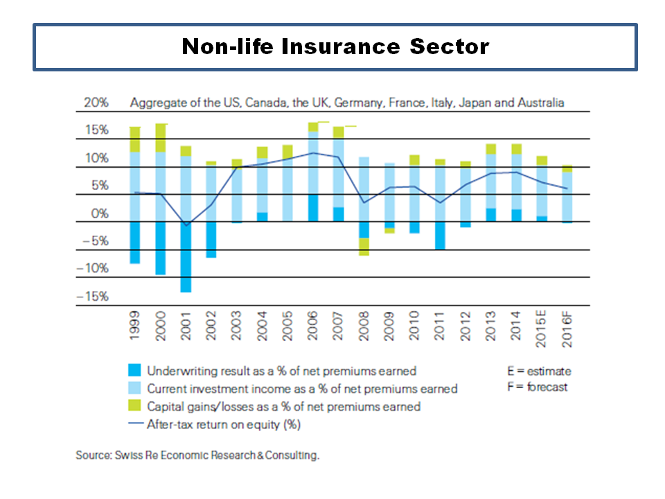
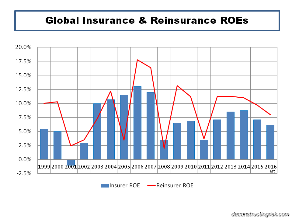
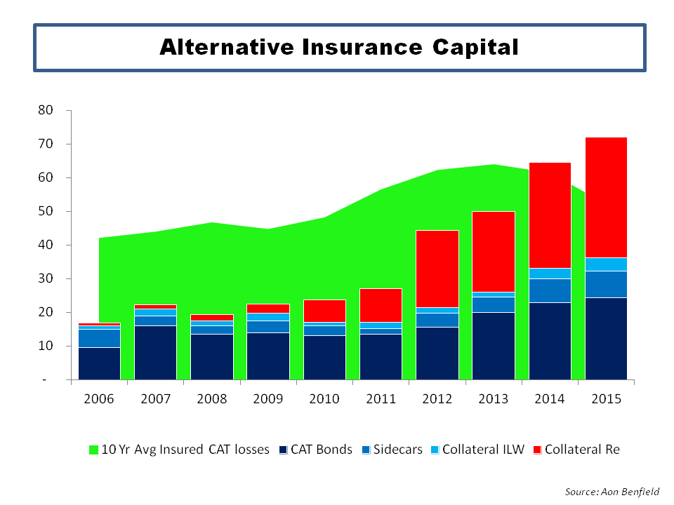
As outlined in this recent post, the insurance sector is grappling with the effect of new capital dampening pricing after the 2017 losses, directly flattening the insurance cycle. It can be argued that this new source of low-cost capital is having a positive impact on insurance availability and could be the answer to protection gap issues, such as those outlined above. And that may be true, although under-priced risk premia have a way of coming home to roost with serious longer-term effects.

The objective of most business models in the financial services sector is to maximise the risk adjusted returns from a selected portfolio, whether that be stocks or bonds for asset managers, credit risks for banks or insurance risks for insurers. Many of these firms have many thousands of potential risks to select from and so the skill or alpha that each claim derives from their ability to select risks and to build a robust portfolio. If for example, a manager wants to build a portfolio of 20 risks from a possible 100 risks, the combinations are 536 trillion (with 18 zeros as per the British definition)! And that doesn’t consider the sizing of each of the 20 positions in the portfolio. It’s no wonder that the financial sector is embracing artificial intelligence (AI) as a tool to assist firms in optimizing portfolios and potential risk weighted returns (here and here are interesting recent articles from the asset management and reinsurance sectors). I have little doubt that AI and machine learning will be a core technique in any portfolio optimisation process of the future.

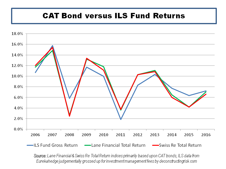
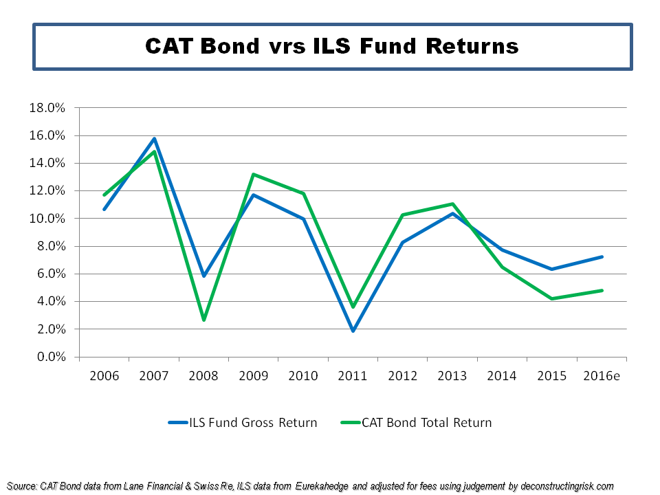
I decided to look at the mechanics behind the ILS fund sector again (previous posts on the topic include this post and this old post). I constructed an “average” portfolio that broadly reflects current market conditions. It’s important to stress that there is a whole variety of portfolios that can be constructed from the relatively small number of available ILS assets out there. Some are pure natural catastrophe only, some are focused at the high excess level only, the vintage and risk profile of the assets of many will reflect the length of time they have been in business, many consist of an increasing number of private negotiated deals. As a result, the risk-return profiles of many ILS portfolios will dramatically differ from the “average”. This exercise is simply to highlight the impact of the change of several variables on an assumed, albeit imperfect, sample portfolio. The profile of my “average” sample portfolio is shown below, by exposure, expected loss and pricing.

click to enlarge

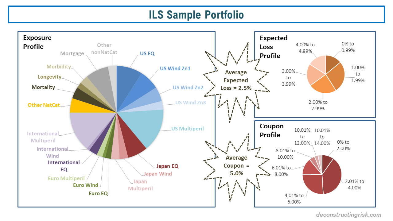
The weighted average expected loss of the portfolio is 2.5% versus the aggregate coupon of 5%. It’s important to highlight that the expected loss of a portfolio of low probability events can be misleading and is often misunderstood. Its not the loss expected but simply the average over all simulations. The likelihood of there being any losses is low, by definition, and in the clear majority of cases losses are small.

To illustrate the point, using my assumed loss exceedance curves for each exposure, with no correlation between the exposures except for the multi-peril coverage within each region, I looked at the distribution of losses over net premium, as below. Net premium is the aggregate coupon received less a management fee. The management fee is on assets under management and is assumed to be 1.5% for the sample portfolio, resulting in a net premium of 3.5% in the base scenario. I also looked at the impact of price increases and decreases averaging approximate +/-20% across the portfolio, resulting in net premium of 4.5% and 2.5% respectively. I guesstimate that the +20% scenario is roughly where an “average” ILS portfolio was 5 years ago.

click to enlarge

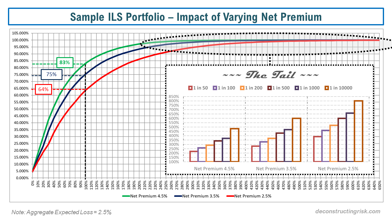
I have no doubt that the experts in the field would quibble with my model assumptions as they are crude. However, experience has thought me that over-modelling can lead to false sense of security and an over optimistic benefit for diversification (which is my concern about the ILS sector in general). My distributions are based upon 250,000 simulations. Others will point out that I haven’t considered the return on invested collateral assets. I would counter this with my belief that investors should only consider insurance risk premium when considering ILS investments as the return on collateral assets is a return they could make without taking any insurance risk.

My analysis shows that currently investors should only make a loss on this “average” portfolio once every 4 years (i.e. 25% of the time). Back 5 years ago, I estimate that probability at approximately 17% or roughly once every 6 years. If pricing deteriorates further, to the point where net premium is equal to the aggregate expected loss on the portfolio, that probability increases to 36% or roughly once every 3 years

The statistics on the tail show that in the base scenario of a net premium of 3.5% the 1 in 500-year aggregate loss on the portfolio is 430% of net premium compared to 340% for a net premium of 4.5% and 600% for a net premium of 2.5%. At an extreme level of a 1 in 10,000-year aggregate loss to the portfolio is 600% of net premium compared to 480% for a net premium of 4.5% and 800% for a net premium of 2.5%.

If I further assume a pure property catastrophe reinsurer (of which there are none left) had to hold capital sufficient to cover a 1 in 10,000-year loss to compete with a fully collaterised ILS player, then the 600% of net premium equates to collateral of 21%. Using reverse engineering, it could therefore be said that ILS capital providers must have diversification benefits (assuming they do collaterise at 100% rather than use leverage or hedge with other ILS providers or reinsurers) of approximately 80% on their capital to be able to compete with pure property catastrophe reinsurers. That is a significant level of diversification ILS capital providers are assuming for this “non-correlating asset class”. By the way, a more likely level of capital for a pure property catastrophe reinsurer would be 1 in 500 which means the ILS investor is likely assuming diversification benefits of more that 85%. Assuming a mega-catastrophic event or string of large events only requires marginal capital of 15% or less with other economic-driven assets may be seen to be optimistic in the future in my view (although I hope the scenario will never be illustrated in real life!).

Finally, given the pressure management fees are under in the ILS sector (as per this post), I thought it would be interesting to look at the base scenario of an aggregate coupon of 5% with different management fee levels, as below. As you would expect, the portfolio risk profile improves as the level of management fees decrease.

click to enlarge

Given the ongoing pressure on insurance risk premia, it is likely that pressure on fees and other expenses will intensify and the use of machines and IA in portfolio construction will increase. The commodification of insurance risks looks set to expand and increase, all driven by an over-optimistic view of diversification within the insurance class and between other asset classes. But then again, that may just lead to the more wide-spread availability of insurance in catastrophe exposed regions. Maybe one day, even in places like Sulawesi.

Beautiful Models

It has been a while since I posted on dear old Solvency II (here). As highlighted in the previous post on potential losses, the insurance sector is perceived as having robust capital levels that mitigates against the current pricing and investment return headwinds. It is therefore interesting to look at some of detail emerging from the new Solvency II framework in Europe, including the mandatory disclosures in the new Solvency and Financial Condition Report (SFCR).

The June 2017 Financial Stability report from EIOPA, the European insurance regulatory, contains some interesting aggregate data from across the European insurance sector. The graph below shows solvency capital requirement (SCR) ratios, primarily driven by the standard formula, averaging consistently around 200% for non-life, life and composite insurers. The ratio is the regulatory capital requirement, as calculated by a mandated standard formula or a firm’s own internal model, divided by assets excess liabilities (as per Solvency II valuation rules). As the risk profile of each business model would suggest, the variability around the average SCR ratio is largest for the non-life insurers, followed by life insurers, with the least volatile being the composite insurers.

click to enlarge

For some reason, which I can’t completely comprehend, the EIOPA Financial Stability report highlights differences in the SCR breakdown (as per the standard formula, expressed as a % of net basic SCR) across countries, as per the graph below, assumingly due to the different profiles of each country’s insurance sector.

click to enlarge

A review across several SFCRs from the larger European insurers and reinsurers who use internal models to calculate their SCRs highlights the differences in their risk profiles. A health warning on any such comparison should be stressed given the different risk categories and modelling methodologies used by each firm (the varying treatment of asset credit risk or business/operational risk are good examples of the differing approaches). The graph below shows each main risk category as a percentage of the undiversified total SCR.

click to enlarge

By way of putting the internal model components in context, the graph below shows the SCR breakdown as a percentage of total assets (which obviously reflects insurance liabilities and the associated capital held against same). This comparison is also fraught with difficulty as an (re)insurers’ total assets is not necessarily a reliable measure of extreme insurance exposure in the same way as risk weighted assets is for banks (used as the denominator in bank capital ratios). For example, some life insurers can have low insurance related liabilities and associated assets (e.g. for mortality related business) compared to other insurance products (e.g. most non-life exposures).

Notwithstanding that caveat, the graph below shows a marked difference between firms depending upon whether they are a reinsurer or insurer, or whether they are a life, non-life or composite insurer (other items such as retail versus commercial business, local or cross-border, specialty versus homogeneous are also factors).

click to enlarge

Initial reactions by commentators on the insurance sector to the disclosures by European insurers through SFCRs have been mixed. Some have expressed disappointment at the level and consistency of detail being disclosed. Regulators will have their hands full in ensuring that sufficiently robust standards relating to such disclosures are met.

Regulators will also have to ensure a fair and consistent approach across all European jurisdictions is adopted in calculating SCRs, particularly for those calculated using internal models, whilst avoiding the pitfall of forcing everybody to use the same assumptions and methodology. Recent reports suggest that EIOPA is looking for a greater role in approving all internal models across Europe. Systemic model risk under the proposed Basel II banking regulatory rules published in 2004 is arguably one of the contributors to the financial crisis.

Only time will tell if Solvency II has avoided the mistakes of Basel II in the handling of such beautiful models.

ILS illuminations

Insurance linked securities (ILS) are now well established in the insurance industry. ILS as an asset class offer, according to its many fans, the benefits of diversification and low correlation to other asset classes whilst offering a stable and attractive risk/reward return. The impact of the new capital on the traditional market has been profound and wide ranging (and a much posted upon topic in this blog – here, here & here for example).

ILS fund managers maintained an “aggressive posture” on price at the recent April renewals according to Willis Re as ILS capacity continues to demonstrate its cost of capital advantage. ILS fund managers are also looking to diversify, moving beyond pure short tail risks and looking at new previously uninsured or underinsured exposures, as well as looking to move their capital along the value-chain by sourcing primary risk more directly and in bulk.

An industry stalwart, John Kavanagh of Willis Re, commented that “with results on many diversifying non-catastrophe classes now marginal, there is greater pressure on reinsurers to address the pricing in these classes” and that “many reinsurers remain prepared to let their top line revenue growth stall and are opting to return excess capital to their shareholders”. The softening reinsurance market cycle is now in its fifth year and S&P estimates that “even assuming continued favourable prior-year reserve releases and benign natural catastrophe losses, we anticipate that reinsurers will barely cover their cost of capital over the next two years”.

Rather than fight the new capital on price, some traditional (re)insurers are, according to Brandan Holmes of Moody’s, “deploying third-party capital in their own capital structures in an effort to lower their blended cost of capital” and are deriving, according to Aon Benfield, “significant benefits from their ability to leverage alternative capital”. One can only fight cheap capital for so long, at some stage you just arbitrage against it (sound familiar!).

A.M. Best recently stated that “more collateralised reinsurance programs covering nonpeak exposures are ceded to the capital markets”. The precipitous growth in the private transacted collateralised reinsurance subsector can be seen in the graph from Aon below.

click to enlarge

Nick Frankland of Guy Carpenter commented that “the capital landscape is ever-changing” and that “such capital diversity also elevates the position of the broker”. Some argue that the all-powerful role of the dominant brokers is exacerbating market softness. These brokers would counterargue that they are simply fulfilling their role in an efficient market, matching buyers and sellers. As Frankland puts it, brokers are “in the strongest position to provide access to all forms of capital and so secure the more beneficial rates and terms and conditions”. Dominic Christian of Aon Benfield commented last year that “to some extent alternative sources of capital are already, and have already uberized insurance and reinsurance, by bringing increased sources of supply”.

Perhaps alone amongst industry participants, Weston Hicks of Alleghany, has questioned the golden goose of cheap ILS capital stating that “some new business models that separate the underwriting decision from the capital provider/risk bearer are, in our view, problematic because of a misalignment of incentives”. Such concerns are batted aside as old fashioned in this new world of endless possibilities. Frighteningly, John Seo of ILS fund manager Fermat Capital, suggests that “for every dollar of money that you see in the market right now, I think there is roughly 10 dollars on the sidelines waiting to come in if the market hardens”.

As an indicator of current ILS pricing, the historical market spread over expected losses in the public CAT bond market can be seen in the exhibit below with data sourced from Lane Financial. It is interesting to note that the average expected loss is increasing indicating CAT bonds are moving down the risk towers towards more working layer coverages.

click to enlarge

In a previous post, I argued that returns from an ILS fund index, with the net returns judgementally adjusted to get to comparable figures gross of management fees, were diverging against those from a pure CAT bond index. I argued that this divergence may illustrate that the ILS funds with exposure to the private collateralised reinsurance sector may be taking on higher risk exposures to pump returns (or may be passing risks amongst themselves in an embryonic spiral) and that ILS investors should be careful they understand the detail behind the risk profiles of the ILS funds they invest in.

Well, the final 2016 figures, as per the graph below, show that the returns in my analysis have in fact converged rather than diverged. On the face of it, this rubbishes my argument and I have to take that criticism on. Stubbornly, I could counter-argue that the ILS data used in the comparison may not reflect the returns of ILS funds with large exposure to collateralised reinsurance deals. Absent actual catastrophic events testing the range of current fund models, better data sources are needed to argue the point further.

click to enlarge

In their annual review of 2016, Lane Financial have an interesting piece on reducing transparency across both the public and private ILS sector. They characterise the private collateralised reinsurance sector as akin to a dark pool compared to the public CAT bond market which they likened to a lit exchange. Decreased transparency across the ILS sector “should send up warning flags” for all market participants as it makes calculating Net Asset Valuations (NAV) with monthly or quarterly frequency more difficult. They argue that the increased use of a relatively smaller public CAT bond market for pricing points across the ILS sector, the less credible is the overall valuation. This is another way of expressing my concern that the collateralised reinsurance market could be destabilising as it is hidden (and unregulated).

In the past, as per this post, I have questioned how the fully funded ILS market can claim to have a lower cost of capital against rated reinsurers who only have to hold capital against a percentage of their exposed limit, akin to fractional banking (see this post for more on that topic). The response is always down to the uncorrelated nature of ILS to other asset classes and therefore its attraction to investors such as pension funds who can apply a low cost of capital to the investment due to its uncorrelated and diversifying portfolio benefits. Market sponsors of ILS often use graphs such as the one below from the latest Swiss Re report to extoll the benefits of the asset class.

click to enlarge

A similar exhibit, this time from a Lombard Odier brochure, from 2016 shows ILS in an even more favourable light!

click to enlarge

As anybody who has looked through any fund marketing metrics knows, performance comparisons with other investment strategies are fraught with bias and generally postdictive. The period over which the comparison is made and the exact indices chosen (look at the differing equity indices used in the comparisons above) can make material differences. Also, the size and liquidity of a market is important, a point which may negate any reliance on ILS returns prior to 2007 for example.

I thought an interesting exercise would be to compare actual historical ILS returns, as represented by the Swiss Re Global Cat Bond Total Return Index, against total returns (i.e. share price annual change plus dividends paid in year) from equity investment in reinsurers across different time periods. The most applicable business model for comparison would be pure property catastrophe reinsurers but unfortunately there are not many of them left.

I have chosen RenRe (RNR) and Validus (VR), from 2007, as representatives of the pure property cat business model, although both have diversified their portfolios away from pure short tail business in recent years. I also selected three of the biggest European reinsurers – Munch Re, Swiss Re and Hannover Re – all of which are large diverse composite reinsurers. Finally, I constructed a US$ portfolio using equal shares of each of the five firms mentioned above (RenRe represents 40% of the portfolio until 2007 when Validus went public) with the € and CHF shares converted at each year end into dollars.

The construction of any such portfolio is postdictive and likely suffers from multiple biases. Selecting successful firms like RenRe and Validus could validly be criticised under survival bias. To counter such criticism, I would point out that the inclusion of the European reinsurers is a considerable historic drag on returns given their diverse composite footprint (and associated correlation to the market) and the exclusion of any specialist CAT firm that has been bought out in recent years, generally at a good premium, also drags down returns.

The comparison over the past 15 years, see graph below, shows that Munich and Swiss struggle to get over their losses from 2002 and 2003 and during the financial crisis. Hannover is the clear winner amongst the Europeans. The strong performance of Hannover, RenRe and Validus mean that the US$ portfolio matches the CAT bond performance after the first 10 years, albeit on a more volatile basis, before moving ahead on a cumulative basis in the last 5 years. The 15-year cumulative return is 217% for the CAT bond index and 377% return for the US$ equity portfolio.

click to enlarge

The comparison over the past 10 years, see graph below, is intriguing. Except for Validus, the CAT bond index beats all other firms and the US$ portfolio for non-volatile returns hands down in the first 5 years. Hannover, Validus and the portfolio each make a strong comeback in the most recent 5 years. The 10-year cumulative return is 125% for the CAT bond index and 189% return for the US$ equity portfolio.

click to enlarge

The comparison over the past 5 years, see graph below, shows that all firms and the portfolio handily beats the CAT bond index. Due to an absence in large loss activity over the recent past and much more shareholder friendly actions by all reinsurers, the equity returns have been steady and non-volatile. The 5-year cumulative return is 46% for the CAT bond index and 122% return for the US$ equity portfolio.

click to enlarge

Overall then, ILS may offer less volatile and uncorrelated returns but I would personally prefer the, often lumpier, historical equity returns from a selected portfolio of top reinsurers in my pension pot (we all could have both in our pension funds!). Then again, the influx of new capital into ILS has put the future viability of the traditional reinsurance business models into question so future equity returns from the sector may not be too rosy.

At the end of the day, the bottom line is whether current market risk premia is adequate, irrespective of being supplied by ILS fund managers or traditional reinsurers. Based upon what I see, I have grave misgivings about current market pricing and therefore have no financial exposure, ILS or equity or otherwise, to the market at present.

Additional Comment, 29th April 2017: The ILS website Artemis.bm had an interesting piece on comments from Torsten Jeworrek of Munich Re during their March conference call. The applicable comment is as follows:

“And now I give you another example, which is not innovation per se or not digitalization, but you know that more and more alternative capital came into the insurance industry over the last years; hedge funds, pension refunds, participating particularly in the cat business and as a trend that not all of the limits they provide, cat limits are fully collateralized anymore. That means there are 10 scenarios; hurricane, earthquake, [indiscernible], and so on; which are put together, but not 10 times the limit is collateralized, let’s say only 4 times, 5 times.

That means these hedge funds and pension funds so to speak in the future if they don’t have to provide full 100% collateralized for all the limits they provide, they need a certain credit risk for the buyer. The more they entertain, the more there’s a likelihood that this reinsurance can also fail. The question is how far will that go and this kind of not fully collateralized reinsurance, will that be then accepted as a reinsurance by the regulator or will that be penalized at a certain time otherwise we don’t have level playing field anymore, which means the traditional reinsurer who was strongly monitored and regulated and also reported as really expensive and a burden for our industry and for us and on the other hand, you have very lean pension and hedge funds who even don’t have to provide the same amount of capital for the same risk.”

Naive Newcomers

The insurance sector has been hit by the Brexit fallout on worries about macro-economic impacts; albeit not to the same extend as the banks. Swiss Re has their latest Sigma world insurance report out. The impact of investment returns on the life insurance sector is obvious but it is interesting to see the contribution from investment income on the profitability of the aggregate of the eight largest markets in the non-life insurance sector, as per the graph from the report below.

click to enlargeNonLife Insurance Sector Profit Breakdown

The insurance sector faces a number of challenges as a recent FT article pointed out. The reinsurance sector also faces challenges, not least of which is a competitive pricing environment and the destabilising influx of new yield seeking capital through new innovations in the insurance linked securities (ILS) market. I have posted my views on the ILS sector many times (more recently here) and in this post I offer more similar thoughts. It is interesting to compare the ROEs in the Sigma report from the non-life insurance sector against those from the reinsurance sector (with the ROEs since 2005 coming from the Guy Carpenter composite index), as per the graph below.

click to enlargeGlobal Insurance & Reinsurance ROEs 1999 to 2016e

The graph is not exactly comparing like with like (e.g. non-life insurance versus composite reinsurance) but it gives the general idea of higher but more volatile ROEs in the reinsurance side compared to more stable but lower ROEs on the direct insurance side. The average since 1999 for insurance is 7% and 9% for reinsurance, with standard deviations of 3.6% and 4.6% respectively. It also confirms that ROEs are under pressure for both sectors and as capital markets continue to siphon off volatile excess catastrophe exposed business, the ROEs of the more proportional traditional reinsurance sector are converging on those of their direct brethren, although a differential will always exist given the differing business models.

It is important to note that these ROEs are returns on equity held by traditional insurers and reinsurers, the majority of which are highly rated by external agencies, who hold a small fraction of their total exposure (if measured as the sum of the policy limits issued) as capital. For example, the new European solvency framework, Solvency II, requires capital at a 1 in 200 level and it is generally assumed to be akin to a financial strength rating of BB or BBB, depending upon a firm’s risk profile.

As I argued previously (more recently in this post), these (re)insurers are akin to fractional reserve banks and I still struggle to understand how ILS structures, which are 100% collaterised, can offer their investors such an attractive return given their fully funded “capital” level in the ROE calculation. The industry argument is that investors have a lower cost of capital due to the uncorrelated nature of the pure insurance risk present in ILS.

My suspicion is that the lower cost of capital assigned by investors is reflective of a lack of understanding of the uncertainties surrounding the risks they are taking on and an over-reliance on modelling which does not fully consider the uncertainties. My fear is that capital is been leveraged or risks are been arbitraged through over-generous retrocession deals passing on under-priced risk to naive capital newcomers.

The accelerating growth in the so-called alternative capital in insurance is shown in the graph below from Aon Benfield, with growth in the private collaterised reinsurance being particularly strong in the last four years (now overshadowing the public CAT bond market). ILS funds, managed by professional asset manager specialists, are largely behind the growth in private collaterised deals with assets under management growing from $20 billion in 2012 to over $50 billion today. Private collaterised deals are usually lower down the reinsurance tower (e.g. attach at lower loss levels) and as such offer higher premiums (as a percentage of limits, aka rate on line or ROL) for the increased exposure to loss. On a risk adjusted basis, these don’t necessarily offer higher ROEs than higher attaching/lower risk CAT bonds.

click to enlargeAlternative Insurance ILS Capital Growth

Property catastrophe pricing has been under particular pressure in the past few years due to the lack of significant insured catastrophe losses. In a previous post, I crudely estimate CAT pricing to be 25% below its technical rate. Willis Re is the first of the brokers to have its mid-year renewal report out. In it, Willis said that ILS funds “were more aggressive on pricing during the second quarter as spreads declined for liquid reinsurance investments”. I also find it interesting that the collaterised ILW volumes have ticked up recently. Pricing and lax terms and conditions in the retrocession sector are historically a sign that discipline is breaking down. Asset managers in the ILS space must be under pressure in maintaining their high fees in a reduced CAT risk premia environment and this pressure is likely to be contributing to the potential for market indiscipline.

I therefore find the graph below very telling. I used the figures from Lane Financial (see here) for the annual total return figures from CAT bonds, which closely match those of the Swiss Re Total Return Index. For the ILS fund returns I used the figures from the Eurekahedge ILS Advisors Index which I adjusted to take out the not unconsiderable typical ILS fund management fees. The 2016 figures are annualized based upon published year to date figures (and obviously assume no major losses).

click to enlargeCAT Bond vrs ILS Fund Returns

The graph shows that ILS fund returns have broken with historical patterns and diverged away from those of CAT bonds as the prevalence in private collaterised deals has grown in recent years. In other words, ILS funds have moved to higher rate on line business, which is by definition higher risk, as they push to service the larger level of assets under management. The question is therefore do the investors really understand the significance of this change? Have they adjusted their cost of capital to reflect the increased risk? Or are some ILS funds representing the higher returns as their ability to get higher returns at the same risk level (against the trend of everybody else in the industry in a softening market)?

Innovation is to be encouraged and a necessary part of progress. Innovation dependent on the naivety of new investors however does not end well.

I can’t but help think of Michael Wade’s comment in 2009 about the commonality between the financial crisis and problems at Lloyds of London (see this post on lessons from Lloyds) when he said that “the consequence with the excess capital was that underlying risks could be underpriced as they were being passed on”. My advice to ILS investors is the next time they are getting a sales pitch with promises of returns that sound too good, look around the room, and ask yourself who is the greater fool here….

Divine Diversification

There have been some interesting developments in the US insurance sector on the issue of systemically important financial institutions (SIFIs). Metlife announced plans to separate some of their US life retail units to avoid the designation whilst shareholder pressure is mounting on AIG to do the same. These events are symptoms of global regulations designed to address the “too big to fail” issue through higher capital requirements. It is interesting however that these regulations are having an impact in the insurance sector rather than the more impactful issue within the banking sector (this may have to do with the situation where the larger banks will retain their SIFI status unless the splits are significant).

The developments also fly in the face of the risk management argument articulated by the insurance industry that diversification is the answer to the ills of failure. This is the case AIG are arguing to counter calls for a breakup. Indeed, the industry uses the diversification of risk in their defences against the sector being deemed of systemic import, as the exhibit below from a report on systemic risk in insurance from an industry group, the Geneva Association, in 2010 illustrates. Although the point is often laboured by the insurance sector (there still remains important correlations between each of the risk types), the graph does make a valid point.

click to enlargeEconomic Capital Breakdown for European Banks and Insurers

The 1st of January this year marked the introduction of the new Solvency II regulatory regime for insurers in Europe, some 15 years after work begun on the new regime. The new risk based solvency regime allows insurers to use their own internal models to calculate their required capital and to direct their risk management framework. A flurry of internal model approvals by EU regulators were announced in the run-up to the new year, although the amount of approvals was far short of that anticipated in the years running up to January 2016. There will no doubt be some messy teething issues as the new regime is introduced. In a recent post, I highlighted the hoped for increased disclosures from European insurers on their risk profiles which will result from Solvency II. It is interesting that Fitch came out his week and stated that “Solvency II metrics are not comparable between insurers due to their different calculation approaches and will therefore not be a direct driver of ratings” citing issues such as the application of transitional measures and different regulator approaches to internal model approvals.

I have written many times on the dangers of overtly generous diversification benefits (here, here, here, and here are just a few!) and this post continues that theme. A number of the large European insurers have already published details of their internal model calculations in annual reports, investor and analyst presentations. The graphic below shows the results from 3 large insurers and 3 large reinsurers which again illustrate the point on diversification between risk types.

click to enlargeInternal Model Breakdown for European Insurers and Reinsurers

The reinsurers show, as one would expect, the largest diversification benefit between risk types (remember there is also significant diversification benefits assumed within risk types, more on that later) ranging from 35% to 40%. The insurers, depending upon business mix, only show between 20% and 30% diversification across risk types. The impact of tax offsets is also interesting with one reinsurer claiming a further 17% benefit! A caveat on these figures is needed, as Fitch points out; as different firms use differing terminology and methodology (credit risk is a good example of significant differences). I compared the diversification benefits assumed by these firms against what the figure would be using the standard formula correlation matrix and the correlations assuming total independence between the risk types (e.g. square root of the sum of squares), as below.

click to enlargeDiversification Levels within European Insurers and Reinsurers

What can be seen clearly is that many of these firms, using their own internal models, are assuming diversification benefits roughly equal to that between those in the standard formula and those if the risk types were totally independent. I also included the diversification levels if 10% and 25% correlations were added to the correlation matrix in the standard formula. A valid question for these firms by investors is whether they are being overgenerous on their assumed diversification. The closer to total independence they are, the more sceptical I would be!

Assumed diversification within each risk type can also be material. Although I can understand arguments on underwriting risk types given different portfolio mixes, it is hard to understand the levels assumed within market risk, as the graph below on the disclosed figures from two firms show. Its hard for individual firms to argue they have material differing expectations of the interaction between interest rates, spreads, property, FX or equities!

click to enlargeDiversification Levels within Market Risk

Diversification within the life underwriting risk module can also be significant (e.g. 40% to 50%) particularly where firms write significant mortality and longevity type exposures. Within the non-life underwriting risk module, diversification between the premium, reserving and catastrophe risks also add-up. The correlations in the standard formula on diversification between business classes vary between 25% and 50%.

By way of a thought experiment, I constructed a non-life portfolio made up of five business classes (X1 to X5) with varying risk profiles (each class set with a return on equity expectation of between 10% and 12% at a capital level of 1 in 500 or 99.8% confidence level for each), as the graph below shows. Although many aggregate profiles may reflect ROEs of 10% to 12%, in my view, business classes in the current market are likely to have a more skewed profile around that range.

click to enlargeSample Insurance Portfolio Profile

I then aggregated the business classes at varying correlations (simple point correlations in the random variable generator before the imposition of the differing distributions) and added a net expense load of 5% across the portfolio (bringing the expected combined ratio from 90% to 95% for the portfolio). The different resulting portfolio ROEs for the different correlation levels shows the impact of each assumption, as below.

click to enlargePortfolio Risk Profile various correlations

The experiment shows that a reasonably diverse portfolio that can be expected to produce a risk adjusted ROE of between 14% and 12% (again at a 1 in 500 level)with correlations assumed at between 25% and 50% amongst the underlying business classes. If however, the correlations are between 75% and 100% then the same portfolio is only producing risk adjusted ROEs of between 10% and 4%.

As correlations tend to increase dramatically in stress situations, it highlights the dangers of overtly generous diversification assumptions and for me it illustrates the need to be wary of firms that claim divine diversification.