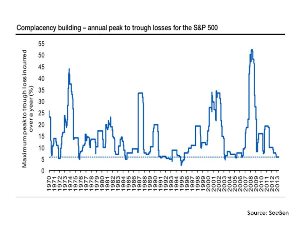
Valuations in the specialty insurance and reinsurance sector have been given a bump up with all of the M&A activity and the on-going speculation about who will be next. The Artemis website reported this week that Deutsche Bank believe the market is not differentiating enough between firms and that even with a lower cost of capital some are over-valued, particularly when lower market prices and the relaxation in terms and conditions are taken into account. Although subject to hyperbole, industry veteran John Charman now running Endurance, stated in a recent interview that market conditions in reinsurance are the most “brutal” he has seen in his 44 year career.
One interesting development is the re-emergence of Richard Brindle with a new hybrid hedge fund type $2 billion firm, as per this Bloomberg article. Given the money Brindle made out of Lancashire, I am surprised that he is coming back with a business plan that looks more like a jump onto the convergence hedge fund reinsurer band wagon than anything more substantive given current market conditions. Maybe he has nothing to lose and is bored! It will be interesting to see how that one develops.
There have been noises coming out of the market that insurance linked securities (ILS) pricing has reached a floor. Given that the Florida wind exposure is ground zero for the ILS market, I had a look through some of the deals on the Artemis website, to see what pricing was like. The graph below does only have a small number of data points covering different deal structures so any conclusions have to be tempered. Nonetheless, it does suggest that rate reductions are at least slowing in 2015.
click to enlarge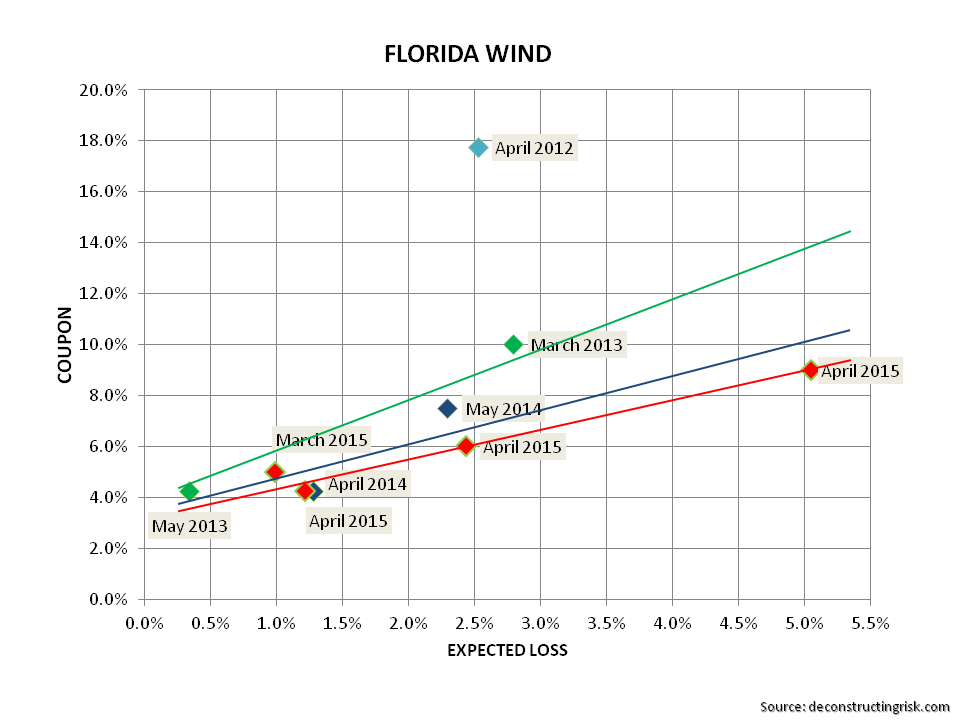
Any review of ILS pricing, particularly for US wind perils, should be seen in the context of a run of low storm recent activity in the US for category 3 or above. In their Q3-2014 call, Renaissance Re commented (as Eddie pointed out in the comments to this post) that the probability of a category 3 or above not making landfall in the past 9 years is statistically at a level below 1%. The graph below shows some wind and earthquake pricing by vintage (the quake deals tend to be the lower priced ones).
click to enlarge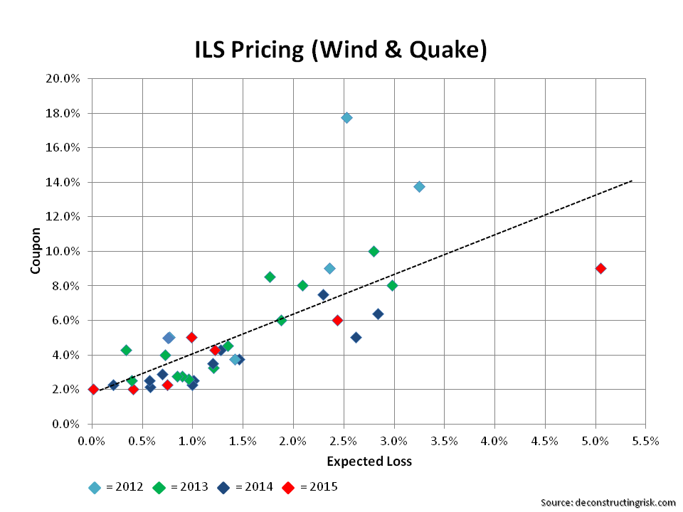
This graph does suggest that a floor has been reached but doesn’t exactly inspire any massive confidence that pricing in recent deals is any more adequate than that achieved in 2014.
From looking through the statistics on the Artemis website, I thought that a comparison to corporate bond spreads would be interesting. In general (and again generalities temper the validity of conclusions), ILS public catastrophe bonds are rated around BB so I compared the historical spreads of BB corporate against the average ILS spreads, as per the graph below.
click to enlarge
The graph shows that the spreads are moving in the same direction in the current environment. Of course, it’s important to remember that the price of risk is cheap across many asset classes as a direct result of the current monetary policy across the developed world of stimulating economic activity through encouraging risk taking.
Comparing spreads in themselves has its limitation as the underlying exposure in the deals is also changing. Artemis uses a metric for ILS that divides the spread by the expected loss, referred to herein as the ILS multiple. The expected loss in ILS deals is based upon the catastrophe modeller’s catalogue of hurricane and earthquake events which are closely aligned to the historical data of known events. To get a similar statistic to the ILS multiple for corporate bonds, I divided the BB spreads by the 20 year average of historical default rates from 1995 to 2014 for BB corporate risks. The historical multiples are in the graph below.
click to enlarge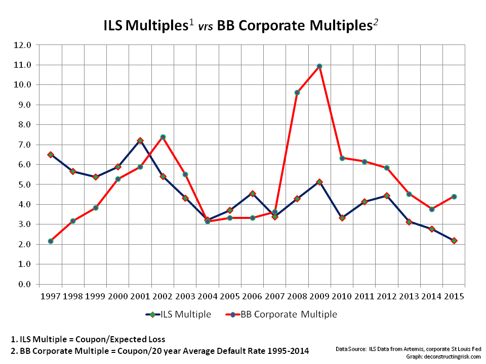
Accepting that any conclusions from the graph above needs to consider the assumptions made and their limitations, the trends in multiples suggests that investors risk appetite in the ILS space is now more aggressive than that in the corporate bond space. Now that’s a frightening thought.
Cheap risk premia never ends well and no fancy new hybrid business model can get around that reality.
Follow-up: Lane Financial LLC has a sector report out with some interesting statistics. One comment that catch my eye is that they estimate a well spread portfolio by a property catastrophic reinsurer who holds capital at a 1-in-100 and a 1-in-250 level would only achieve a ROE of 8% and 6.8% respectively at todays ILS prices compared to a ROE of 18% and 13.3% in 2012. They question “the sustainability of the independent catastrophe reinsurer” in this pricing environment and offer it as an explanation “why we have begun to see mergers and acquisitions, not between two pure catastrophe reinsurers but with cat writers partnering with multi-lines writers“.