As the first week of January progressed and markets tumbled, I was thinking about this post and couldn’t get away from the thought that 2016 feels very like 2015. The issues that were prominent in 2015 are those that will be so again in 2016 plus a few new ones. The UK vote on the EU and a US presidential race are just two new issues to go with China economic and political uncertainty, Middle East turmoil, Russian trouble making, a political crisis in Brazil, the insidious spread of terrorism, a move towards political extremes in developed countries and the on-going fault lines in Europe and the Euro. All of these macro factors together with earnings and the impact of rising interest rates are going to dominate 2016.
2015 joins two other years, 2011 and 1994, in being a -1% year for the S&P500 in recent times, as the graph below shows. In fact, the movements of the S&P500 in 2015 show remarkable similarity with 2011. However, there the similarities end. 2011 was the year of the Euro crisis, the Arab spring and the Japan quake. Interest rates were falling, earnings stable, and PE multiples were around 15. 1994 was even more different than 2015. In 1994, the economy was taking off and the Fed was aggressively raising rates, earnings were stable and PE multiples fell to around 15. Interesting the next 5 years after 1994 on the stock market were each 20%+ years! With 2015 around a 20 PE and earnings falling, the comparisons are not favourable and may even suggest we got off lightly with just a -1% fall.
click to enlarge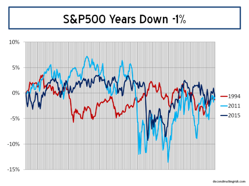
A recent article in the FT does point to the influence of a limited number of stocks on the 2015 performance with the top 10 stocks in the S&P500 up 14% in 2015 and the remaining 490 stocks down 5.8% collectively. The performance of the so-called nifty nine is shown below. The article highlights that “dominance by a few big companies – or a “narrowing” market – is a symptom of the end of a bull run, as it was in the early 1970s (dominated by the “Nifty Fifty”) or the late 1990s (dominated by the dot-coms).”
click to enlarge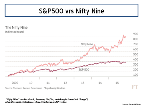
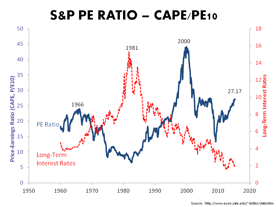
Bears have long questioned valuations. The impact of continuing falls in oil prices on energy earnings and a fall off in operating margins are signalling a renewed focus on valuations, as the events of this past week dramatically illustrate. A graph of the PE10 (aka Shiller CAPE) as at year end from the ever insightful Doug Short shows one measure of overvaluation (after this week’s fall the overvaluation on a PE10 basis is approx 30%).
click to enlarge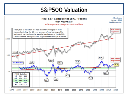
One of the longstanding bears, John Hussman, had an article out this week called “The Next Big Short”, in honour of the movie on the last big short. Hussman again cites his favourite metrics of the ratio of nonfinancial market capitalization to corporate gross value added (GVA) and the ratio of nonfinancial corporate debt to corporate GVA (right scale) as proof that “the financial markets are presently at a speculative extreme”.
click to enlarge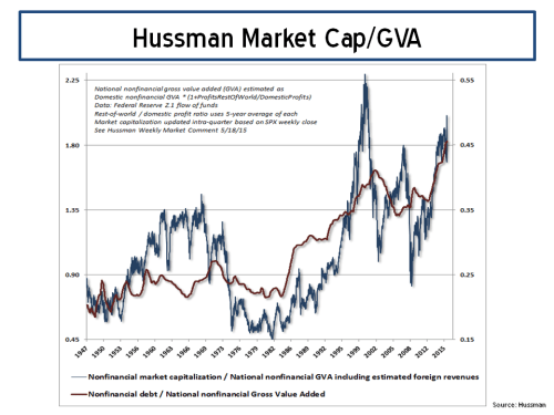
Many commentators are predicting a flat year for 2016 with some highlighting the likelihood of a meaningful correction. Whether the first week in January is the beginning of such a correction or just a blip along the path of a continually nervous market has yet to be seen. Analysts and their predictions for 2016 have been predictably un-inspiring as the graph below shows (particularly when compared to their 2015 targets).
click to enlarge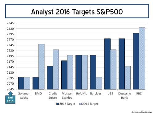
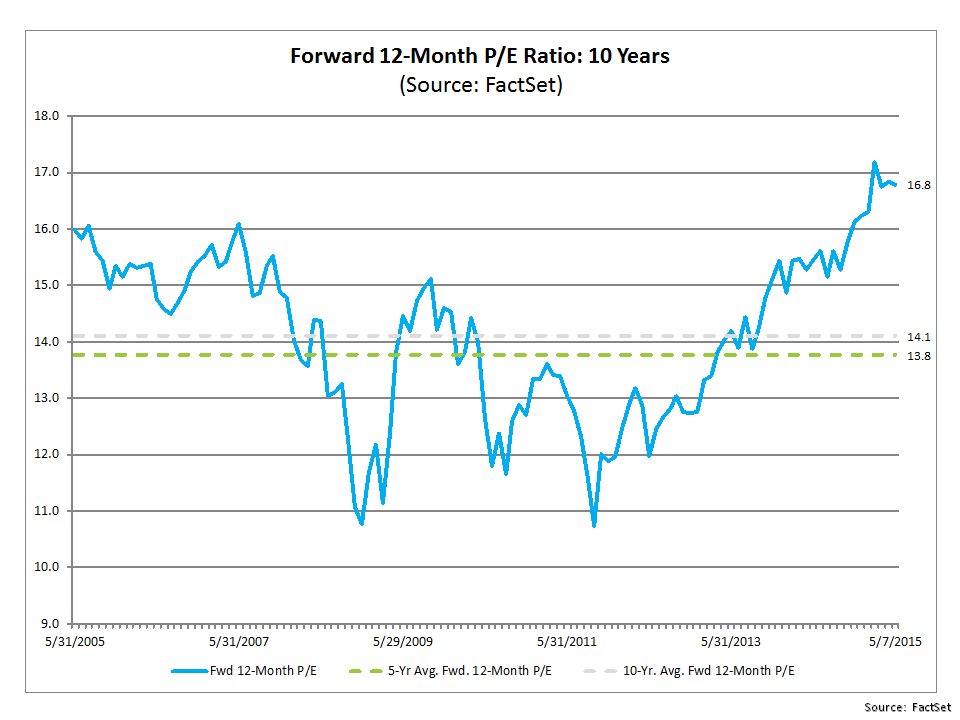
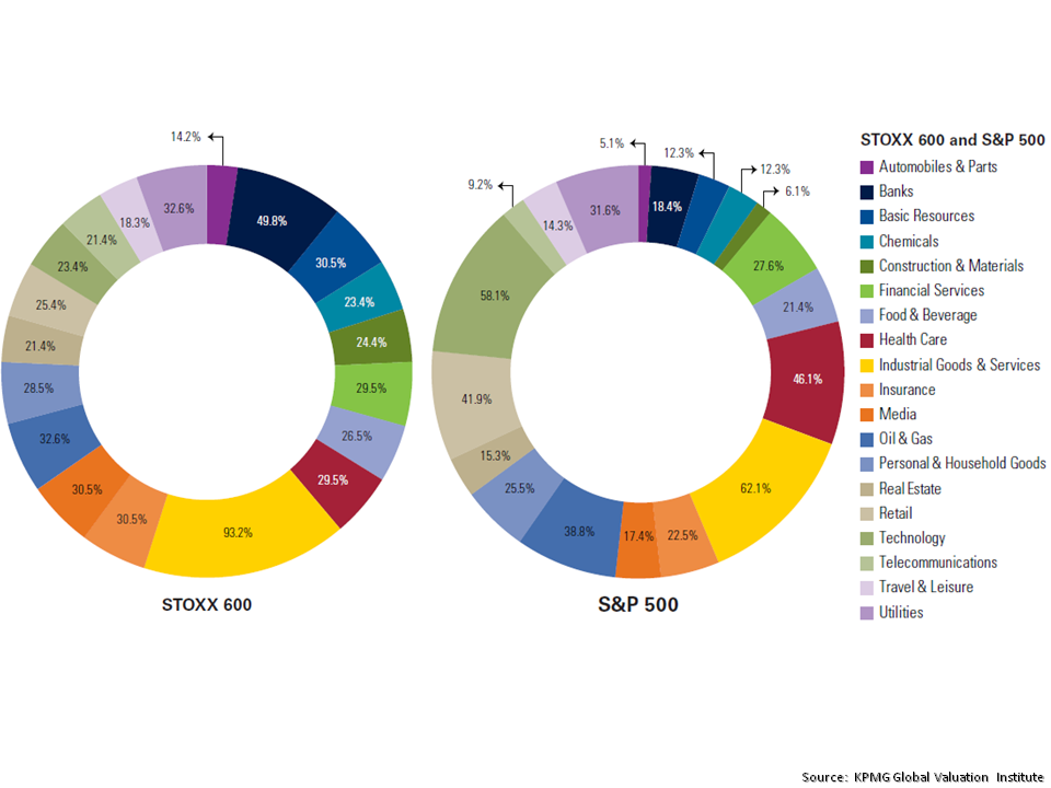
Some, such as Goldman Sachs, have already started to reduce their EPS estimates, particularly for energy stocks given the increasingly negative opinions on oil prices through 2016. The 12 month forward PEs by sector, according to Factset Earning Insight dated the 8th of January as reproduced below, show the different multiples explicit in current estimates with the overall S&P500 at 15.7.
click to enlarge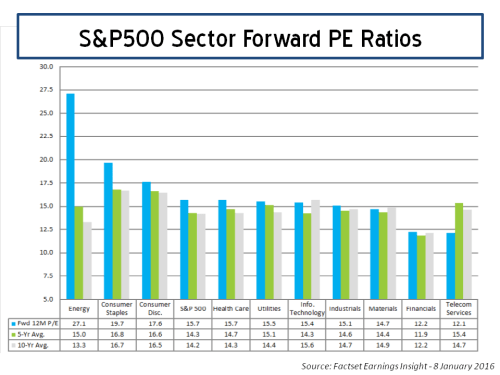
Current earnings estimates for 2016 as per the latest Yardeni report (EPS growth graph is reproduced below), look to me to be too optimistic compared to the trends in 2015 and given the overall global economic outlook. Future downward revisions will further challenge multiples, particularly for sectors where earnings margins are stagnating or even decreasing.
click to enlarge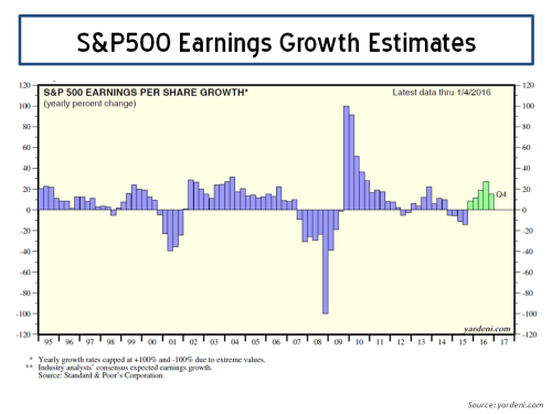
To further illustrate the experts’ views on EPS estimates, using S&P data this time, I looked at the evolution in actual operating EPS figures and the 2015 and 2016 estimates by sector, as per the graph below.
click to enlarge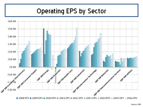
With US interest rates rising (albeit only marginally off generational lows), the dollar will likely continue its strength and higher borrowing costs will influence the environment for corporate profits. Pent up labour costs as slack in the US economy reduces may also start to impact corporate profits. In this context, the EPS estimates above look aggressive to me (whilst accepting that I do not have detailed knowledge on the reasoning behind the EPS increases in individual sectors such as health care or materials), particularly when global macro issues such as China are added into the mix.
So, as I stated at the start of this post, the outlook for 2016 is looking much like 2015. And perhaps even a tad worse.