Tag Archives: CAPE

Broken Record II

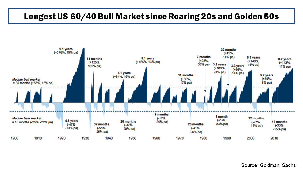
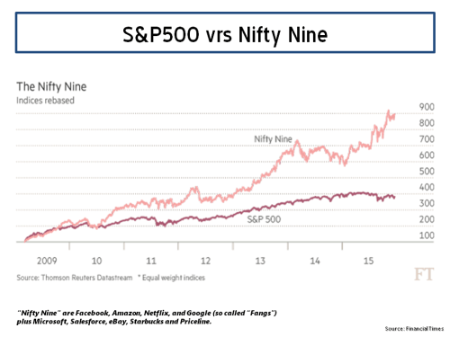
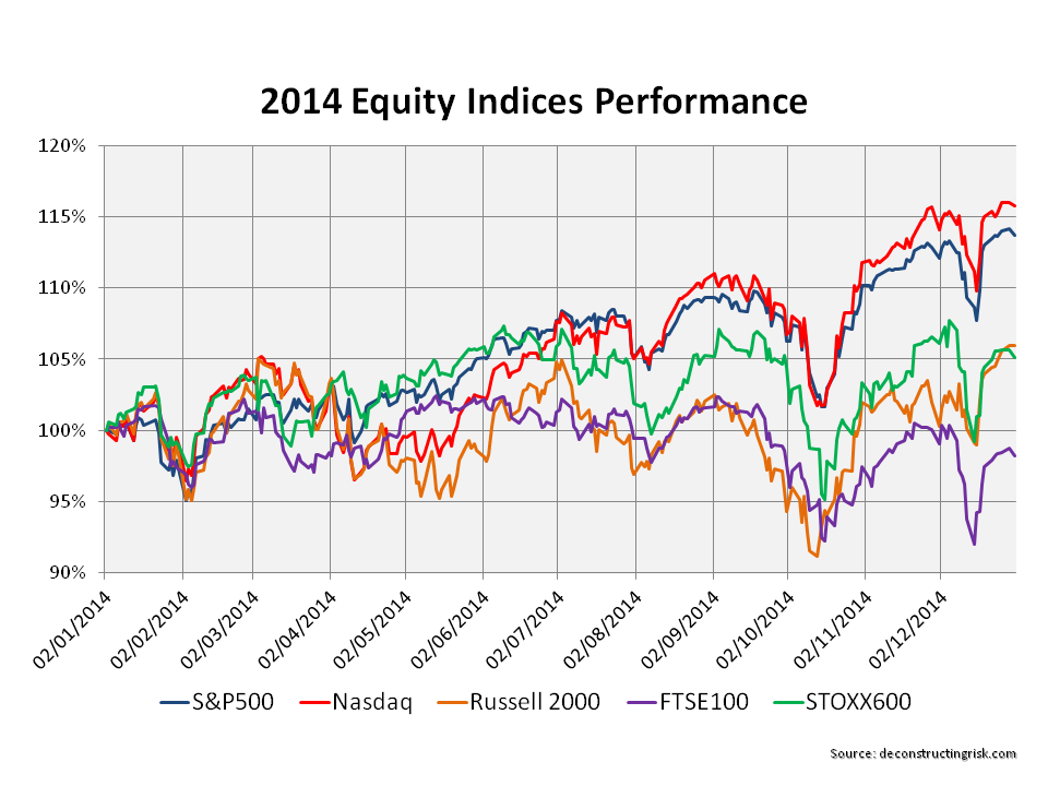
As the S&P500 hit an intraday all-time high yesterday, it’s been nearly 9 months since I posted on the valuation of the S&P500 (here). Since then, I have touched on factors like the reversal of global QE flows by Central Banks (here) and the lax credit terms that may be exposed by tightening monetary conditions (here). Although the traditional pull back after labor day in the US hasn’t been a big feature in recent years, the market feels frothy and a pullback seems plausible. The TINA (There Is No Alternative) trade is looking distinctly tired as the bull market approaches the 3,500-day mark. So now is an opportune time to review some of the arguments on valuations.

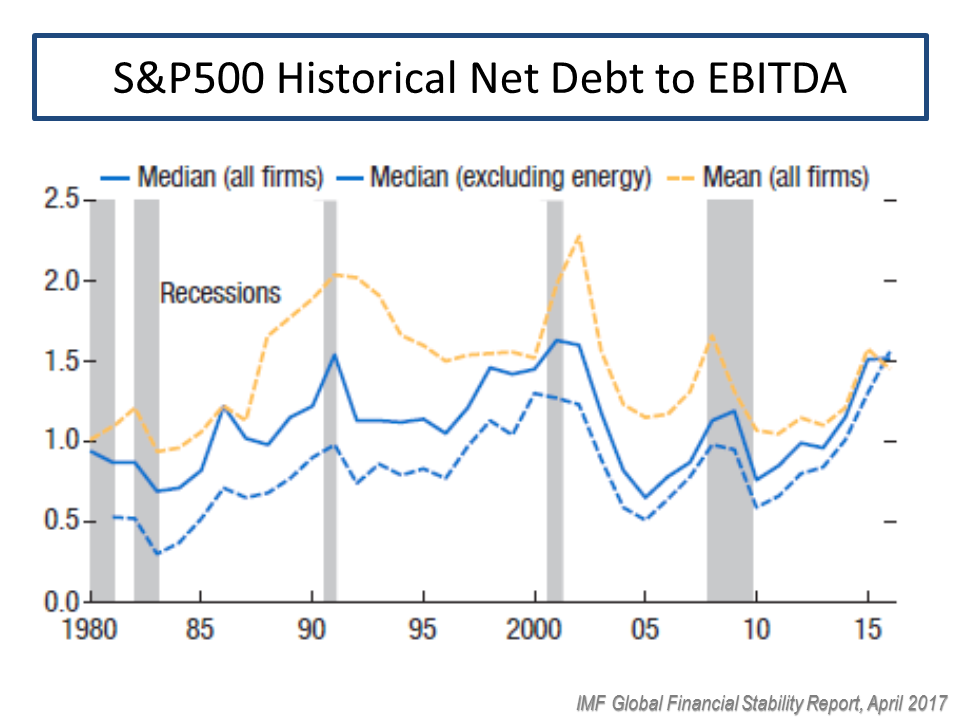
Fortune magazine recently had an interesting summary piece on the mounting headwinds in the US which indicate that “the current economic expansion is much nearer its end than its beginning”. Higher interest rates and the uncertainty from the ongoing Trump trade squabble are obvious headwinds that have caused nervous investors to moderate slightly valuation multiples from late last year. The Fortune article points to factors like low unemployment rates and restrictions on immigration pushing up wage costs, rising oil prices, the fleeting nature of Trump’s tax cuts against the long-term impact on federal debt, high corporate debt levels (with debt to EBITDA levels at 15 years high) and the over-optimistic earnings growth estimated by analysts.

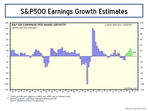
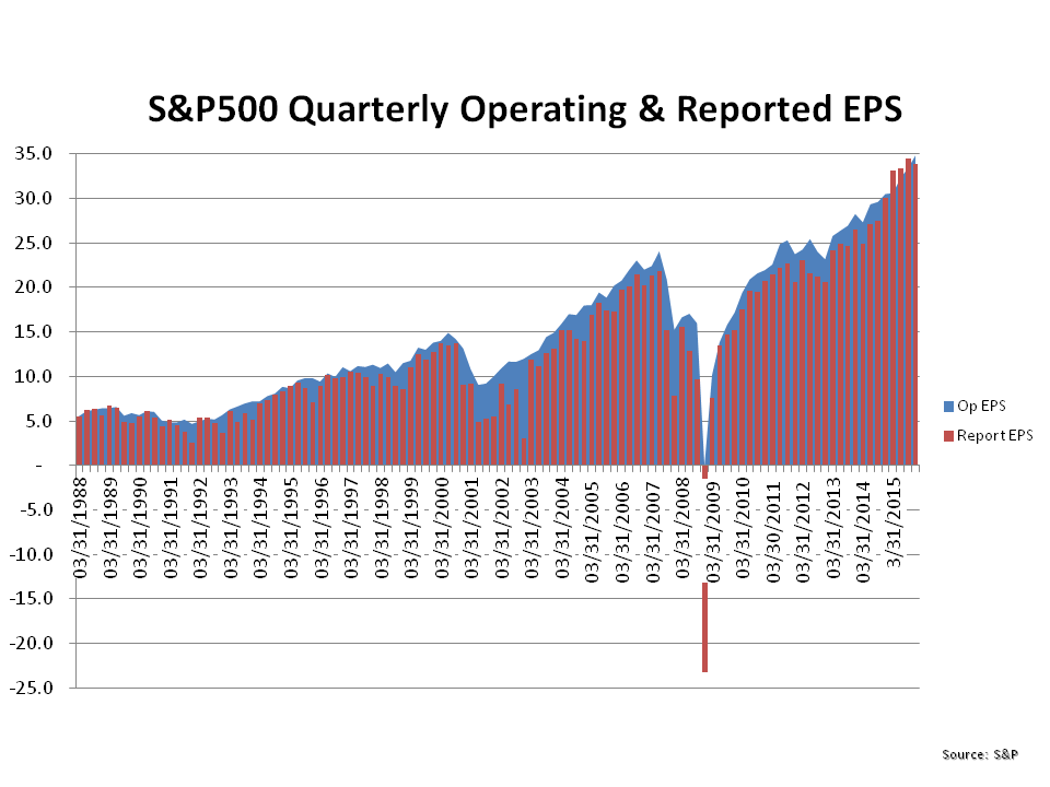
That last point may seem harsh given the 24% and 10% growth in reported quarterly EPS and revenue respectively in Q2 2018 over Q2 2017, according to Factset as at 10/08/2018. The graph below shows the quarterly reported growth projections by analysts, as per S&P Dow Jones Indices, with a fall off in quarterly growth in 2019 from the mid-20’s down to a 10-15% range, as items like the tax cuts wash out. Clearly 10-15% earnings growth in 2019 is still assuming strong earnings and has some commentators questioning whether analysts are being too optimistic given the potential headwinds outlined above.

click to enlarge

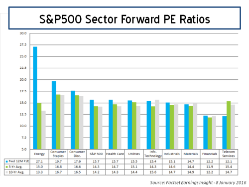
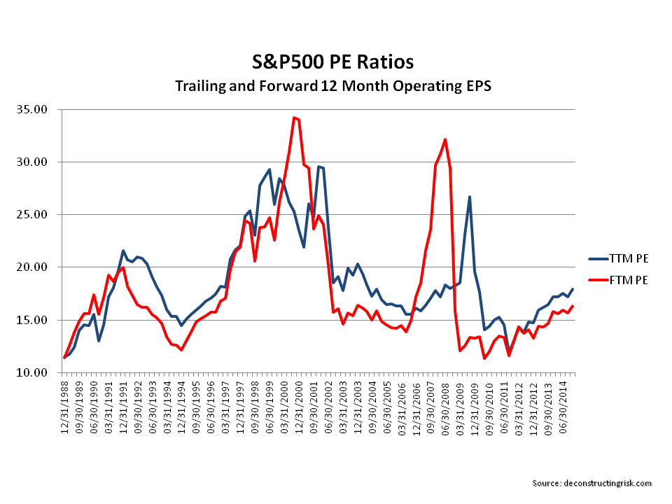
According to Factset as at 10/08/2018, the 12-month forward PE of 16.6 is around the 5-year average level and 15% above the 10-year average, as below. As at the S&P500 high on 21/08/2018, the 12-month forward PE is 16.8.

click to enlarge

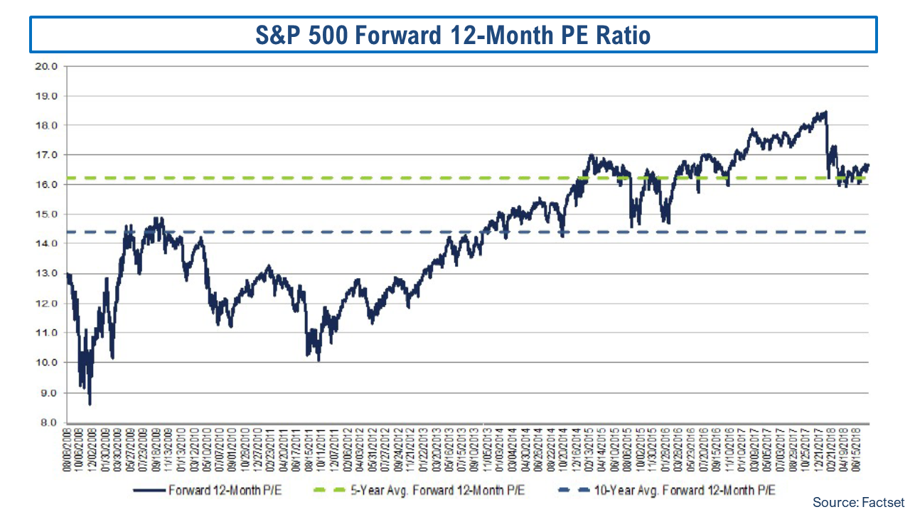
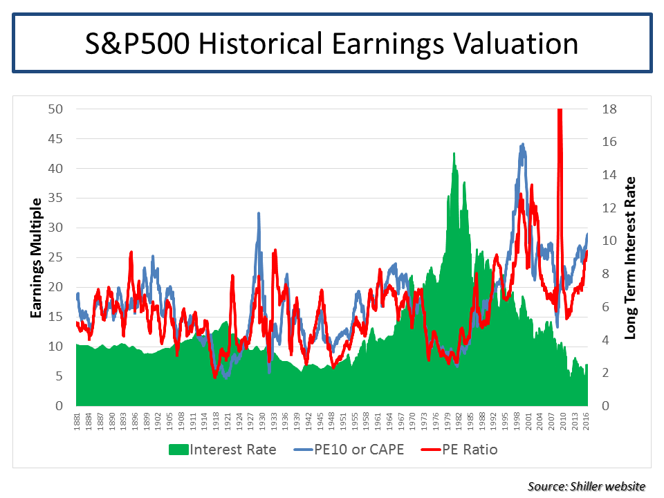
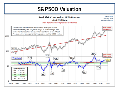
In terms of the Shiller PE or the cyclically adjusted PE (PE10), the graph below shows that the current PE10 ratio of 32.65 as at the S&P500 high on 21/08/2018, which is 63% higher than 50-year average of 20. For the purists, the current PE10 is 89% above the 100-year average.

click to enlargeCAPE Shiller PE PE10 as at 21082018 S&P500 high

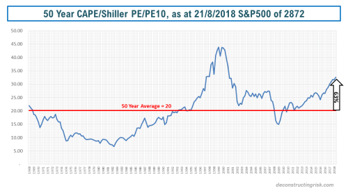
According to this very interesting research paper called King of the Mountain, the PE10 metric varies across different macro-economic conditions, specifically the level of real interest rates and inflation. The authors further claim that PE10 becomes a statistically significant and economically meaningful predictor of shorter-term returns under the assumption that PE10 levels mean-revert toward the levels suggested by prevailing macroeconomic conditions rather than toward long-term averages. The graph below shows the results from the research for different real yield and inflation levels, the so-called valuation mountain.

click to enlarge

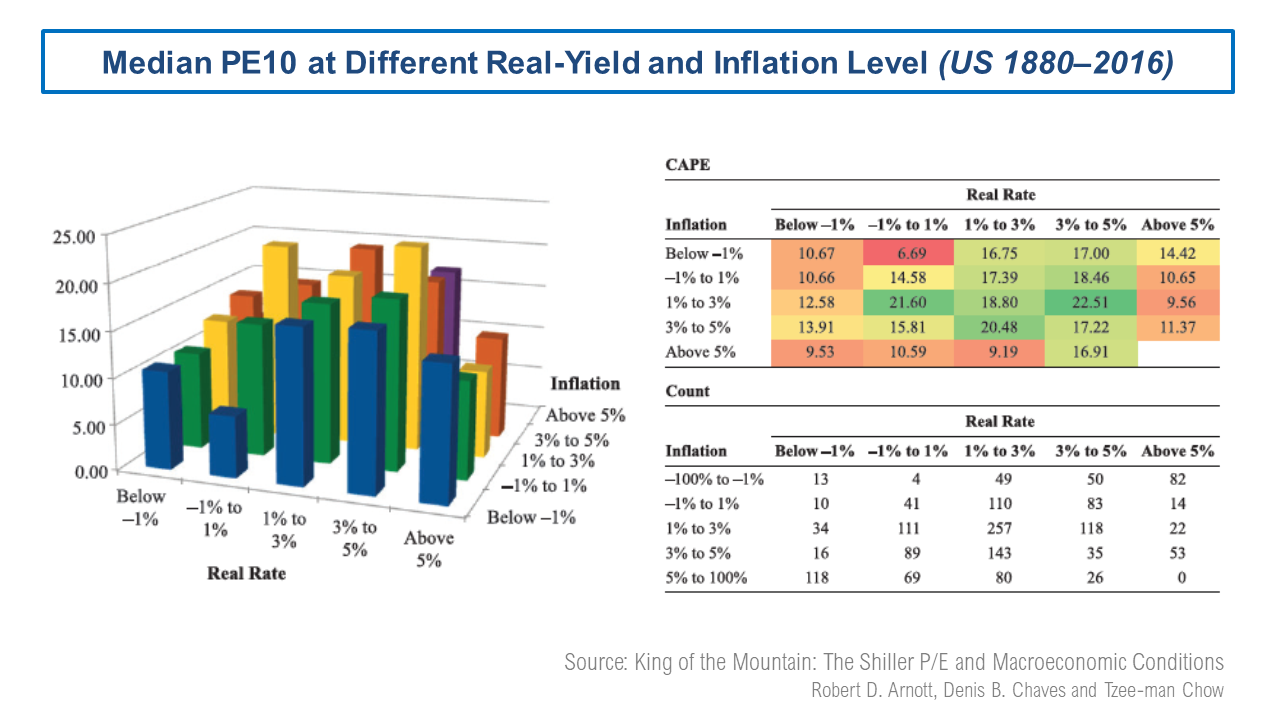
At a real yield around 1% and inflation around 2%, the research suggests a median PE around 20 is reasonable. Although I know that median is not the same as mean, the 20 figure is consistent with the 50-year PE10 average. The debates on CAPE/PE10 as a valuation metric have been extensively aired in this blog (here and here are examples) and range around the use of historically applicable earnings data, adjustments around changes in accounting methodology (such as FAS 142/144 on intangible write downs), relevant time periods to reflect structural changes in the economy, changes in dividend pay-out ratios, the increased contribution of foreign earnings in US firms, and the reduced contribution of labour costs (due to low real wage inflation).

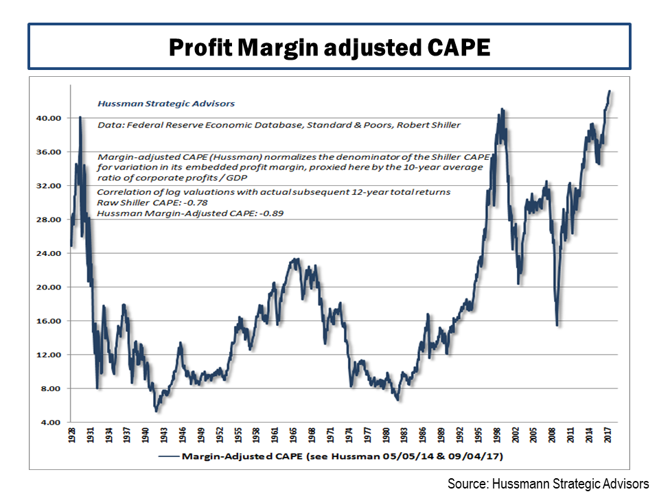
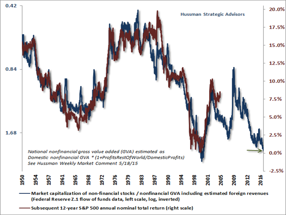
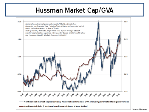
One hotly debated issue around CAPE/PE10 is the impact of the changing profit margin levels. One conservative adjustment to PE10 for changes in profit margins is the John Hussman adjusted CAPE/PE10, as below, which attempts to normalise profit margins in the metric. This metric indicates that the current market is at an all time high, above the 1920s and internet bubbles (it sure doesn’t feel like that!!). In Hussman’s most recent market commentary, he states that “we project market losses over the completion of this cycle on the order of -64% for the S&P 500 Index”.

click to enlarge

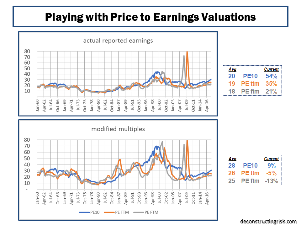
Given the technological changes in business models and structures across economic systems, I believe that assuming current profit margins “normalise” to the average is too conservative, particularly given the potential for AI and digital transformation to cut costs across a range of business models over the medium term. Based upon my crude adjustment to the PE10 for 2010 and prior, as outlined in the previous Broken Record post (i.e. adjusted to 8.5%), using US corporate profits as a % of US GDP as a proxy for profit margins, the current PE10 of 32.65 is 21% above my profit margin adjusted 50-year average of 27, as shown below.

click to enlargeCAPE Shiller PE PE10 adjusted as at 21082018 S&P500 high

So, in summary, the different ranges of overvaluation for the S&P500 at its current high are from 15% to 60%. If the 2019 estimates of 10-15% quarterly EPS growth start to look optimistic, whether through deepening trade tensions or tighter monetary policy, I could see a 10% to 15% pullback. If economic headwinds, as above, start to get serious and the prospect of a recession gets real (although these things normally come quickly as a surprise), then something more serious could be possible.

On the flipside, I struggle to see where significant upside can come from in terms of getting earnings growth in 2019 past the 10-15% range. A breakthrough in trade tensions may be possible although unlikely before the mid-term elections. All in all, the best it looks like to me in the short term is the S&P500 going sideways from here, absent a post-labor day spurt of profit taking.

But hey, my record on calling the end to this bull market has been consistently broken….

Broken Record

Whilst the equity market marches on regardless, hitting highs again today, writing about the never-ending debates over equity valuations makes one feel like a broken record at times. At its current value, I estimate the S&P500 has returned an annualised rate of nearly 11%, excluding dividends, since its low in March 2009. As of the end of September 2017, First Trust estimated the total return from the S&P500 at 18% since March 2009, as per the graph below.

click to enlarge

Goldman Sachs recently published an analysis on a portfolio of 60% in the S&P 500 and 40% in 10-year U.S. Treasuries, as per the graph below, and commented that “we are nearing the longest bull market for balanced equity/bond portfolios in over a century, boosted by a Goldilocks backdrop of strong growth without inflation”. They further stated that “it has seldom been the case that all assets are expensive at the same time—historical examples include the Roaring ‘20s and Golden ‘50s. While in the near term, growth might stay strong and valuations could pick up further, they should become a speed limit for returns”.

click to enlarge

My most recent post on the topic of US equity valuations in May looked at the bull and bear arguments on low interest rates and heighten profit margins by Jeremy Grantham and John Hussman. In that post I further highlighted some of the other factors which are part of the valuation debate such as the elevated corporate leverage levels, reduced capital expenditures, and increased financial risk taking as outlined in the April IMF Global Financial Stability report. I also highlighted, in my view, another influential factor related to aging populations, namely the higher level of risk assets in public pensions as the number of retired members increases.

In other posts, such as this one on the cyclically adjusted PE (CAPE or PE10), I have highlighted the debates around the use of historically applicable earnings data in the use of valuation metrics. Adjustments around changes in accounting methodology (such as FAS 142/144 on intangible write downs), relevant time periods to reflect structural changes in the economy, changes in dividend pay-out ratios, the increased contribution of foreign earnings in US firms, and the reduced contribution of labour costs (due to low real wage inflation) are just some examples of items to consider.

The FT’s John Authers provided an update in June on the debate between Robert Shiller and Jeremy Siegel over CAPE from a CFA conference earlier this year. Jeremy Siegel articulated his critique of the Shiller CAPE in this piece last year. In an article by Robert Shiller in September article, called “The coming bear market?”, he concluded that “the US stock market today looks a lot like it did at the peaks before most of the country’s 13 previous bear markets”.

The contribution of technology firms to the bull market, particularly the so-called FANG or FAANG stocks, has also been a much-debated issue of late. The graph below shows the historical sector breakdown of the S&P500 since 1995.

click to enlarge

A recent article from GMO called “FAANG SCHMAANG: Don’t Blame the Over-valuation of the S&P Solely on Information Technology” tried to quantify the impact that the shift in sector composition upon valuations and concluded that “today’s higher S&P 500 weight in the relatively expensive Information Technology sector is cause for some of its expensiveness, but it does not explain away the bulk of its high absolute and relative valuation level. No matter how you cut it, the S&P 500 (and most other markets for that matter) is expensive”. The graph below shows that they estimate the over-valuation of the S&P500, as at the end of September 2017, using their PE10 measure is only reduced from 46% to 39% if re-balanced to take account of today’s sector weightings.

click to enlarge

In his recent article this month, John Hussman (who meekly referred to “his incorrectly tagged reputation as a permabear”!!) stated that “there’s no need to take a hard-negative outlook here, but don’t allow impatience, fear of missing out, or the illusion of permanently rising stock prices to entice you into entrusting your financial future to the single most overvalued market extreme in history”.

As discussed in my May post, Hussman reiterated his counter-argument to Jeremy Grantham’s argument that structurally low interest rates, in the recent past and in the medium term, can justify a “this time it’s different” case. Hussman again states that “the extreme level of valuations cannot, in fact, be “justified” on the basis of depressed interest rates” and that “lower interest rates only justify higher valuations if the stream of future cash flows is held constant” and that “one of the reasons why reliable valuation measures have retained such a high correlation with subsequent market returns across history, regardless of the level of interest rates, is that the impact of interest rates and growth rates on “terminal” valuations systematically offset each other”.

Hussman also again counters the argument that higher profit margins are the new normal, stating that “it’s important to recognize just how dependent elevated profit margins are on maintaining permanently depressed wages and salaries, as a share of GDP” and that “simply put, elevated corporate profit margins are the precise mirror-image of depressed labour compensation” which he contends is unlikely to last in a low unemployment environment.

Hussman presents a profit margin adjusted CAPE as of the 3rd of November, reproduced below, which he contends shows that “market valuations are now more extreme than at any point in history, including the 1929 and 2000 market highs”.

click to enlarge

However, I think that his profit margin analysis is harsh. If you adjust historical earnings upwards for newer higher margin levels, of course the historical earning multiples will be lower. I got to thinking about what current valuations would look like against the past if higher historical profit margins, and therefore earnings, had resulted in higher multiples. Using data from Shiller’s website, the graph below does present a striking representation of the relationship between corporate profits (accepting the weaknesses in using profits as a percentage of US GDP) and interest rates.

click to enlarge

Purely as a thought experiment, I played with Shiller’s data, updating the reported earnings for estimates through 2018 (with a small discount to reflect over-zealous estimates as per recent trends of earnings revisions), recent consensus end 2018 S&P500 targets, and consensus inflation and the 10-year US interest rates through 2018. Basically, I tried to represent the base case from current commentators of slowly increasing inflation and interest rates over the short term, with 2018 reported EPS growth of 8% and the S&P500 growing to 2,900 by year end 2018. I then calculated the valuation metrics PE10, the regular PE (using trailing twelve month reported earnings called PE ttm), and the future PE (using forward twelve month reported earnings called PE ftm) to the end of 2018. I further adjusted the earnings multiples, for 2007 and prior, by applying an (principally upward) adjustment equal to a ratio of the pre-2007 actual  corporate profits percentage to GDP divided by a newly assumed normalised percentage of 8.5% (lower than the past 10-year average around 9% to factor in some upward wage pressures over the medium term). The resulting historical multiples and averages are shown below.

click to enlarge

Based upon this analysis, whilst accepting its deeply flawed assumptions, if 2018 follows the base case currently expected (i.e. no external shocks, no big inflation or interest rates moves, steady if not spectacular earnings growth), the S&P500 currently looks over-valued by 50% to 20% using historical norms. If this time it is different and higher profit margins and lower interest rates are the new normal, then the S&P500 looks roughly fairly-valued and current targets for 2018 around 2,900 look achievable. Mind you, it’s a huge leap in mind-set to assume that the long-term average PE is justifiably in the mid-20s.

I continue to be concerned about increasing corporate leverage levels, as highlighted in my May post from the IMF Global Financial Stability report in April, and the unforeseen consequences of rising interest rate after such a long period of abnormally low rates.

In the interim, to paraphrase an ex-President, it’s all about the earnings stupid!

Still Dancing

The latest market wobble this week comes under the guise of the endless Trump soap opera and the first widespread use of the impeachment word. I doubt it will be the last time we hear that word! The bookies are now offering even odds of impeachment. My guess is that Trump’s biggest stumble will come over some business conflict of interest and/or a re-emergence of proof of his caveman behaviour towards woman. The prospect of a President Pence is unlikely to deeply upset (the non-crazy) republicans or the market. The issue is likely “when not if” and the impact will depend upon whether the republicans still control Congress.

Despite the week’s wobble, the S&P500 is still up over 6% this year. May is always a good month to assess market valuation and revisit the on-going debate on whether historical metrics or forward looking metrics are valid in this low interest rate/elevated profit margin world. Examples of recent posts on this topic include this post one highlighted McKinsey’s work on the changing nature of earnings and this post looked at the impact of technology on profit profiles.

The hedge fund guru Paul Tudor Jones recently stated that a chart of the market’s value relative to US GDP, sometimes called the Buffet indicator as below, should be “terrifying” to central bankers and an indicator that investors are unrealistically valuing future growth in the economy.

click to enlarge

Other historical indicators such as the S&P500 trailing 12 month PE or the PE10 (aka Shiller CAPE) suggest the market is 60% to 75% overvalued (this old post outlines some of the on-going arguments around CAPE).

click to enlarge

So, it was fascinating to see a value investor as respected as Jeremy Grantham of GMO recently issue a piece called “This time seems very very different” stating that “the single largest input to higher margins, though, is likely to be the existence of much lower real interest rates since 1997 combined with higher leverage” and that “pre-1997 real rates averaged 200 bps higher than now and leverage was 25% lower”. Graham argues that low interest rates, relative to historical levels, are here for some time to come due to structural reasons including income inequality and aging populations resulting in more aged savers and less younger spenders. Increased monopoly, political, and brand power in modern business models have, according to Graham, reduced the normal competitive pressures and created a new stickiness in profits that has sustained higher margins.

The ever-cautious John Hussman is disgusted that such a person as Jeremy Grantham would dare join the “this time it’s different” crowd. In a rebuttal piece, Hussman discounts interest rates as the reason for elevated profits (he points out that debt of U.S. corporations as a ratio to revenues is more than double its historical median) and firmly puts the reason down to declining labour compensation as a share of output prices, as illustrated by the Hussman graph below.

click to enlarge

Hussman argues that labour costs and profit margins are in the process of being normalised as the labour market tightens. Bloomberg had an interesting article recently on wage growth and whether the Phillips Curve is still valid. Hussman states that “valuations are now so obscenely elevated that even an outcome that fluctuates modestly about some new, higher average [profit margin] would easily take the S&P 500 35-40% lower over the completion of the current market cycle”. Hussman favoured valuation metric of the ratio of nonfinancial market capitalization to corporate gross value-added (including estimated foreign revenues), shown below, predicts a rocky road ahead.

click to enlarge

The bulls point to a growing economy and ongoing earnings growth, as illustrated by the S&P figures below on operating EPS projections, particularly in the technology, industrials, energy, healthcare and consumer sectors.

click to enlarge

Taking operating earnings as a valid valuation metric, the S&P figures show that EPS estimates for 2017 and 2018 (with a small haircut increasing in time to discount the consistent over optimism of analyst forward estimates) support the bull argument that current valuations will be justified by earnings growth over the coming quarters, as shown below.

click to enlarge

The IMF Global Financial Stability report from April contains some interesting stuff on risks facing the corporate sector. They highlight that financial risk taking (defined as purchases of financial assets, M&A and shareholder pay-outs) has averaged $940 billion a year over the past three years for S&P 500 firms representing more than half of free corporate cash flow, with the health care and information technology sectors being the biggest culprits. The IMF point to elevated leverage levels, as seen in the graph below, reflective of a mature credit cycle which could end badly if interest rates rise above the historical low levels of recent times.

click to enlarge

The report highlights that debt levels are uneven with particularly exposed sectors being energy, real estate and utilities, as can be seen below.

click to enlarge

The IMF looked beyond the S&P500 to a broader set of nearly 4,000 US firms to show a similar rise in leverage and capability to service debt, as illustrated below.

click to enlarge

Another graph I found interesting from the IMF report was the one below on the level of historical capital expenditure relative to total assets, as below. A possible explanation is the growth in technology driven business models which don’t require large plant & property investments. The IMF report does point out that tax cuts or offshore tax holidays will, based upon past examples, likely result in more financial risk taking actions rather than increased investment.

click to enlarge

I also found a paper referenced in the report on pensions (“Pension Fund Asset Allocation and Liability Discount Rates” by Aleksandar Andonov, Rob Bauer and Martijn Cremers) interesting as I had suspected that low interest rates have encouraged baby boomers to be over-invested in equities relative to historical fixed income allocations. The paper defines risky assets as investments in public equity, alternative assets, and high-yield bonds. The authors state that “a 10% increase in the percentage of retired members of U.S. public pension funds is associated with a 5.93% increase in their allocation to risky assets” and for all other funds “a 10% increase in the percentage of retired members is associated with a 1.67% lower allocation to risky assets”.  The graph below shows public pension higher allocation to risky assets up to 2012. It would be fascinating to see if this trend has continued to today.

click to enlarge

They further conclude that “this increased risk-taking enables more mature U.S. public funds to use higher discount rates, as a 10% increase in their percentage of retired members is associated with a 75 basis point increase in their discount rate” and that “our regulatory incentives hypothesis argues that the GASB guidelines give U.S. public funds an incentive to increase their allocation to risky assets with higher expected returns in order to justify a higher discount rate and report a lower value of liabilities”. The graph below illustrates the stark difference between the US and Europe.

click to enlarge

So, in conclusion, unless Mr Trump does something really stupid (currently around 50:50 in my opinion) like start a war, current valuations can be justified within a +/- 10% range by bulls assuming the possibility of fiscal stimulus and/or tax cuts is still on the table. However, there are cracks in the system and as interest rates start to increase over the medium term, I suspect vulnerabilities will be exposed in the current bull argument. I am happy to take some profits here and have reduced by equity exposure to around 35% of my portfolio to see how things go over the summer (sell in May and go away if you like). The ability of Trump to deliver tax cuts and/or fiscal stimulus has to be question given his erratic behaviour.

Anecdotally my impression is that aging investors are more exposed to equities than historically or than prudent risk management would dictate, even in this interest rate environment, and this is a contributing factor behind current sunny valuations. Any serious or sudden wobble in equity markets may be magnified by a stampede of such investors trying to protect their savings and the mammoth gains of the 8 year old bull market. For the moment through, to misquote Chuck Price, as long as the music is playing investors are still dancing.

So….2016

As the first week of January progressed and markets tumbled, I was thinking about this post and couldn’t get away from the thought that 2016 feels very like 2015. The issues that were prominent in 2015 are those that will be so again in 2016 plus a few new ones. The UK vote on the EU and a US presidential race are just two new issues to go with China economic and political uncertainty, Middle East turmoil, Russian trouble making, a political crisis in Brazil, the insidious spread of terrorism, a move towards political extremes in developed countries and the on-going fault lines in Europe and the Euro. All of these macro factors together with earnings and the impact of rising interest rates are going to dominate 2016.

2015 joins two other years, 2011 and 1994, in being a -1% year for the S&P500 in recent times, as the graph below shows. In fact, the movements of the S&P500 in 2015 show remarkable similarity with 2011. However, there the similarities end. 2011 was the year of the Euro crisis, the Arab spring and the Japan quake. Interest rates were falling, earnings stable, and PE multiples were around 15. 1994 was even more different than 2015. In 1994, the economy was taking off and the Fed was aggressively raising rates, earnings were stable and PE multiples fell to around 15. Interesting the next 5 years after 1994 on the stock market were each 20%+ years! With 2015 around a 20 PE and earnings falling, the comparisons are not favourable and may even suggest we got off lightly with just a -1% fall.

click to enlargeS&P500 Years Down -1%

A recent article in the FT does point to the influence of a limited number of stocks on the 2015 performance with the top 10 stocks in the S&P500 up 14% in 2015 and the remaining 490 stocks down 5.8% collectively. The performance of the so-called nifty nine is shown below. The article highlights that “dominance by a few big companies – or a “narrowing” market – is a symptom of the end of a bull run, as it was in the early 1970s (dominated by the “Nifty Fifty”) or the late 1990s (dominated by the dot-coms).”

click to enlargeS&P500 vrs Nifty Nine

Bears have long questioned valuations. The impact of continuing falls in oil prices on energy earnings and a fall off in operating margins are signalling a renewed focus on valuations, as the events of this past week dramatically illustrate. A graph of the PE10 (aka Shiller CAPE) as at year end from the ever insightful Doug Short shows one measure of overvaluation (after this week’s fall the overvaluation on a PE10 basis is approx 30%).

click to enlargeS&P500 Valuation PE10 Doug Short

One of the longstanding bears, John Hussman, had an article out this week called “The Next Big Short”, in honour of the movie on the last big short. Hussman again cites his favourite metrics of the ratio of nonfinancial market capitalization to corporate gross value added (GVA) and the ratio of nonfinancial corporate debt to corporate GVA (right scale) as proof that “the financial markets are presently at a speculative extreme”.

click to enlargeHussman Market Cap to GVA

Many commentators are predicting a flat year for 2016 with some highlighting the likelihood of a meaningful correction. Whether the first week in January is the beginning of such a correction or just a blip along the path of a continually nervous market has yet to be seen. Analysts and their predictions for 2016 have been predictably un-inspiring as the graph below shows (particularly when compared to their 2015 targets).

click to enlarge2016 S&P500 Analyst Targets

Some, such as Goldman Sachs, have already started to reduce their EPS estimates, particularly for energy stocks given the increasingly negative opinions on oil prices through 2016. The 12 month forward PEs by sector, according to Factset Earning Insight dated the 8th of January as reproduced below, show the different multiples explicit in current estimates with the overall S&P500 at 15.7.

click to enlargeS&P500 Sector Forward PE Factset 08012016

Current earnings estimates for 2016 as per the latest Yardeni report (EPS growth graph is reproduced below), look to me to be too optimistic compared to the trends in 2015 and given the overall global economic outlook. Future downward revisions will further challenge multiples, particularly for sectors where earnings margins are stagnating or even decreasing.

click to enlargeS&P500 Earnings Growth 2016 Yardeni

To further illustrate the experts’ views on EPS estimates, using S&P data this time, I looked at the evolution in actual operating EPS figures and the 2015 and 2016 estimates by sector, as per the graph below.

click to enlargeS&P500 Operating EPS by sector

With US interest rates rising (albeit only marginally off generational lows), the dollar will likely continue its strength and higher borrowing costs will influence the environment for corporate profits. Pent up labour costs as slack in the US economy reduces may also start to impact corporate profits. In this context, the EPS estimates above look aggressive to me (whilst accepting that I do not have detailed knowledge on the reasoning behind the EPS increases in individual sectors such as health care or materials), particularly when global macro issues such as China are added into the mix.

So, as I stated at the start of this post, the outlook for 2016 is looking much like 2015. And perhaps even a tad worse.

Goodbye 2014, Hello 2015!

So, after the (im)piety of the Christmas break, its time to reflect on 2014 and look to the new year. As is always the case, the world we live in is faced with many issues and challenges. How will China’s economy perform in 2015? What about Putin and Russia? How strong may the dollar get? Two other issues which are currently on traders’ minds as the year closes are oil and Greece.

The drop in the price of oil, driven by supply/demand imbalances and geo-political factors in the Middle East, was generally unforeseen and astonishing swift, as the graph of European Brent below shows.

click to enlargeEuropean Brent Spot Price 2004 to 2014

Over the short term, the drop will be generally beneficial to the global economy, acting like a tax cut. At a political level, the reduction may even put manners on oil dependent states such as Iran and Russia. Over the medium to long term however, it’s irrational for a finite resource to be priced at such levels, even with the increased supply generated by new technologies like fracking (the longer term environmental impacts of which remain untested). The impact of a low oil price over the medium term would also have negative environmental impacts upon the need to address our carbon based economies as highlighted in 2014 by the excellent IPCC reports. I posted on such topics with a post on climate models in March, a post on risk and uncertainty in the IPCC findings in April, and another post on the IPCC synthesis reports in November.

The prospect of another round of structural stresses on the Euro has arisen by the calling of an election in late January in Greece and the possible success of the anti-austerity Syriza party. Although a Greek exit from the Euro seems unlikely in 2015, pressure is likely to be exerted for relief on their unsustainable debt load through write offs. Although banking union has been a positive development for Europe in 2014, a post in May on an article from Oxford Professor Kevin O’Rourke outlining the ultimate need to mutualise European commitments by way of a federal Europe to ensure the long term survival of the Euro. Recent commentary, including this article in the Economist, on the politics behind enacting any meaningful French economic reforms highlights how far Europe has to go. I still doubt that the German public can be convinced to back-stop the commitments of others across Europe, despite the competitive advantage that the relatively weak Euro bestows on Germany’s exporting prowess.

Perpetually, or so it seems, commentators debate the possible movements in interest rates over the coming 12 months, particularly in the US. A post in September on the findings of a fascinating report, called “Deleveraging, What Deleveraging?”, showed the high level of overall debt in the US and the rapid increase in the Chinese debt load. Although European debt levels were shown to have stabilised over the past 5 years, the impact of an aggressive round of quantitative easing in Europe on already high debt levels is another factor limiting action by the ECB. The impact of a move towards the normalisation of interest rates in the US on its economy and on the global economy remains one of the great uncertainties of our time. In 2015, we may just begin to see how the next chapter will play out.

Low interest rates have long been cited as a factor behind the rise in stock market valuations and any increase in interest rates remains a significant risk to equity markets. As the graph below attests, 2014 has been a solid if unspectacular year for nearly all equity indices (with the exception of the FTSE100), albeit with a few wobbles along the way, as highlighted in this October post.

click to enlarge2014 Stock Indices Performance

The debate on market valuations has been an ever-present theme of many of my posts throughout 2014. In a March post, I continued to highlight the differing views on the widely used cyclically adjusted PE (CAPE) metric. Another post in May highlighted Martin Wolf’s concerns on governments promoting cheap risk premia over an extended period as a rational long term policy. Another post in June, called Reluctant Bulls, on valuations summarized Buttonwood’s assertion that many in the market were reluctant bulls in the absence of attractive yields in other asset classes. More recently a post in September and a post in December further details the opposing views of such commentators as Jim Paulsen, Jeremy Siegel, Andrew Lapthorne, Albert Edwards, John Hussman, Philosophical Economics, and Buttonwood. The debate continues and will likely be another feature of my posts in 2015.

By way of a quick update, CAPE or the snappily named P/E10 ratio as used by Doug Short in a recent article on his excellent website shows the current S&P500 at a premium of 30% to 40% above the historical average. In his latest newsletter, John Hussman commented as follows:

“What repeatedly distinguishes bubbles from the crashes is the pairing of severely overvalued, overbought, overbullish conditions with a subtle but measurable deterioration in market internals or credit spreads that conveys a shift from risk-seeking to risk-aversion.”

Hussman points to a recent widening in spreads, as illustrated by a graph from the St Louis Fed’s FRED below, as a possible shift towards risk aversion.

click to enlargeFRED High Yield vrs AAA Spread Graph

The bull arguments are that valuations are not particularly stressed given the rise in earnings driven by changes to the mix of the S&P500 towards more profitable and internationally diverse firms. Critics counter that EPS growth is being flattered by subdued real wage inflation and being engineered by an explosion in share buybacks to the detriment of long term investments. The growth in quarterly S&P500 EPS, as illustrated below, shows the astonishing growth in recent years (and includes increasingly strong quarterly predicted EPS growth for 2015).

click to enlargeS&P500 Quarterly Operating & Reported EPS

A recent market briefing from Yardeni research gives a breakdown of projected forward PEs for each of the S&P500 sectors. Its shows the S&P500 index at a relatively undemanding 16.6 currently. In the graph below, I looked at the recent PE ratios using the trailing twelve month and forward 12 month operating EPS (with my own amended projections for 2015). It also shows the current market at a relatively undemanding level around 16, assuming operating EPS growth of approx 10% for 2015 over 2014.

click to enlargeS&P500 Operating PE Ratios

The focus for 2015 is therefore, as with previous years, on the sustainability of earnings growth. As a March post highlighted, there are concerns on whether the high level of US corporate profits can be maintained. Multiples are high and expectations on interest rates could make investors reconsider the current multiples. That said, I do not see across the board irrational valuations. Indeed, at a micro level, valuations in some sectors seem very rational to me as do those for a few select firms.

The state of the insurance sector made up the most frequent number of my posts throughout 2014. Starting in January with a post summarizing the pricing declines highlighted in the January 2014 renewal broker reports (the 2015 broker reports are due in the next few days). Posts in March and April and November (here, here and here) detailed the on-going pricing pressures throughout the year. Other insurance sector related posts focussed on valuation multiples (here in June and here in December) and sector ROEs (here in January, here in February and here in May). Individual insurance stocks that were the subject of posts included AIG (here in March and here in September) and Lancashire (here in February and here in August). In response to pressures on operating margins, M&A activity picking up steam in late 2014 with the Renaissance/Platinum and XL/Catlin deals the latest examples. When seasoned executives in the industry are prepared to throw in the towel and cash out you know market conditions are bad. 2015 looks to be a fascinating year for this over-capitalised sector.

Another sector that is undergoing an increase in M&A activity is the telecom sector, as a recent post on Europe in November highlighted. Level3 was one of my biggest winners in 2014, up 50%, after another important merger with TW Telecom. I remain very positive on this former basket case given its operational leverage and its excellent management with a strong focus on cash generation & debt reduction (I posted on TWTC in February and on the merger in June and July). Posts on COLT in January and November were less positive on its prospects.

Another sector that caught my attention in 2014, which is undergoing its own disruption, is the European betting and online gambling sector. I posted on that sector in January, March, August and November. I also posted on the fascinating case of Betfair in July. This sector looks like one that will further delight (for the interested observer rather than the investor!) in 2015.

Other various topics that were the subject of posts included the online education sector in February, Apple in May, a dental stock in August, and Trinity Biotech in August and October. Despite the poor timing of the August TRIB call, my view is that the original investment case remains intact and I will update my thoughts on the topic in 2015 with a view to possibly building that position once the selling by a major shareholder subsides and more positive news on their Troponin trials is forthcoming. Finally, I ended the year having a quick look at Chinese internet stocks and concluded that a further look at Google was warranted instead.

So that’s about it for 2014. There was a few other random posts on items as diverse as a mega-tsunami to correlations (here and here)!

I would like to thank everybody who have taken the time to read my ramblings. I did find it increasingly difficult to devote quality time to posting as 2014 progressed and unfortunately 2015 is looking to be similarly busy. Hopefully 2015 will provide more rich topics that force me to find the time!

A very happy and health 2015 to all those who have visited this blog in 2014.