Whilst the equity market marches on regardless, hitting highs again today, writing about the never-ending debates over equity valuations makes one feel like a broken record at times. At its current value, I estimate the S&P500 has returned an annualised rate of nearly 11%, excluding dividends, since its low in March 2009. As of the end of September 2017, First Trust estimated the total return from the S&P500 at 18% since March 2009, as per the graph below.
click to enlarge
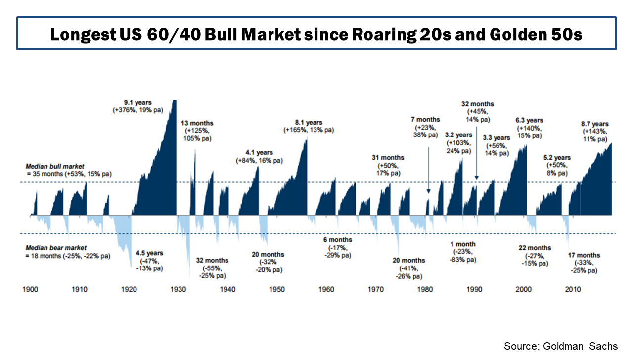
Goldman Sachs recently published an analysis on a portfolio of 60% in the S&P 500 and 40% in 10-year U.S. Treasuries, as per the graph below, and commented that “we are nearing the longest bull market for balanced equity/bond portfolios in over a century, boosted by a Goldilocks backdrop of strong growth without inflation”. They further stated that “it has seldom been the case that all assets are expensive at the same time—historical examples include the Roaring ‘20s and Golden ‘50s. While in the near term, growth might stay strong and valuations could pick up further, they should become a speed limit for returns”.
click to enlarge
My most recent post on the topic of US equity valuations in May looked at the bull and bear arguments on low interest rates and heighten profit margins by Jeremy Grantham and John Hussman. In that post I further highlighted some of the other factors which are part of the valuation debate such as the elevated corporate leverage levels, reduced capital expenditures, and increased financial risk taking as outlined in the April IMF Global Financial Stability report. I also highlighted, in my view, another influential factor related to aging populations, namely the higher level of risk assets in public pensions as the number of retired members increases.
In other posts, such as this one on the cyclically adjusted PE (CAPE or PE10), I have highlighted the debates around the use of historically applicable earnings data in the use of valuation metrics. Adjustments around changes in accounting methodology (such as FAS 142/144 on intangible write downs), relevant time periods to reflect structural changes in the economy, changes in dividend pay-out ratios, the increased contribution of foreign earnings in US firms, and the reduced contribution of labour costs (due to low real wage inflation) are just some examples of items to consider.
The FT’s John Authers provided an update in June on the debate between Robert Shiller and Jeremy Siegel over CAPE from a CFA conference earlier this year. Jeremy Siegel articulated his critique of the Shiller CAPE in this piece last year. In an article by Robert Shiller in September article, called “The coming bear market?”, he concluded that “the US stock market today looks a lot like it did at the peaks before most of the country’s 13 previous bear markets”.
The contribution of technology firms to the bull market, particularly the so-called FANG or FAANG stocks, has also been a much-debated issue of late. The graph below shows the historical sector breakdown of the S&P500 since 1995.
click to enlarge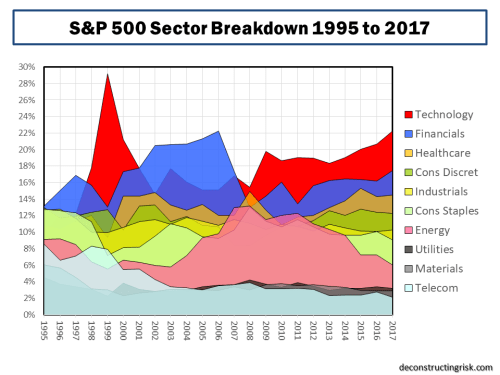
A recent article from GMO called “FAANG SCHMAANG: Don’t Blame the Over-valuation of the S&P Solely on Information Technology” tried to quantify the impact that the shift in sector composition upon valuations and concluded that “today’s higher S&P 500 weight in the relatively expensive Information Technology sector is cause for some of its expensiveness, but it does not explain away the bulk of its high absolute and relative valuation level. No matter how you cut it, the S&P 500 (and most other markets for that matter) is expensive”. The graph below shows that they estimate the over-valuation of the S&P500, as at the end of September 2017, using their PE10 measure is only reduced from 46% to 39% if re-balanced to take account of today’s sector weightings.
click to enlarge
In his recent article this month, John Hussman (who meekly referred to “his incorrectly tagged reputation as a permabear”!!) stated that “there’s no need to take a hard-negative outlook here, but don’t allow impatience, fear of missing out, or the illusion of permanently rising stock prices to entice you into entrusting your financial future to the single most overvalued market extreme in history”.
As discussed in my May post, Hussman reiterated his counter-argument to Jeremy Grantham’s argument that structurally low interest rates, in the recent past and in the medium term, can justify a “this time it’s different” case. Hussman again states that “the extreme level of valuations cannot, in fact, be “justified” on the basis of depressed interest rates” and that “lower interest rates only justify higher valuations if the stream of future cash flows is held constant” and that “one of the reasons why reliable valuation measures have retained such a high correlation with subsequent market returns across history, regardless of the level of interest rates, is that the impact of interest rates and growth rates on “terminal” valuations systematically offset each other”.
Hussman also again counters the argument that higher profit margins are the new normal, stating that “it’s important to recognize just how dependent elevated profit margins are on maintaining permanently depressed wages and salaries, as a share of GDP” and that “simply put, elevated corporate profit margins are the precise mirror-image of depressed labour compensation” which he contends is unlikely to last in a low unemployment environment.
Hussman presents a profit margin adjusted CAPE as of the 3rd of November, reproduced below, which he contends shows that “market valuations are now more extreme than at any point in history, including the 1929 and 2000 market highs”.
click to enlarge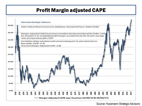
However, I think that his profit margin analysis is harsh. If you adjust historical earnings upwards for newer higher margin levels, of course the historical earning multiples will be lower. I got to thinking about what current valuations would look like against the past if higher historical profit margins, and therefore earnings, had resulted in higher multiples. Using data from Shiller’s website, the graph below does present a striking representation of the relationship between corporate profits (accepting the weaknesses in using profits as a percentage of US GDP) and interest rates.
click to enlarge
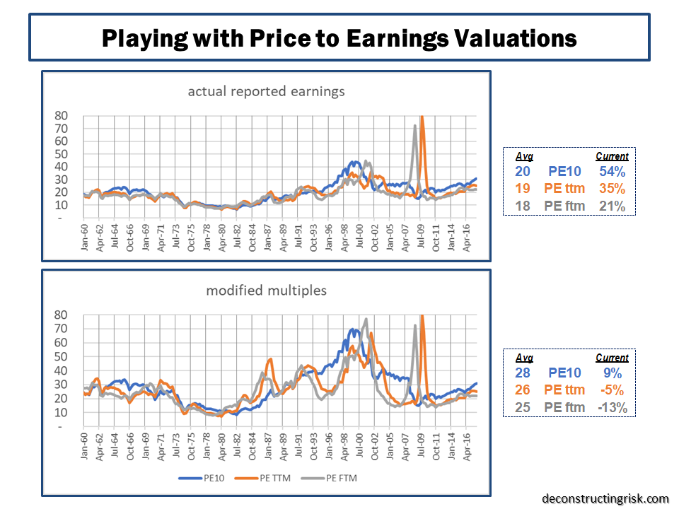
Purely as a thought experiment, I played with Shiller’s data, updating the reported earnings for estimates through 2018 (with a small discount to reflect over-zealous estimates as per recent trends of earnings revisions), recent consensus end 2018 S&P500 targets, and consensus inflation and the 10-year US interest rates through 2018. Basically, I tried to represent the base case from current commentators of slowly increasing inflation and interest rates over the short term, with 2018 reported EPS growth of 8% and the S&P500 growing to 2,900 by year end 2018. I then calculated the valuation metrics PE10, the regular PE (using trailing twelve month reported earnings called PE ttm), and the future PE (using forward twelve month reported earnings called PE ftm) to the end of 2018. I further adjusted the earnings multiples, for 2007 and prior, by applying an (principally upward) adjustment equal to a ratio of the pre-2007 actual corporate profits percentage to GDP divided by a newly assumed normalised percentage of 8.5% (lower than the past 10-year average around 9% to factor in some upward wage pressures over the medium term). The resulting historical multiples and averages are shown below.
click to enlarge
Based upon this analysis, whilst accepting its deeply flawed assumptions, if 2018 follows the base case currently expected (i.e. no external shocks, no big inflation or interest rates moves, steady if not spectacular earnings growth), the S&P500 currently looks over-valued by 50% to 20% using historical norms. If this time it is different and higher profit margins and lower interest rates are the new normal, then the S&P500 looks roughly fairly-valued and current targets for 2018 around 2,900 look achievable. Mind you, it’s a huge leap in mind-set to assume that the long-term average PE is justifiably in the mid-20s.
I continue to be concerned about increasing corporate leverage levels, as highlighted in my May post from the IMF Global Financial Stability report in April, and the unforeseen consequences of rising interest rate after such a long period of abnormally low rates.
In the interim, to paraphrase an ex-President, it’s all about the earnings stupid!