It has been a while since I looked at net tangible asset multiples for reinsurers and selected specialty insurers (the last such post is here). Motivated by the collapse in Lancashire’s multiple (briefly mentioned in a previous post) since they went ex-dividend, I redid the tangible book multiple figures. Previously I have used average operating ROEs as the x-axis but this time I have used annualized total returns since year-end 2010 (to capture the 2011 catastrophe year with the recent results of the past 3 years). Annualized total returns are made up of tangible book growth and dividends paid in 2011 to today. The split between tangible book growth and dividends, on an annualized basis across the past 4 years, for each firm as per the graph below (when calculating tangible book values, as is my usual practise disclosed previously, I excluded all goodwill and intangibles, except for the present value of future profits (PVFP) for life reinsurance business for European reinsurers).
click to enlarge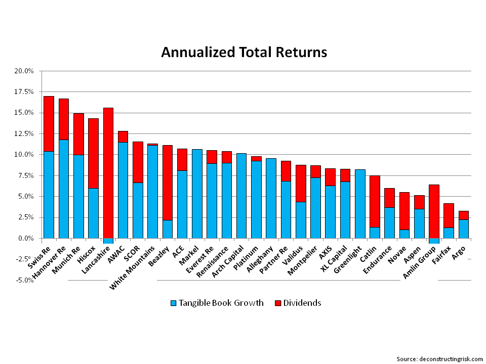
The graph of tangible book multiples to annualized returns is below. [Note – although insurance accounting has converged somewhat in recent years, caution still needs to be taken when comparing UK, European, and Bermudian/US firms due to the differing accounting regimes under which results are reported].
click to enlarge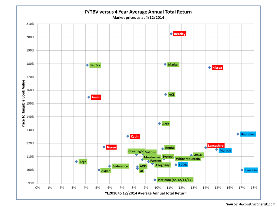
I split the firms into different colours – green is for the Bermudian & US firms, red is for London market firms, and blue is for the European composite reinsurers. In terms of who else may get involved in M&A following the Renaissance/Platinum deal, its interesting to see most of the Bermudians bunched up so close to each other in valuation and return profiles. The higher valued and larger firms may be the instigators in taking over smaller competitors but it looks more likely that medium sized firms need to get with today’s realities and seek tie-ups together. Who will wait it out in the hope of some market changing event or who will get it together in 2015 will be fascinating to watch!!
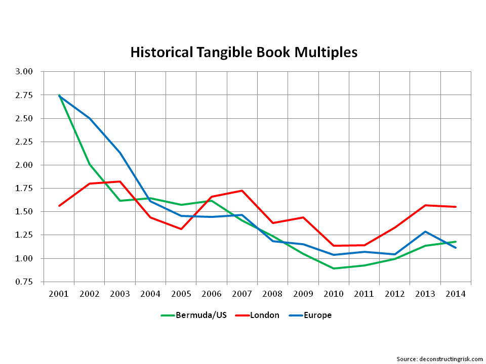
Follow-on: To get an idea of historical changes in the tangible book multiples in the three groupings above, the graph below shows the trends. The multiples in each year are simple averages across the firms (and not all are at the same point in the year) but the graph nonetheless gives an idea of changing market sentiment. Although the London and European firms are a smaller sample than the Bermudian/US firms, the graph indicates that the market is confident that the underwriting indiscipline of years past have been overcome in the London market, thus justifying a premium multiple. Time will tell on that score…..
click to enlarge