
My household may be somewhat unusual in that we do not own any Apple products. It’s not that we do not understand the attraction; we have family and friends that are Apple fanatics. It has more being a case of not wanting to get sucked into the Apple eco-system and the contrarian in me going against the hype (plus no teenagers in the house!). We have laptops, smart-phones, MP3 players – you name it – all excellent products with brand names across the spectrum but no Apple.
That said, the recent drop in Apple’s share price has got my attention. I recently asked a friend who manages a fund whether Apple was worth considering. An Apple bear, he said that no electronics consumer firm could maintain operating margins in excess of 20% for ever and that Apple’s time had come. Although that made sense to me, Apple is hardly any consumer electronics company. I decided Apple was worth a closer look.
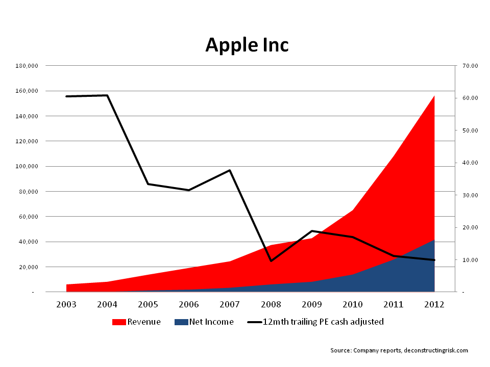
The first thing to highlight is that given Apple is the most analysed company in the world, this post may seem naive to many who are familiar with the company. Monthly sales, component orders, consumer surveys and the like are all analysed by legions of analysts and commentators prior to each quarter’s results. This post simply illustrates what I saw when I had a little dig around into AAPL’s historical results and is likely all old news to AAPL followers. As the graph below shows, a quick look at the past 10 years shows just what an impressive story AAPL has been. Impressive may become an overused word in this post!
From net margins of 1% in 2003, AAPL had an incredible net margin of 27% in 2012 with gross margins over 40%. Revenues grew from $6.2B in 2003 to $156.5B in 2012. The P/E ratio, using market values in early November (AAPL’s year end is end September) & the trailing annual EPS, which have been adjusted for AAPL’s cash & liquid assets (at approx $110 per share at year end 2012) has decreased from 60 in 2003 to just below 10, at 9.88, for 2012 (a figure not seen since the depths of the financial crisis). To say that AAPL’s balance sheet is a fortress with net assets consistently over 60% of total assets is an understatement!
Switching over to the quarterly results from Q1 2009 to Q1 2013, AAPL’s revenue by region (and retail unit) are in the graph below. Its strength in the Americas, Europe and China (as of Q1 2013, its 2nd largest market) can be clearly seen. What is also interesting is that the operating margins across each region, with the exception of the retail unit at 25%, are all over 40% for the 2012 year (with Japan at an astonishing 56%!). It will be interesting to see the exact China margins in future AAPL reports although the 2012 figures suggest that AAPL is maintaining pricing discipline in each of its major markets.
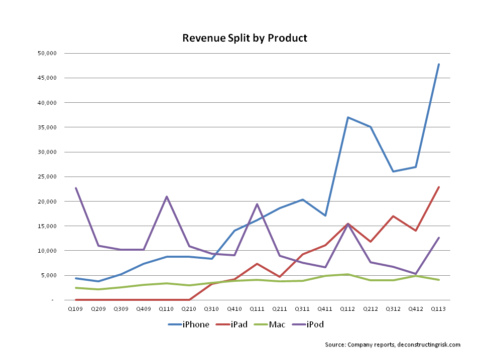
One of the reasons for the drop in AAPL’s share price is the uncertainty over its next block buster product. The iPod was introduced in 2001, the iTunes store in 2003, the Apple retail store in 2004, the iPhone in 2007 and the iPad in 2010. Fierce competition in the smartphone market from players such as Samsung has led to commentators fretting over Apple’s next move. The graph below, showing revenue by major product line, shows the importance of the iPhone to Apple.
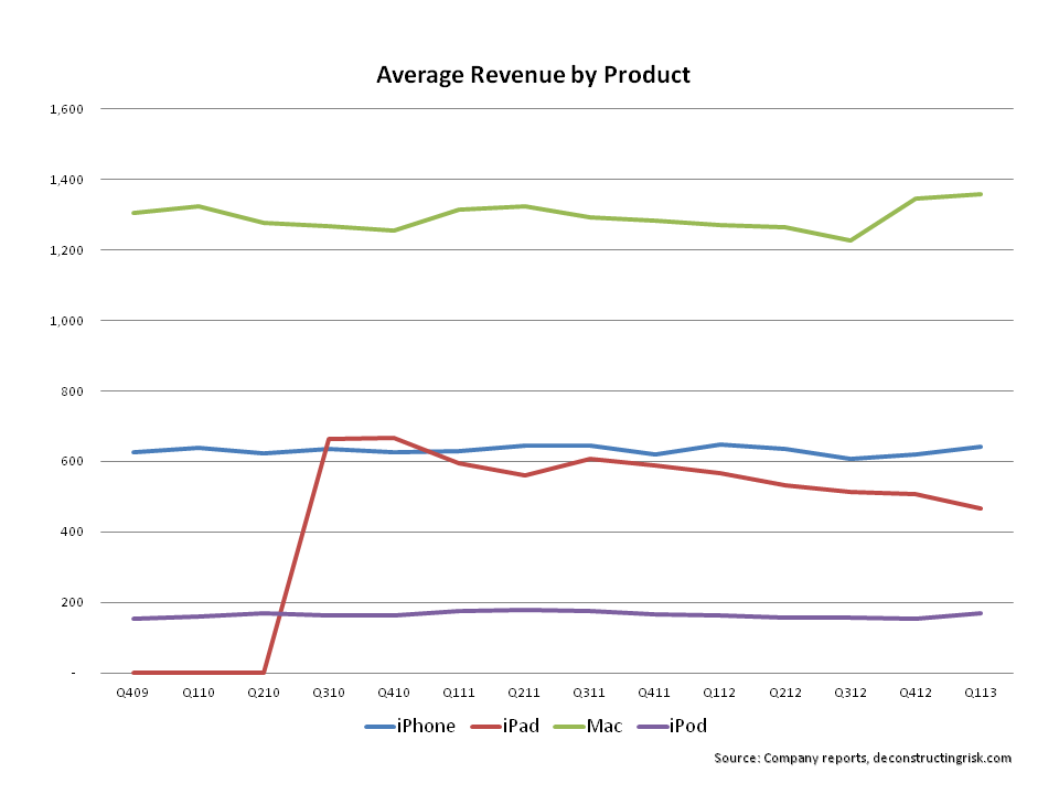
The graph below of average revenue by product also shows how the iPad is under pressure, with the introduction of the iPad mini likely to continue the trend. The relative consistency from the other main products should be highlighted as yet another strength.
Recent concerns about AAPL include the lack of success of the iPhone 5, the price declines in the iPad range, and the possibility of new launches later in 2013 of a low cost iPhone impacting average revenues of their core product. Speculation about a 2013 launch 0f the iWatch (with a retail price around $220) or the long awaited iTV keeps the hope of a new blockbuster product. Other press reports speculate on what Apple’ recent hiring of robotic expertise could mean and on the next steps in its ongoing battle with Samsung as both a supplier and a competitor. Some reports even conclude that Apple has lost its cool amongst the younger generation and is now a brand associated with thirty somethings and above. Blasphemy to any self respecting Apple worshipper!
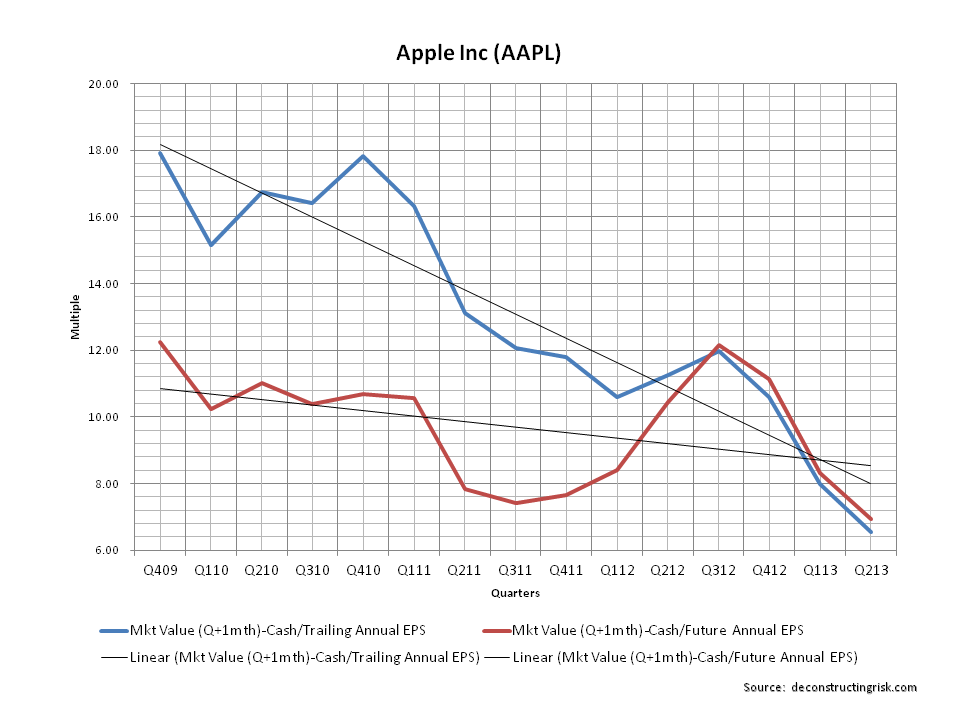
All of these concerns have led to AAPL’s current valuation. The graph below shows the quarterly PE ratio from Q4 2009 to Q1 2013 (Q2 2013 on the graph represents the position as at the 2nd of April). The market values are taken a month after quarter end (i.e. after quarterly results) with the cash value deducted. The blue line shows the trailing four quarters EPS whereas the red line shows the current quarter and the following 3 quarters (for Q2 to Q4 2013, I have used average analysts estimates). The graph illustrates how much the market is worried about future growth at Apple with both metrics for Q1 2013 in a 8.0 to 8.30 range. My estimates as of end Q2 2013 (assuming EPS of 10.15, 9.38 and 9.0 for Q2 to Q4) put that multiple around 7.0 (that’s even below the relative valuation seen at the depths of the financial crisis!).
So, in conclusion, is Apple undervalued? I don’t know because I don’t know if Apple has peaked. But I do know that this incredible company is at an attractive valuation if the concerns about it’s future growth path can be addressed. I will play with some projections and give the issue further thought (and hopefully post any enlightenments!). One thing is certain though, AAPL trades on current sentiment rather than on its incredible history. My gut tells me that they deserve much more respect than they are currently getting.
