Tag Archives: Buttonwood

How low is CAT pricing?

So, the February dip in the equity market is but a memory with the S&P500 now in positive territory for the year. With the forward PE at 16.4 and the Shiller CAPE at 25.75, it looks like the lack of alternatives has, once again, brought investors back to the equity market. As Buttonwood puts it – “investors are reluctant bulls; there seems no alternative.”  A December report from Bank of England staffers Rachel and Smith (as per previous post) has an excellent analysis of the secular drivers on the downward path of real interest rates. I reproduced a sample of some of the interesting graphs from the report below.

click to enlargeReal interest & growth & ROC rates

In the course of a recent conversation with a friend on the lack of attractive investment opportunities the subject of insurance linked securities (ILS) arose. My friend was unfamiliar with the topic so I tried to give him the run down on the issues. I have posted my views on ILS many times previously (here, here and here are just a recent few). During our conversation, the question was asked how low is current pricing in the catastrophe market relative to the “technically correct” level.

So this post is my attempt at answering that question. On a back of the envelop basis (I am sure professionals in this sector will be appalled at my crude methodology!). Market commentary currently asserts that non-US risks are the more under-priced of the peak catastrophe risks. Guy Carpenter’s recent rate on line (ROL) regional index, which is a commonly used industry metric for premium as a percentage of limit, shows that US, Asian, European and UK risks are off 30%, 28%, 32% and 35% respectively off their 2012 levels.

Using the US as a proxy for the overall market, I superimposed the Guy Carpenter US ROL index over historical annual US insured losses (CPI inflation adjusted to 2015) as per Munich Re estimates in the graph below. The average insured loss and ROL index since 1990 is $25 billion and 168 respectively. On the graph below I show the 15 year average for both which is $32 billion and 178 respectively. The current ROL pricing level is 18% and 23% below the average ROL since 1990 and the 15 year average respectively.

click to enlargeUS CAT Losses & ROL Index

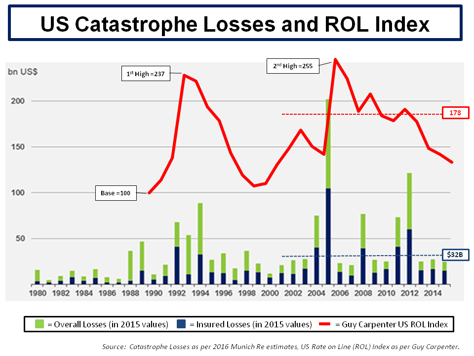
However, inflation adjusted insured losses are not exposure adjusted. Exposure adjusted losses are losses today which take into account today’s building stock and topology. To further illustrate the point, the graph in this 2014 post from Karen Clark shows exposure adjusted historical catastrophe losses above $10 billion. One of the vendor catastrophe modelling firms, AIR Worldwide, publishes its exposure adjusted annual average insured loss each year and its 2015 estimate for the US was $47 billion (using its medium timescale forecasts). That estimate is obviously some way off the 15 year average of $32 billion (which has been influenced by the recent run of low losses).

By way of answering the question posed, I have assumed (using nothing more than an educated guess) a base of an average annual insured loss level of $40 billion, being within an approximate inflation adjusted and exposure adjusted range of $35-45 billion, would imply a “technically correct” ROL level around 185. I guesstimated this level based upon the 10 year average settling at 195 for 4 years before the 2016 decline and applying a discount to 185 due to the lower cost of capital that ILS investors require. The former assumes that the market is an efficient means of price discovery for volatile risks and the latter is another way of saying that these ILS investors accept lower returns than professional insurers due to the magic which market wisdom bestows on the uncorrelated nature of catastrophic risk. 185 would put current US catastrophe premium at a 25% discount to the supposed “technical correct” level.

Some in the market say rates have bottomed out but, without any significant losses, rates will likely continue to drop. Kevin O’Donnell of RenRe recently said the following:

“We believe that a playbook relying on the old cycle is dead. The future will not see multi-region, multi-line hardening post-event. There’s too much capital interested in this risk and it can enter our business more quickly and with less friction. There will be cycles, but they will be more targeted and shorter and we have worked hard to make sure that we can attract the best capital, underwrite better, and deploy first when the market presents an opportunity.”

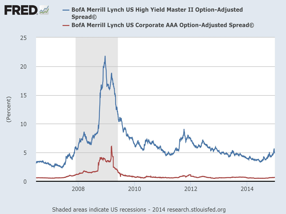
I cannot but help think that the capital markets are not fully appreciating the nuances of the underlying risks and simply treating catastrophe risks like other BB asset classes as the graph below illustrates.

click to enlargeBB Corporate vrs ILS Spreads

There is an alternate explanation. The factors impacting weather systems are incredibly complex. Sea surface temperatures (SSTs) and wind shear conditions are key variables in determining hurricane formation and characteristics. Elements which may come into play on these variables include the North Atlantic Oscillation (NAO) which is a fluctuation in pressure differences between the Icelandic and Azores regions, the Atlantic Multi-Decadal Oscillation (AMO) which measures the natural variability in sea surface temperature (and salinity) of the North Atlantic, and the El Niño Southern Oscillation (ENSO) which measures cyclical temperature anomalies in the Pacific Ocean off South America. Climate change is impacting each of these variables and it may be possible that US hurricanes will become less frequent (but likely more severe).

An article from late last year in the Nature Geoscience Journal from Klotzbach, Gray and Fogarty called “Active Atlantic hurricane era at its end?” suggests the active hurricane phase in the Atlantic could be entering a new quieter cycle of storm activity. The graph below is from their analysis.

click to enlargeAtlantic hurricane frequency

Could it be that the capital markets are so efficient that they have already factored in such theories with a 25% discount on risk premia? Yep, right.

More on Non-existent Deleveraging

McKinsey released their third report on global debt levels recently, entitled “Debt and (not much) Deleveraging”. Covering much of the same ground as the Geneva report in September (see previous post), the highlights of the report include detail behind the rise in public sector and household debt, the growth rates needed to start real deleveraging, the higher capital levels in the banking sector, the detail behind China’s rising debt, and some suggestions to live with high debt levels in the future. I would recommend the report to anybody interested in the macroeconomics.

The report is the subject of the Buttonwood piece this week where he also talks about the challenges that higher global debt brings. A recent post on changes to global demographic profiles is also relevant when thinking about servicing future public and private debt.

Below are a few of the graphics of interest from the report on the size and split of global debt, the mix between private and public debt in developed countries and the growth rate needed to start deleveraging, and the debt in China.

click to enlargeMGI Global Debt

click to enlargeMGI Advanced Economies Public vrs Private Debt

click to enlargeMGI GDP required to start deleveraging

click to enlargeMGI China Debt to GDP

Debt in a greying age

The book “Capital in the Twenty-First Century” by Thomas Piketty is unquestioningly one of the books of 2014. This blogger is currently reading Piketty’s book after finding it in his Santa sock this Christmas. There were not many other books from 2014 that caught my attention. One book that I am very much looking forward to in 2015 is the new Steven Drobny book “The New House of Money” with detailed interviews of money managers. On his website, Drobny has already released the first two chapters – one on Kyle Bass and the other with Jim Chanos.

The views of Kyle Bass, in particular, on Japan got me thinking again about demographics and the ability to withstand large debt loads. The views of Bass are also articulated in a piece on the investor perspectives website. For example, Bass states that currently in Japan debt repayments take up 25% of government tax revenues but that a 100bps rise in interest rates in Japan would mean that 100% of tax revenues would go to repayments. That leaves very little room for error!

This week, Buttonwood also has an article on the restrictions that large debt loads places on the effectiveness of monetary policy.

In terms of age profiles, the graphic below shows the profiles of the 9 largest economies (according to the World Bank).

click to enlargeTop 9 Demographics

Japan and Germany clearly stand out as countries with an aging population, currently with 26% and 21% of their populations over 65 respectively. I also compared the age profiles against the public and private debt figures (excluding that from banking and other financial service firms) from the “Deleveraging. What Deleveraging?report (see previous post on that report), as per the graph below.

click to enlargeMajor Country Public & Private Debt ex financial versus Age Profile

The graph does show that there is a clear relationship between debt loads and age profiles, particularly the percentages for the over 55s. However, the outliers of Germany and Russia on the low debt side and indeed Japan on the high debt side show that there are many other factors at play, not least the historic cultural characteristics of each country. The burden that high debt loads places on future generations is clearly an important policy issue for the global economy, one that will become ever more important if interest rates are to return to anyway close to normality.

As a follow-on to this post, I have been looking through the UN population projections and the following graphs represent population profiles I found interesting. The first is the world population historical figures and projections by age profile.

click to enlargeWorld Population Projections & Age Profile

The next graph is the world population split by continent (with Japan and China split out of Asia).

click to enlargeWorld Population Projections by Continent

And finally, a graph of the world population aged over 60 and aged under 15 split by continent.

click to enlargeWorld Population Over 60s & Under 15s by Continent

Goodbye 2014, Hello 2015!

So, after the (im)piety of the Christmas break, its time to reflect on 2014 and look to the new year. As is always the case, the world we live in is faced with many issues and challenges. How will China’s economy perform in 2015? What about Putin and Russia? How strong may the dollar get? Two other issues which are currently on traders’ minds as the year closes are oil and Greece.

The drop in the price of oil, driven by supply/demand imbalances and geo-political factors in the Middle East, was generally unforeseen and astonishing swift, as the graph of European Brent below shows.

click to enlargeEuropean Brent Spot Price 2004 to 2014

Over the short term, the drop will be generally beneficial to the global economy, acting like a tax cut. At a political level, the reduction may even put manners on oil dependent states such as Iran and Russia. Over the medium to long term however, it’s irrational for a finite resource to be priced at such levels, even with the increased supply generated by new technologies like fracking (the longer term environmental impacts of which remain untested). The impact of a low oil price over the medium term would also have negative environmental impacts upon the need to address our carbon based economies as highlighted in 2014 by the excellent IPCC reports. I posted on such topics with a post on climate models in March, a post on risk and uncertainty in the IPCC findings in April, and another post on the IPCC synthesis reports in November.

The prospect of another round of structural stresses on the Euro has arisen by the calling of an election in late January in Greece and the possible success of the anti-austerity Syriza party. Although a Greek exit from the Euro seems unlikely in 2015, pressure is likely to be exerted for relief on their unsustainable debt load through write offs. Although banking union has been a positive development for Europe in 2014, a post in May on an article from Oxford Professor Kevin O’Rourke outlining the ultimate need to mutualise European commitments by way of a federal Europe to ensure the long term survival of the Euro. Recent commentary, including this article in the Economist, on the politics behind enacting any meaningful French economic reforms highlights how far Europe has to go. I still doubt that the German public can be convinced to back-stop the commitments of others across Europe, despite the competitive advantage that the relatively weak Euro bestows on Germany’s exporting prowess.

Perpetually, or so it seems, commentators debate the possible movements in interest rates over the coming 12 months, particularly in the US. A post in September on the findings of a fascinating report, called “Deleveraging, What Deleveraging?”, showed the high level of overall debt in the US and the rapid increase in the Chinese debt load. Although European debt levels were shown to have stabilised over the past 5 years, the impact of an aggressive round of quantitative easing in Europe on already high debt levels is another factor limiting action by the ECB. The impact of a move towards the normalisation of interest rates in the US on its economy and on the global economy remains one of the great uncertainties of our time. In 2015, we may just begin to see how the next chapter will play out.

Low interest rates have long been cited as a factor behind the rise in stock market valuations and any increase in interest rates remains a significant risk to equity markets. As the graph below attests, 2014 has been a solid if unspectacular year for nearly all equity indices (with the exception of the FTSE100), albeit with a few wobbles along the way, as highlighted in this October post.

click to enlarge2014 Stock Indices Performance

The debate on market valuations has been an ever-present theme of many of my posts throughout 2014. In a March post, I continued to highlight the differing views on the widely used cyclically adjusted PE (CAPE) metric. Another post in May highlighted Martin Wolf’s concerns on governments promoting cheap risk premia over an extended period as a rational long term policy. Another post in June, called Reluctant Bulls, on valuations summarized Buttonwood’s assertion that many in the market were reluctant bulls in the absence of attractive yields in other asset classes. More recently a post in September and a post in December further details the opposing views of such commentators as Jim Paulsen, Jeremy Siegel, Andrew Lapthorne, Albert Edwards, John Hussman, Philosophical Economics, and Buttonwood. The debate continues and will likely be another feature of my posts in 2015.

By way of a quick update, CAPE or the snappily named P/E10 ratio as used by Doug Short in a recent article on his excellent website shows the current S&P500 at a premium of 30% to 40% above the historical average. In his latest newsletter, John Hussman commented as follows:

“What repeatedly distinguishes bubbles from the crashes is the pairing of severely overvalued, overbought, overbullish conditions with a subtle but measurable deterioration in market internals or credit spreads that conveys a shift from risk-seeking to risk-aversion.”

Hussman points to a recent widening in spreads, as illustrated by a graph from the St Louis Fed’s FRED below, as a possible shift towards risk aversion.

click to enlargeFRED High Yield vrs AAA Spread Graph

The bull arguments are that valuations are not particularly stressed given the rise in earnings driven by changes to the mix of the S&P500 towards more profitable and internationally diverse firms. Critics counter that EPS growth is being flattered by subdued real wage inflation and being engineered by an explosion in share buybacks to the detriment of long term investments. The growth in quarterly S&P500 EPS, as illustrated below, shows the astonishing growth in recent years (and includes increasingly strong quarterly predicted EPS growth for 2015).

click to enlargeS&P500 Quarterly Operating & Reported EPS

A recent market briefing from Yardeni research gives a breakdown of projected forward PEs for each of the S&P500 sectors. Its shows the S&P500 index at a relatively undemanding 16.6 currently. In the graph below, I looked at the recent PE ratios using the trailing twelve month and forward 12 month operating EPS (with my own amended projections for 2015). It also shows the current market at a relatively undemanding level around 16, assuming operating EPS growth of approx 10% for 2015 over 2014.

click to enlargeS&P500 Operating PE Ratios

The focus for 2015 is therefore, as with previous years, on the sustainability of earnings growth. As a March post highlighted, there are concerns on whether the high level of US corporate profits can be maintained. Multiples are high and expectations on interest rates could make investors reconsider the current multiples. That said, I do not see across the board irrational valuations. Indeed, at a micro level, valuations in some sectors seem very rational to me as do those for a few select firms.

The state of the insurance sector made up the most frequent number of my posts throughout 2014. Starting in January with a post summarizing the pricing declines highlighted in the January 2014 renewal broker reports (the 2015 broker reports are due in the next few days). Posts in March and April and November (here, here and here) detailed the on-going pricing pressures throughout the year. Other insurance sector related posts focussed on valuation multiples (here in June and here in December) and sector ROEs (here in January, here in February and here in May). Individual insurance stocks that were the subject of posts included AIG (here in March and here in September) and Lancashire (here in February and here in August). In response to pressures on operating margins, M&A activity picking up steam in late 2014 with the Renaissance/Platinum and XL/Catlin deals the latest examples. When seasoned executives in the industry are prepared to throw in the towel and cash out you know market conditions are bad. 2015 looks to be a fascinating year for this over-capitalised sector.

Another sector that is undergoing an increase in M&A activity is the telecom sector, as a recent post on Europe in November highlighted. Level3 was one of my biggest winners in 2014, up 50%, after another important merger with TW Telecom. I remain very positive on this former basket case given its operational leverage and its excellent management with a strong focus on cash generation & debt reduction (I posted on TWTC in February and on the merger in June and July). Posts on COLT in January and November were less positive on its prospects.

Another sector that caught my attention in 2014, which is undergoing its own disruption, is the European betting and online gambling sector. I posted on that sector in January, March, August and November. I also posted on the fascinating case of Betfair in July. This sector looks like one that will further delight (for the interested observer rather than the investor!) in 2015.

Other various topics that were the subject of posts included the online education sector in February, Apple in May, a dental stock in August, and Trinity Biotech in August and October. Despite the poor timing of the August TRIB call, my view is that the original investment case remains intact and I will update my thoughts on the topic in 2015 with a view to possibly building that position once the selling by a major shareholder subsides and more positive news on their Troponin trials is forthcoming. Finally, I ended the year having a quick look at Chinese internet stocks and concluded that a further look at Google was warranted instead.

So that’s about it for 2014. There was a few other random posts on items as diverse as a mega-tsunami to correlations (here and here)!

I would like to thank everybody who have taken the time to read my ramblings. I did find it increasingly difficult to devote quality time to posting as 2014 progressed and unfortunately 2015 is looking to be similarly busy. Hopefully 2015 will provide more rich topics that force me to find the time!

A very happy and health 2015 to all those who have visited this blog in 2014.

An ice age or a golden one?

The debate on whether the US stock market is overvalued, as measured by the cyclically adjusted price to earnings ratio (CAPE) as developed by Robert Shiller, or whether CAPE is not relevant due to weaknesses in comparing past cycles with today’s mixed up macro-economic world, continues to rage. I have posted several times on this, most recently here and here. In an article in this week’s Economist, Buttonwood outlines some of the bull and bear arguments on the prospects for US corporate growth and concludes that “America is an exception but not as big an exception as markets suggest”.

Bulls argue that, although the CAPE for the S&P500 is currently historically high at 26.5, earnings growth remains strong as the US economy picks up speed and that at a forward PE around 16 the S&P500 is not at excessive levels indicative of a bubble. The latest statistics compiled by the excellent Yardeni Research from sources such as the Bureau of Economic Analysis show that earnings, whether S&P reported or operating earnings or NIPA after tax profits from current production or based upon tax returns, continue to trend along a 7% growth projection. Jim Paulsen, chief investment strategist at Wells Capital Management, believes that “this recovery will last several more years” and “earnings will grow”. Even the prospect of increased US interest rates does not perturb some bulls who assert that rates will remain low relative to history for some time and that S&P500 firms still have plenty of cash with an aggregate cash-pile of over $1 trillion. The king of the bulls, Jeremy Siegel recently said that “If you look at history, the bull markets do not end when the Fed starts raising interest rates. Bull markets could go on for another 9 months to 2 years“.

Bears point to high corporate profits to GDP and argue that they are as a direct result of low real wages and are therefore unsustainable when normal macro conditions return. Others point to the surge in share buybacks, estimated at nearly $2 trillion by S&P500 firms since 2009, as a significant factor behind EPS growth. Société Générale estimate a 20% fall in Q2 buybacks and (the always to be listened to) Andrew Lapthorne warns that as debt gets dearer firms will find it hard to maintain this key support to stock prices as in the “absence of the largest buyers of US equity going forward is likely to have significant consequence on stock prices”. The (current) king of the bears, Albert Edwards, also at SocGen, provided good copy in a recent report “Is that a hissing I can hear?” saying that “companies themselves have been the only substantive buyers of equity, but the most recent data suggests that this party is over and as profits also stall out, the equity market is now running on fumes“. Edwards believes that an economic Ice Age is possible due to global deflationary pressures. Another contender for king of the bears is fund manager John Hussman and he recently commented: “make no mistake, this is an equity bubble, and a highly advanced one“.

One commentator who I also respect is the author behind the excellent blog Philosophical Economics. A post last month on CAPE highlighted the obvious but often forgotten fact thatthe market’s valuation arises as an inadvertent byproduct of the equilibriation of supply and demand: the process through which the quantity of equity being supplied by sellers achieves an equilibrium with the quantity of equity being demanded by buyers”. As such, the current macro-economic situation makes any reference to an average or a “normal period” questionable. The post is well worth a read and concludes that the author expects the market to be volatile but continue its upward trajectory, albeit at a slower pace, until signs that the real economy is in trouble.

For me, the easy position is to remain negative as I see valuations and behaviour that frightens me (hello AAPL?). I see volatility but not necessarily a major correction. Unless political events get messy, I think the conclusion in a previous Buttonwood piece still holds true: “investors are reluctant bulls; there seems no alternative”. Sticking only to high conviction names and careful risk management through buying insurance where possible remain my core principles. That and trying to keep my greed in check…..