After Hurricane Arthur briefly made landfall in North Carolina on Thursday night, a weakened storm is now heading north. I thought this would be good time to have a look at the probable maximum losses (PMLs) published as at the Q1 2014 results by a sample of specialist (re)insurers, first presented in a post in June 2013. That post went into some detail on the uncertainties surrounding the published PMLs and should be read as relevant background to the figures presented here.
Despite predictions of an above average 2013 Atlantic hurricane season, the number of named hurricanes was the lowest since 1982. Predictions for the 2014 season are for a below average number of hurricanes primarily due to cooler sea temperatures in the Atlantic due to the transition to El Niño (although that is now thought to be slower than previously anticipated). The graph below includes the 2014 predictions.
click to enlarge I like to look at PMLs as a percentage of net tangible assets (NTA) on a consistent basis across firms to assess exposures from a common equity viewpoint. Many firms include subordinated debt or other forms of hybrid debt in capital when showing their PMLS. For example, Lancashire has approximately $330 million of sub-debt which they include in their capital figures and I have show the difference with and without the sub-debt in the percentages for Lancashire in the graph below on US wind PMLs to illustrate the comparison.
Whether hybrid debt comes in before equity or alongside equity depends upon the exact terms and conditions. The detail of such instruments will determine whether such debt is classified as tier 1, 2 or 3 capital for regulatory purposes under Solvency II (although there are generous transitional timeframes of up to 10 years for existing instruments). The devil is often in the detail and that is another reason why I prefer to exclude them and use a consistent NTA basis.
As per the June 2013 post, firms often classify their US wind exposures by zone but I have taken the highest exposures for each (which may not necessarily be the same zone for each firm).
click to enlarge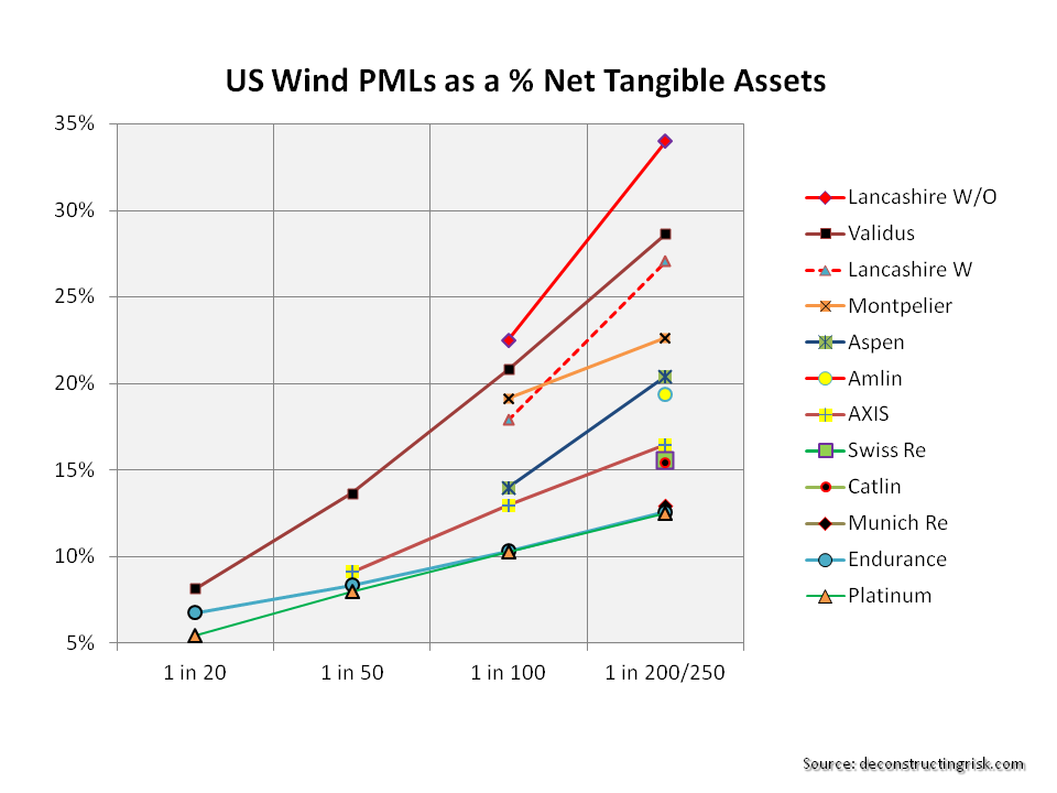 These exposures, although expressed as percentages of NTAs, should be considered net of potential profits made for 2014 to assess the real impact upon equity (provided, of course, that the expected profits don’t all come from property catastrophe lines!). If for example we assume a 10% return on NTA across each firm, then the figures above have to be adjusted.
Another issue, also discussed in the previous post, is the return period for similar events that each firms present. For example, the London market firms present Lloyds’ realistic disaster scenarios (RDS) as their PMLs. One such RDS is a repeat of the 1926 Miami hurricane which is predicted to cost $125 billion for the industry if it happened today. For the graph above, I have assumed a 1 in 200 return period for this scenario. The US & Bermudian firms do not present scenarios but points on their occurrence exceedance probability (OEP) curves.
As it is always earthquake season, I also include the PMLs for a California earthquake as per the graph below.
click to enlarge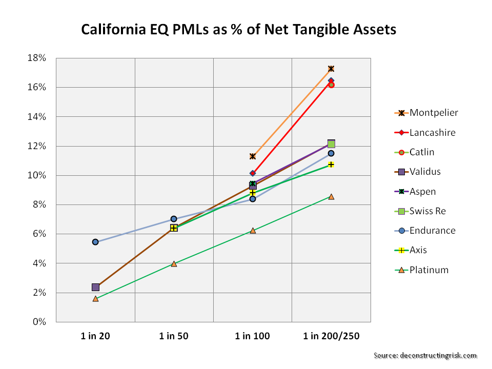 In terms of current market conditions, the mid-year broker reports are boringly predictable. John Cavanagh, the CEO of Willis Re, commented in their report that “the tentacles of the softening market are spreading far and wide, with no immediate signs of relief. We’ve seen muted demand throughout 2014 and market dynamics are unlikely to change for some time to come. The current market position is increasingly challenging for reinsurers.” Aon Benfield, in their report, stated that “the lowest reinsurance risk margins in a generation stimulate new growth opportunities for insurers and may allow governments to reduce their participation in catastrophe exposed regions as insurance availability and affordability improves”. When people start talking about low pricing leading to new opportunities to take risk, I can but smile. That’s what they said during the last soft market, and the one before that!
Some commentators are making much of the recent withdrawal of the latest Munich Re bond on pricing concerns as an indicator that property catastrophe prices have reached a floor and that the market is reasserting discipline. That may be so but reaching a floor below the technical loss cost level sounds hollow to me when talking about underwriting discipline.
To finish, I have reproducing the graph on Flagstone Re from the June 2013 post as it speaks a thousand words about the dangers of relying too much on the published PMLs. Published PMLs are, after all, only indicators of losses from single events and, by their nature, reflect current (group) thinking from widely used risk management tools.
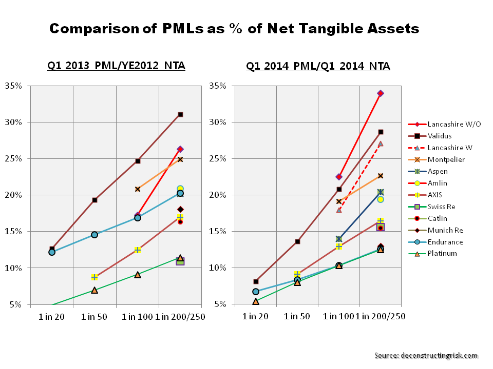
click to enlarge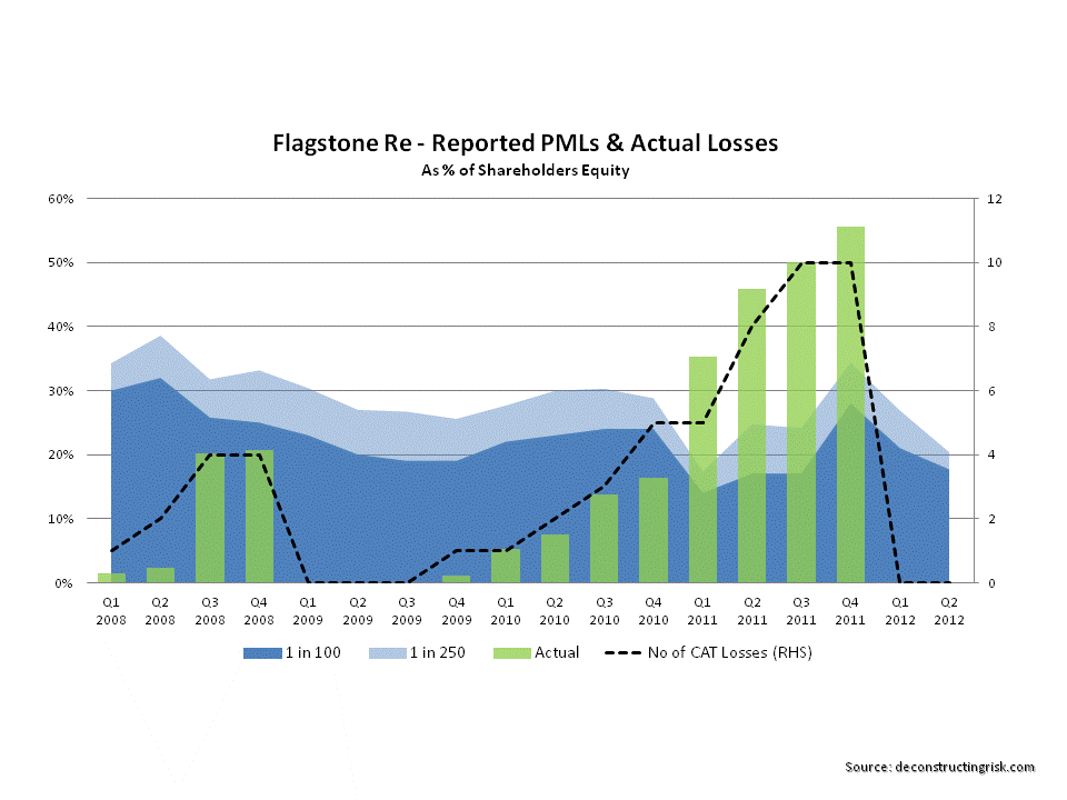 Follow-on: It occurred to me after posting that I could compare the PMLs for the selected firms as at Q1 2014 against those from Q1 2013 and the graph below shows the comparison. It does indicate that many firms have taken advantage of cheap reinsurance/retrocession and reduced their net profiles, as highlighted in this post on arbitrage opportunities. Some firms have gone through mergers or business model changes. Endurance, for example, has been changed radically by John Charman (as well as being an aggressive buyer of coverage). Lancashire is one of the only firms whose risk profile has increased using the NTA metric as a result of the Cathedral acquisition and the increase in goodwill.
click to enlarge