Monthly Archives: July 2016

EBA Bank Stress Tests

The results of the EBA stress tests on the largest European banks were released on Friday night. As expected, the Italian bank Monte Paschi performed badly. Rather than go into the results at a individual bank level, I thought it would be interesting to look at the results at a country level.

The first graph below shows the movement in the common equity tier 1 ratios under the adverse scenario by country.

click to enlarge2016 EBA Stress Test Common Equity Tier 1 Ratios by country

The next graph below shows the movement in the leverage ratios under the adverse scenario by country.

click to enlarge2016 EBA Stress Test Leverage Ratios by country

On the CET1 ratios, Ireland and Austria join Italy as the countries with the lowest aggregate ratios. The fall in Ireland’s ratios is particularly noticeable. In terms of the leverage ratios, Italy and Austria again appear in the bottom of the list. Perhaps surprisingly, the Netherlands is the lowest with Germany and France around 4%.

Another interesting piece of data from the EBA is the profile of sovereign exposures in the EU banks. In the exhibit below, I looked at these exposures to see if there is any insight that could be gained on risks from any potential breakup of the Euro (not a risk that’s talked about much these days but one that hasn’t gone away in my view).

click to enlargeGross Sovereign Exposures in EU Banks

A few things come to mind from this exhibit. Germany bonds are not held in as high quantities as I would of expected (except for the weird 46% from Finland, with other concentrations in Denmark, Italy and the Netherlands), likely to be a function of their yield. The strongest capitalized countries – Denmark, Finland and Sweden – have the lowest holding in their own bonds, with Denmark and Sweden having a particularly diverse spread of holdings. Italian bonds are widely held across a number of countries but not in large concentrations. Ireland holds most of the Irish exposure.

There is likely more food for thought  among the interesting data released by the EBA from these bank stress tests.


Apple Average

It’s always strange when you have a relief rally in a stock (in after hours at least) because the actual results are not as bad as expected. So it seems to be with AAPL’s Q3 results. iPhone sales were not as bad as expected (albeit the lowest unit iPhone sales in 7 quarters at just above 40 million units) and the current quarter revenue guidance was above expectations. The average revenue per phone was below $600 for the first time in 2 years due to the the latest models with promises of improvements from management in future quarters. When the dust settles on the Q3 results though it could be time to finally reassess AAPL’s future trajectory.

The graph below shows the latest results by product which illustrate just how poor a quarter this was relative to historical trends, with services being the sole bright spot.

click to enlarge

AAPL Revenue by product Q32016

The split by revenue by region again illustrates the challenges AAPL is having in China. It also shows the lackluster response to Apple’s current products in the US.

click to enlargeAAPL Revenue by region Q32016

On valuation, AAPL still looks reasonable on a forward PE excluding cash basis (using analysts estimates for the next 4 quarters), as per the graph below.

click to enlarge

AAPL Forward 12 Month PE Ratio Q32016

The bulls are hyping up the iPhone 7 cycle as a source of future growth which is now the tired but only realistic growth thesis for AAPL. In the medium term however AAPL looks range bound around $100.

Anarchy in the UK

Uncertainty reins and the economic impacts of Brexit on the UK and on Europe have yet to become clear. And a big factor in the uncertainty is the political path to Brexit. The UK political class are now trying to rally around newly agreed leadership of their respective parties (assuming Labour MPs eventually manage to get rid of their current leader) and craft policies on how to engage in the divorce negotiations.

A unique political feature of the UK is their first past the post (FPTP) electoral system. The graph below of the 2015 general election shows how the system favours the larger political parties. It also shows how parliamentary representation under FPTP can be perverse. The Scottish SNP, for example, got 4.8% of the vote but 8.6% of the members of parliament (MPs). The right wing little Englander party UKIP, whose rise in popularity was a direct cause of the decision to have a referendum on Brexit, got 12.6% of the vote but just 0.26% of the MPs. Despite its obvious failings, the British are fond of their antiquated FPTP system and voted to retain it by 68% in a 2011 referendum (albeit with a low voter turnout at 42%).

click to enlarge2015 UK General Election Results

One lasting impact of the Brexit vote is likely to be on the make-up of British politics. Much has been commented on the generational, educational and geographical disparities in the Brexit vote. A breakdown of the leave-remain vote by the political parties, as per the graph below, shows how the issue of the EU has caused schisms within the largest two parties. Such schisms are major contributors to the uncertainty on how the Brexit divorce settlement will go.

click to enlargeUK Brexit Vote Breakdown by Political Party

Currently both sides, the UK and the EU, have taken hard positions with Conservative politicians saying restrictions on the freedom of labour movement is a red line issue and the EU demanding that Article 50 is triggered and the UK agree the divorce terms before the future relationship can be discussed.

Let’s assume that all of the different arrangements touted in the media since the vote boil down to two basic options. The first involves access to EU markets through the European Economic Area (EEA) or the European Free Trade Association in exchange for some form of free movement of labour, commonly referred to as the Norway or the Switzerland options. The second option is a bilateral trade agreement with a skills based immigration policy, commonly referred to as the Canadian option (although it’s interesting to see that there is political uncertainty in Europe over how the Canadian trade deal, which has been agreed in principle, will be ratified). I have called these option 1 and option 2 respectively (commonly referred to as soft and hard Brexit respectively).

Let’s assume the negotiations on Brexit in the near future will be conducted in a sensible, rather than an emotive, manner whereby the economic impacts have been shown to be detrimental albeit not life threatening. And both sides come to realise that extreme positions are not in their interest and a workable compromise is what everybody wants. In such a scenario, I have further assumed that the vast majority (e.g. 98%) of remain voters would favour option 1 and I have judgmentally assigned political preferences for each option by political party (e.g. 90% and 75% of Conservative and Labour leave voters prefer option 2 respectively). Based upon these estimates, I calculate that there would be a 56% majority of the UK electorate in favour of option 1, as per the graph below.

click to enlargeBrexit Options Breakdown by Political Party

Now, the above thought experience makes a lot of assumptions, most of which are likely to be well off the reality. Particularly, I suspect the lack of emotive and divisive negotiations is an assumption too far.

What the heck, let’s go one step further in these fanciful thoughts. Let’s assume the new leadership in the Conservative party adopt option 2 as their official policy. Let’s also assume that the Labour party splits into old labour, a left wing anti-globalisation party, and a new centre left party whose official policy is option 1. In a theoretical general election (which may be required to approve any negotiated deal), I guesstimate the result below under the unpredictable FPTP system.

click to enlargeTheoretical post Brexit General Election Result

This analysis suggests a majority government of 52% of MPs with option 1 as their policy could be possible with a grand coalition of the new centre party (Labour break away party), the Liberal Democrats and the SNP. The Conservatives and UKIP could, in this scenario, only manage 35% between them (the old labour party at 9% of MPs wouldn’t tolerate to join such a combination no matter what their views on the EU). The net result would be a dramatic shift in UK politics with Europe as a defining issue for the future.

Yea, right!

Back to today’s mucky and uncertain reality….


Follow-up: I thought I was been clever with the title of this post and I only realised after posting it that the Economist used it in their title this week! Is there nothing original any more….

Naive Newcomers

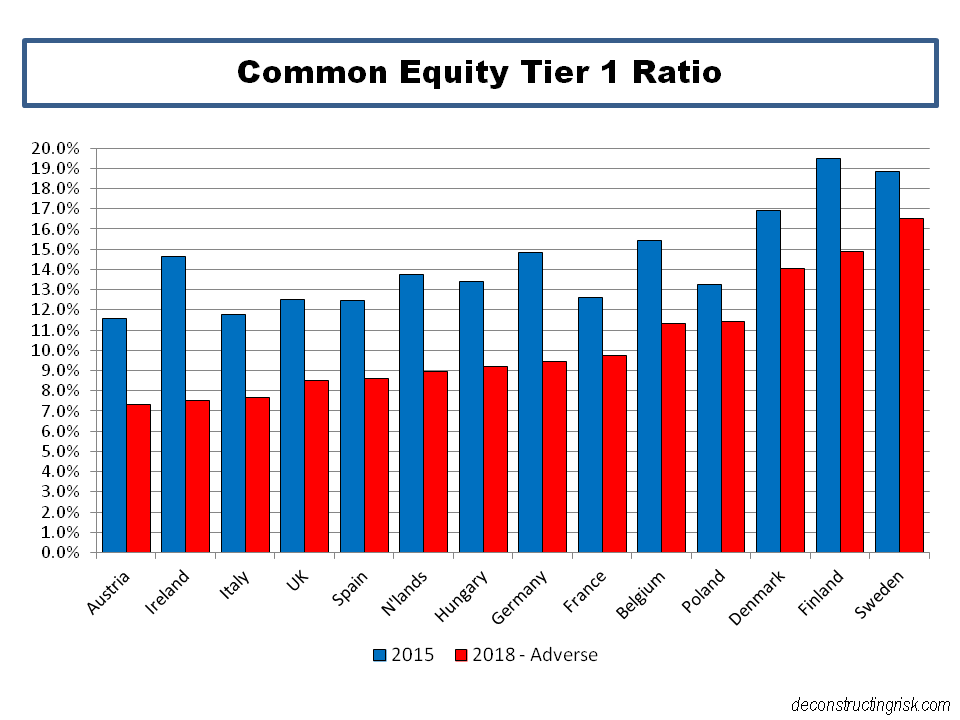
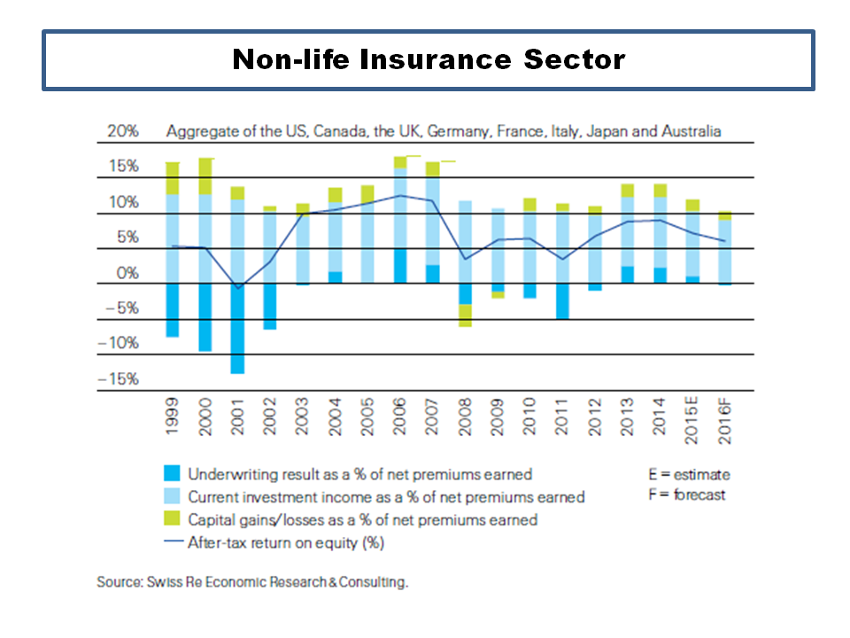
The insurance sector has been hit by the Brexit fallout on worries about macro-economic impacts; albeit not to the same extend as the banks. Swiss Re has their latest Sigma world insurance report out. The impact of investment returns on the life insurance sector is obvious but it is interesting to see the contribution from investment income on the profitability of the aggregate of the eight largest markets in the non-life insurance sector, as per the graph from the report below.

click to enlargeNonLife Insurance Sector Profit Breakdown

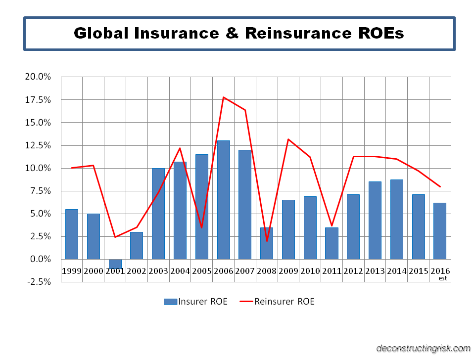
The insurance sector faces a number of challenges as a recent FT article pointed out. The reinsurance sector also faces challenges, not least of which is a competitive pricing environment and the destabilising influx of new yield seeking capital through new innovations in the insurance linked securities (ILS) market. I have posted my views on the ILS sector many times (more recently here) and in this post I offer more similar thoughts. It is interesting to compare the ROEs in the Sigma report from the non-life insurance sector against those from the reinsurance sector (with the ROEs since 2005 coming from the Guy Carpenter composite index), as per the graph below.

click to enlargeGlobal Insurance & Reinsurance ROEs 1999 to 2016e

The graph is not exactly comparing like with like (e.g. non-life insurance versus composite reinsurance) but it gives the general idea of higher but more volatile ROEs in the reinsurance side compared to more stable but lower ROEs on the direct insurance side. The average since 1999 for insurance is 7% and 9% for reinsurance, with standard deviations of 3.6% and 4.6% respectively. It also confirms that ROEs are under pressure for both sectors and as capital markets continue to siphon off volatile excess catastrophe exposed business, the ROEs of the more proportional traditional reinsurance sector are converging on those of their direct brethren, although a differential will always exist given the differing business models.

It is important to note that these ROEs are returns on equity held by traditional insurers and reinsurers, the majority of which are highly rated by external agencies, who hold a small fraction of their total exposure (if measured as the sum of the policy limits issued) as capital. For example, the new European solvency framework, Solvency II, requires capital at a 1 in 200 level and it is generally assumed to be akin to a financial strength rating of BB or BBB, depending upon a firm’s risk profile.

As I argued previously (more recently in this post), these (re)insurers are akin to fractional reserve banks and I still struggle to understand how ILS structures, which are 100% collaterised, can offer their investors such an attractive return given their fully funded “capital” level in the ROE calculation. The industry argument is that investors have a lower cost of capital due to the uncorrelated nature of the pure insurance risk present in ILS.

My suspicion is that the lower cost of capital assigned by investors is reflective of a lack of understanding of the uncertainties surrounding the risks they are taking on and an over-reliance on modelling which does not fully consider the uncertainties. My fear is that capital is been leveraged or risks are been arbitraged through over-generous retrocession deals passing on under-priced risk to naive capital newcomers.

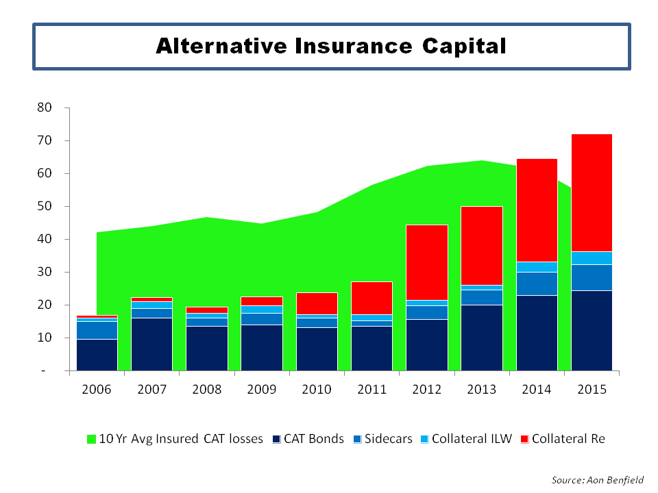
The accelerating growth in the so-called alternative capital in insurance is shown in the graph below from Aon Benfield, with growth in the private collaterised reinsurance being particularly strong in the last four years (now overshadowing the public CAT bond market). ILS funds, managed by professional asset manager specialists, are largely behind the growth in private collaterised deals with assets under management growing from $20 billion in 2012 to over $50 billion today. Private collaterised deals are usually lower down the reinsurance tower (e.g. attach at lower loss levels) and as such offer higher premiums (as a percentage of limits, aka rate on line or ROL) for the increased exposure to loss. On a risk adjusted basis, these don’t necessarily offer higher ROEs than higher attaching/lower risk CAT bonds.

click to enlargeAlternative Insurance ILS Capital Growth

Property catastrophe pricing has been under particular pressure in the past few years due to the lack of significant insured catastrophe losses. In a previous post, I crudely estimate CAT pricing to be 25% below its technical rate. Willis Re is the first of the brokers to have its mid-year renewal report out. In it, Willis said that ILS funds “were more aggressive on pricing during the second quarter as spreads declined for liquid reinsurance investments”. I also find it interesting that the collaterised ILW volumes have ticked up recently. Pricing and lax terms and conditions in the retrocession sector are historically a sign that discipline is breaking down. Asset managers in the ILS space must be under pressure in maintaining their high fees in a reduced CAT risk premia environment and this pressure is likely to be contributing to the potential for market indiscipline.

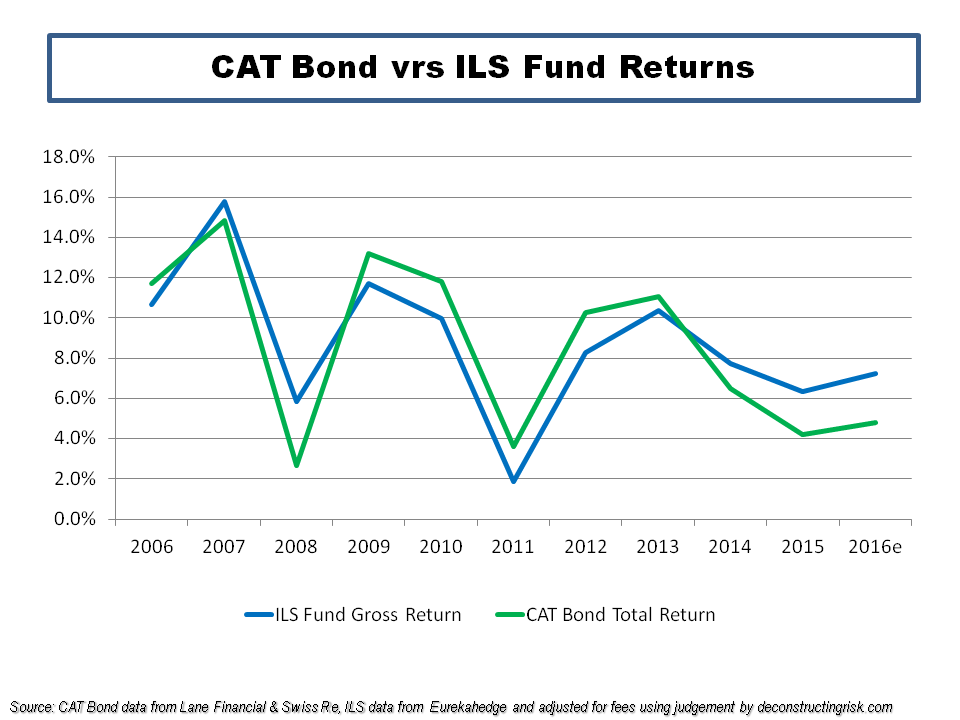
I therefore find the graph below very telling. I used the figures from Lane Financial (see here) for the annual total return figures from CAT bonds, which closely match those of the Swiss Re Total Return Index. For the ILS fund returns I used the figures from the Eurekahedge ILS Advisors Index which I adjusted to take out the not unconsiderable typical ILS fund management fees. The 2016 figures are annualized based upon published year to date figures (and obviously assume no major losses).

click to enlargeCAT Bond vrs ILS Fund Returns

The graph shows that ILS fund returns have broken with historical patterns and diverged away from those of CAT bonds as the prevalence in private collaterised deals has grown in recent years. In other words, ILS funds have moved to higher rate on line business, which is by definition higher risk, as they push to service the larger level of assets under management. The question is therefore do the investors really understand the significance of this change? Have they adjusted their cost of capital to reflect the increased risk? Or are some ILS funds representing the higher returns as their ability to get higher returns at the same risk level (against the trend of everybody else in the industry in a softening market)?

Innovation is to be encouraged and a necessary part of progress. Innovation dependent on the naivety of new investors however does not end well.

I can’t but help think of Michael Wade’s comment in 2009 about the commonality between the financial crisis and problems at Lloyds of London (see this post on lessons from Lloyds) when he said that “the consequence with the excess capital was that underlying risks could be underpriced as they were being passed on”. My advice to ILS investors is the next time they are getting a sales pitch with promises of returns that sound too good, look around the room, and ask yourself who is the greater fool here….