The debates on the cyclically adjusted PE (CAPE), developed by recent Nobel Prize winner Robert Shiller, as a market valuation indicator continue to rage. My last post on the subject is indicative of where I left the arguments.
A variation on Jeremy Siegel’s arguments against CAPE was put forward in an interesting post on the blog Philosophical Economics (hereinafter referred to as PE), centred on the failure of CAPE to mean revert through the ups and downs of the past 23 years and the need for a consistent measure for earnings in the PE calculation across historical reference periods.
The first point essentially relates to the time period over which CAPE is relevant for today’s global economy. Shiller uses available S&P reported GAAP earnings dating back to the 1936 and has supplemented them with his own GAAP earnings calculations from 1936 back to 1871. PE makes the point that historical periods which are “distorted by world wars (1914-1918, 1939-1945, 1950-1953), gross economic mismanagement (1929-1938), and painfully high inflation and interest rates (1970-1982)” may not be the most appropriate as a reference period for today (as reflective of the changed macro-economic period covering the so called great moderation). In essence, PE is saying that structural changes in the economy and investor sophistication may justify a shorter and more relevant time period (yes, PE admits it is a flavour of the “this time it’s different” argument!).
On earnings, PE repeats many of Siegel’s arguments. For example, the point is again made about asymmetric accounting changes to intangible write downs from FAS 142/144. In addition, PE also highlights the lower dividend payouts of 34% over the past 18 years compared to 52% over the 40 year period between the mid-50s and mid-90s. PE argues that lower dividend yields indicate higher investment by firms and therefore support the argument that historical comparisons may not be as relevant.
PE uses Pro-Forma (non-GAAP) S&P earnings from 1954 as reported by Bloomberg for earnings (as opposed to Siegel’s use of National Income and Product Accounts (NIPA) earnings for all approx 9,000 US corporations) and stresses that these earnings may not necessarily be more applicable but they are at least consistent. PE shows that using these earnings since 1954 the market (as at December 2013) was only modestly above the geometric mean and further supports the use of Pro-Forma earnings by back testing this metric against CAPE as an indicator of value through the financial crisis.
A counter-argument (in a December paper) from Bill Hester of Hussman Funds centred on differences in the Bloomberg Pro-Forma earnings used in PE’s calculations, arguing that from 1988 to 1998 the earnings reported by Bloomberg are a mixture of reported & operating earnings and that from 1998 they are akin to operating earnings. The argument highlights the problem of data quality in many databases which are commonly used in the market creating a source of systematic risk. [As an aside, on an individual stock basis, I have found issues with data from commonly used databases and that is why I always take my historical figures from published accounts – not that they are without any issues, just try reconciling some of AIG’s historical financial statements given the almost annual restatements!]. On earnings, Hestor uses work done by Andrew Smithers in his book “The Road to Recovery” which suggests that executive compensation tied to short term results has been a factor in earnings volatility.
PE counters Hester’s counter argument in another post that after adjusting the Boomberg data pre-1998 and applying an adjustment for the change in dividend payout ratio the ProForma earnings based CAPE still signals a less overvalued market that Shiller’s CAPE. PE also rubbishes the contention from Smithers that volatility is as a result of executive remuneration saying that low volatility is in the executive’s interest to maximise their options which vest over time and that investment is currently low due to the uncertainty around unprecedented macro- economic risks.
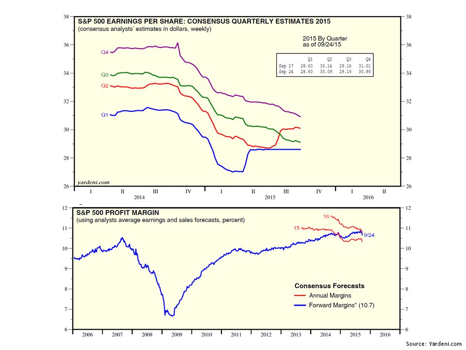
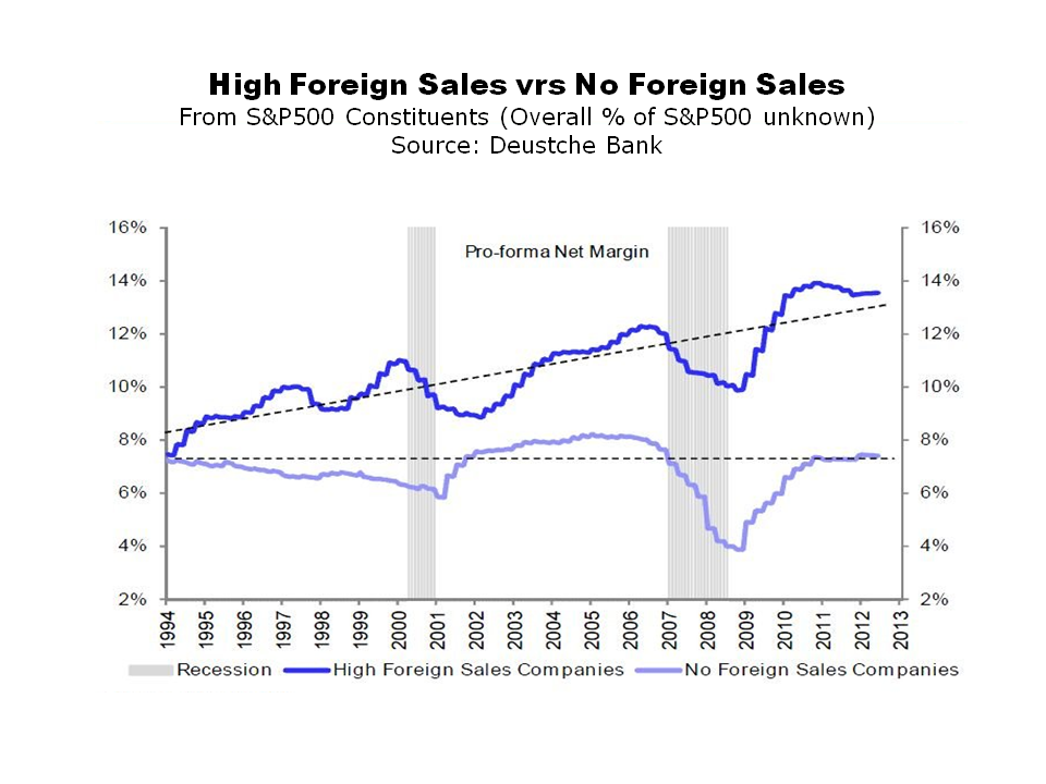
PE cites arguments similar to those of other bulls such as Siegel who content that US corporate profits as a percentage of GDP (or GNP) is high compared to historical levels due to increased foreign contributions to profits, lower corporate taxes and a higher S&P concentration of globalised technology and energy firms with fatter profit margins. PE points to stability in statistics such as S&P 500 net profit margins for non-financials (excluding energy & technology) produced by BoA Merrill Lynch and analysis of David Bianco from Deutsche Bank on firms with a high level of foreign sales showing higher profit margins (see graph reproduced below). To be fair to Bianco, he recently maintained his year-end 2014 S&P500 target of 1850 and warning of volatility in 2014 stating “buy the dips, but I’m also saying in advance, wait for the dips“.
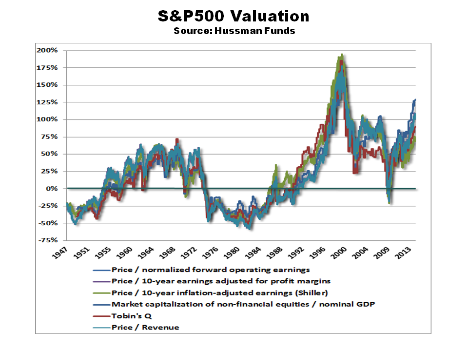
click to enlarge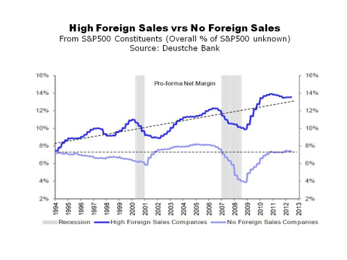 In a December note, the extremely bearish John Hussman stated that “in recent years, weak employment paired with massive government deficits have introduced a wedge into the circular flow, allowing wages and salaries to fall to the lowest share of GDP in history, even while households have been able to maintain consumption as the result of deficit spending, reduced household savings, unemployment compensation and the like”. In another note from John Hussman out this week on foreign profits, based upon a range of valuation metrics (see graph reproduced below) he puts the S&P500 at a 100% premium to the level needed to achieve historical normal returns (or indicating a negative total return on horizons of 7 years or less). He also rubbishes the higher contribution from foreign profits, saying they have been decreasing since 2007 and that they “do not have any material role in the surge in overall profit margins”.
click to enlarge The (only) slightly more cheerful folk over at GMO also had an insightful paper out in February by James Montier on the CAPE debate. One of the more interesting pieces of analysis in the paper was a Kalecki decomposition of profits which indicate that the US government deficit is a major factor in replacing reduced investment since the crisis (see graph reproduced below). As we know, this US deficit is in the process of being run down and the knock on impact upon profits could result (save a recovery in investment or a significant re-leveraging of households!). The Kalecki composition also seems to support the larger contributions from foreign earnings (albeit a decreasing contribution in recent years).
click to enlarge Depending upon whether you use the S&P500 PE, the Shiller PE or the NIPA based PE since 1940 the market, according to Montier, is 30%, 40% or 20% overvalued respectively. Using a variety of metrics, Montier estimates that the expected total return (i.e. including dividends) for the market over the next 7 years ranges from an annual return of 3.6% from Siegel’s preferred method using NIPA to a negative 3.2% per annum from a full revision Shiller PE (using 10 year trend earnings rather than current trailing 10 year earnings). The average across a number of valuation metrics suggests a 0% per annum return over the next 7 years!
Ben Inker also has a piece in the February GMO letter on their strategy of slowly averaging in and out of the market. Inker calls it slicing whereby you take account of historical forecasts as well as your current “spot” view of valuations. Their research shows that you capture more value through averaging purchasing or selling over time by benefiting from market momentum. GMO currently are in selling mode whereby they “are in the process of selling our equity weight down slowly over the next 9 to 12 months”.
So, where do all of these arguments leave a poor little amateur investor like me? Most sensible metrics point to the S&P500 being overvalued and the only issue is quantum. As I see it, there is validity on both sides of the CAPE arguments outlined above. Earnings are high and are likely to be under pressure, or at best stable, in the medium term. I am amenable to some of the arguments over the relevant timeframe used to calculate the mean to assess the mean reverting adjustment needed (I do however remain wedded to mean revision as a concept).
To me, the figures of 20% to 40% overvaluation in Montier’s note based on calculations back to 1940 from different CAPE calculations feel about right. A 30% overvaluation represents the current S&P500 to a mean calculated from 1960. The rapid bounce back in the S&P500 from the 5% January fall does show how resilient the market is however and how embedded the “buy on the dip” mentality currently is. GMO’s philosophy of averaging in and out of the market over time to take advantage of market momentum makes sense.
In the absence of any external shock that could hit values meaningfully (i.e. +15% fall), the market does look range bound around +/- 5%. Common sense data points such as the Facebook deal for WhatsApp at 19 times revenues confirm my unease and medium term negative bias. I have cut back to my core holdings and, where possible, bought protect against big pull backs. In the interim, my wish-list of “good firms/pity about the price” continues to grow.
They say that “the secret to patience is doing something else in the meantime”. Reading arguments and counter argument on CAPE is one way to pass some of the time…….