Prior to the recent market wobbles on what a post QE world will look like, a number of reinsurers with relatively high property catastrophe exposures have suffered pullbacks in their stock due to fears about catastrophe pricing pressures (subject of previous post). Credit Suisse downgraded Validus recently stating that “reinsurance has become more of a commodity due to lower barriers to entry and vendor models.”
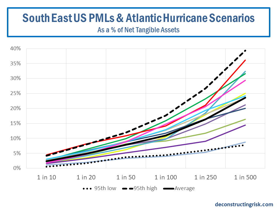
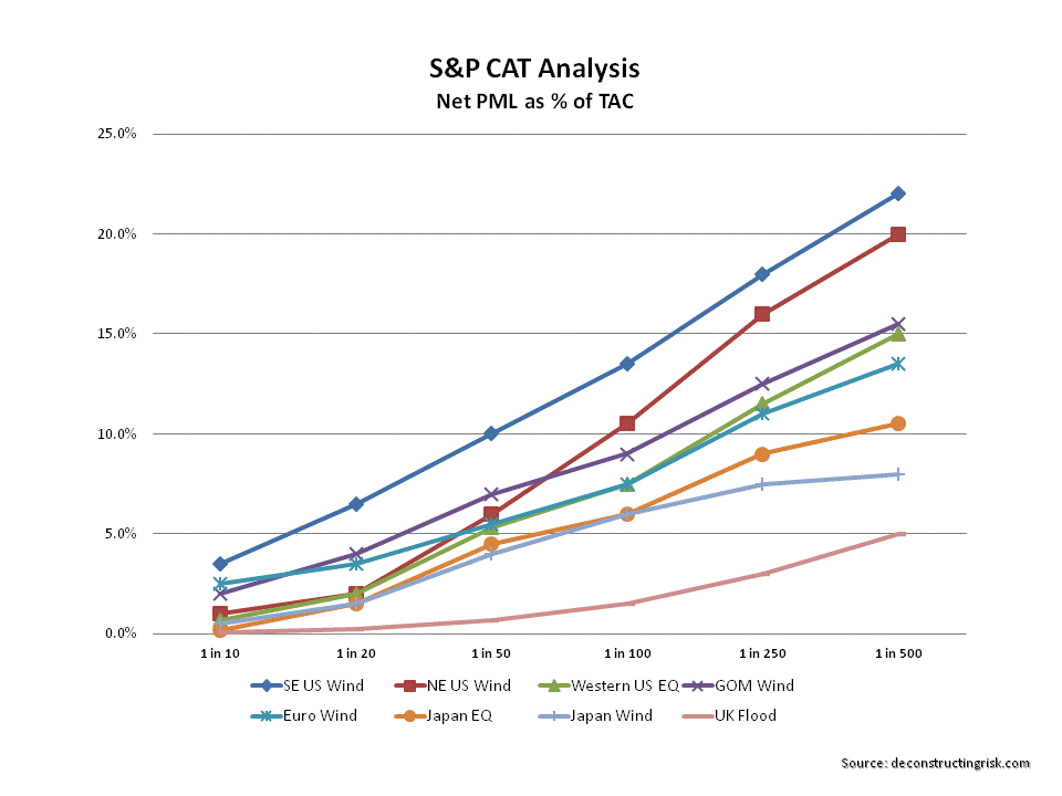
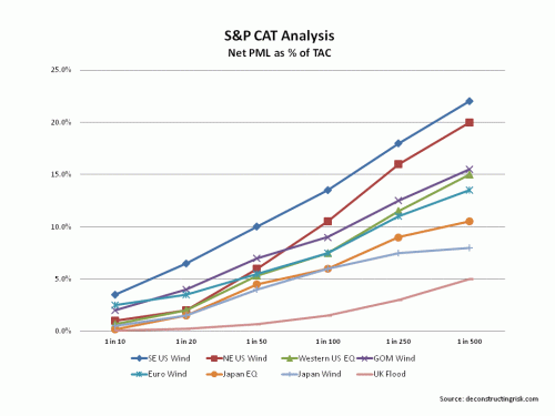
As we head deeper into the US hurricane season, it is worth reviewing the disclosures of a number of reinsurers in relation to catastrophe exposures, specifically their probable maximum losses or PMLs . In 2012 S&P’s influential annual publication – Global Reinsurance Highlights – there is an interesting article called “Just How Much Capital Is At Risk”. The article looked at net PMLs as a percentage of total adjusted capital (TAC), an S&P determined calculation, and also examined relative tail heaviness of PMLs disclosed by different companies. The article concluded that “by focusing on tail heaviness, we may have one additional tool to uncover which reinsurers could be most affected by such an event”. In other words, not only is the amount of the PMLs for different perils important but the shape of the curve across different return periods (e.g. 1 in 50 years, 1 in 100 years, 1 in 250 years, etc.) is also an important indicator of relative exposures. The graphs below show the net PMLs as a percentage of TAC and the net PMLs as a percentage of aggregate limits for the S&P sample of insurers and reinsurers.
click to enlarge
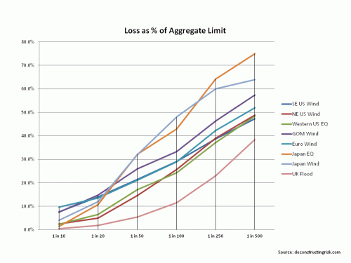
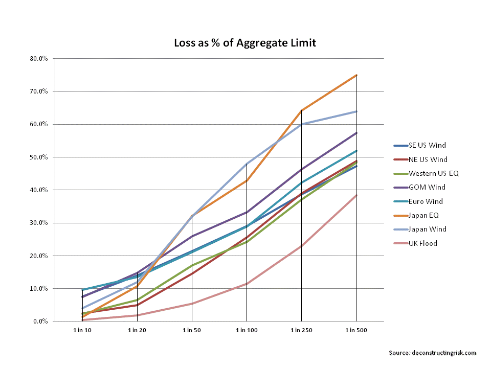
Given the uncertainties around reported PMLs discussed in this post, I particularly like seeing PMLs as a percentage of aggregate limits. In the days before the now common use of catastrophic models (by such vendor firms as RMS, AIR and Eqecat), underwriters would subjectively calculate their PMLs as a percentage of their maximum possible loss or MPL (in the past when unlimited coverage was more common an estimate of the maximum loss was made whereas today the MPL is simply the sum of aggregate limits). This practise, being subjective, was obviously open to abuse (and often proved woefully inadequate). It is interesting to note however that some of the commonly used MPL percentages applied for peak exposures in certain markets were higher than those used today from the vendor models at high return periods.
The vendor modellers themselves are very open about the limitations in their models and regularly discuss the sources of uncertainty in their models. There are two main areas of uncertainty – primary and secondary – highlighted in the models. Some also refer to tertiary uncertainty in the uses of model outputs.
Primary uncertainty relates to the uncertainty in determining events in time, in space, in intensity, and in spatial distribution. There is often limited historical data (sampling error) to draw upon, particularly for large events. For example, scientific data on the physical characteristics of historical events such as hurricanes or earthquakes are only as reliable for the past 100 odd years as the instruments available at the time of the event. Even then, due to changes in factors like population density, the space over which many events were recorded may lack important physical elements of the event. Also, there are many unknowns relating to catastrophic events and we are continuously learning new facts as this article on the 2011 Japan quake illustrates.
Each of the vendor modellers build a catalogue of possible events by supplementing known historical events with other possible events (i.e. they fit a tail to known sample). Even though the vendor modellers stress that they do not predict events, their event catalogues determine implied probabilities that are now dominant in the catastrophe reinsurance pricing discovery process. These catalogues are subject to external validation from institutions such as Florida Commission which certifies models for use in setting property rates (and have an interest in ensuring rates stay as low as possible).
Secondary uncertainty relates to data on possible damages from an event like soil type, property structures, construction materials, location and aspect, building standards and such like factors (other factors include liquefaction, landslides, fires following an event, business interruption, etc.). Considerable strides, especially in the US, have taken place in reducing secondary uncertainties in developed insurance markets as databases have grown although Asia and parts of Europe still lag.
A Guy Carpenter report from December 2011 on uncertainty in models estimates crude confidence levels of -40%/+90% for PMLs at national level and -60%/+170% for PMLs at State level. These are significant levels and illustrate how all loss estimates produced by models must be treated with care and a healthy degree of scepticism.
Disclosures by reinsurers have also improved in recent years in relation to specific events. In the recent past, many reinsurers simply disclosed point estimates for their largest losses. Some still do. Indeed some, such as the well-respected Renaissance Re, still do not disclose any such figures on the basis that such disclosures are often misinterpreted by analysts and investors. Those that do disclose figures do so with comprehensive disclaimers. One of my favourites is “investors should not rely on information provided when considering an investment in the company”!
Comparing disclosed PMLs between reinsurers is rife with difficulty. Issues to consider include how firms define zonal areas, whether they use a vendor model or a proprietary model, whether model options such as storm surge are included, how model results are blended, and annual aggregation methodologies. These are all critical considerations and the detail provided in reinsurers’ disclosures is often insufficient to make a detailed determination. An example of the difficulty is comparing the disclosures of two of the largest reinsurers – Munich Re and Swiss Re. Both disclose PMLs for Atlantic wind and European storm on a 1 in 200 year return basis. Munich Re’s net loss estimate for each event is 18% and 11% respectively of its net tangible assets and Swiss Re’s net loss estimate for each event is 11% and 10% respectively of its net tangible assets. However, the comparison is of limited use as Munich’s is on an aggregate VaR basis and Swiss Re’s is on the basis of pre-tax impact on economic capital of each single event.
Most reinsurers disclose their PMLs on an occurrence exceedance probability (OEP) basis. The OEP curve is essentially the probability distribution of the loss amount given an event, combined with an assumed frequency of an event. Other bases used for determining PMLs include an aggregate exceedance probability (AEP) basis or an average annual loss (AAL) basis. The AEP curves show aggregate annual losses and how single event losses are aggregated or ranked when calculating (each vendor has their own methodology) the AEP is critical to understand for comparisons. The AAL is the mean value of a loss exceedance probability distribution and is the expected loss per year averaged over a defined period.
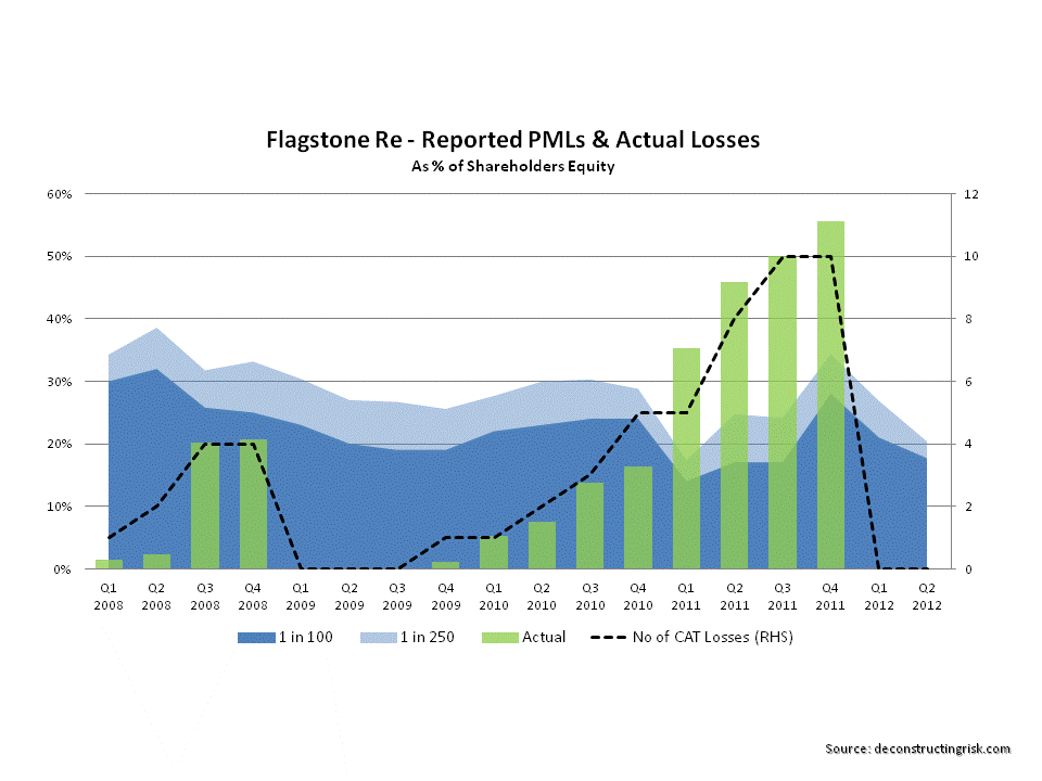
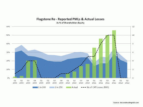
An example of the potential misleading nature of disclosed PMLs is the case of Flagstone Re. Formed after Hurricane Katrina, Flagstone’s business model was based upon building a portfolio of catastrophe risks with an emphasis upon non-US risks. Although US risks carry the highest premium (by value and rate on line), they are also the most competitive. The idea was that superior risk premia could be delivered by a diverse portfolio sourced from less competitive markets. Flagstone reported their annual aggregate PML on a 1 in 100 and 1 in 250 year basis. As the graph below shows, Flagstone were hit by a frequency of smaller losses in 2010 and particularly in 2011 that resulted in aggregate losses far in excess of their reported PMLs. The losses invalidated their business model and the firm was sold to Validus in 2012 at approximately 80% of book value. Flagstone’s CEO, David Brown, stated at the closing of the sale that “the idea was that we did not want to put all of our eggs in the US basket and that would have been a successful approach had the pattern of the previous 30 to 40 years continued”.
click to enlarge
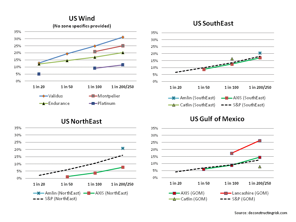
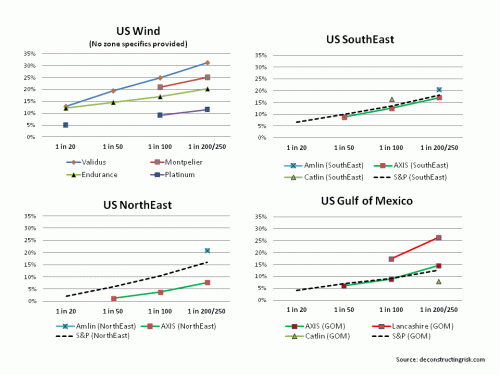
The graphs below show a sample of reinsurer’s PML disclosures as at end Q1 2013 as a percentage of net tangible assets. Some reinsurers show their PMLs as a percentage of capital including hybrid or contingent capital. For the sake of comparisons, I have not included such hybrid or contingent capital in the net tangible assets calculations in the graphs below.
US Windstorm (click to enlarge)
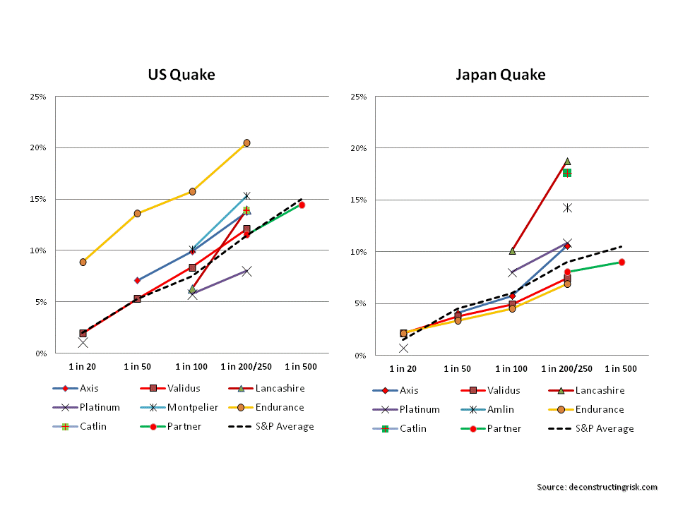
US & Japan Earthquake (click to enlarge)
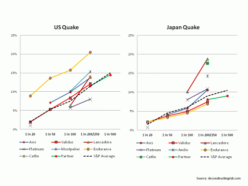
As per the S&P article, its important to look at the shape of PML curves as well as the levels for different events. For example, the shape of Lancashire PML curve stands out in the earthquake graphs and for the US gulf of Mexico storm. Montpelier for US quake and AXIS for Japan quakes also stand out in terms of the increased exposure levels at higher return periods. In terms of the level of exposure, Validus stands out on US wind, Endurance on US quake, and Catlin & Amlin on Japan quake.
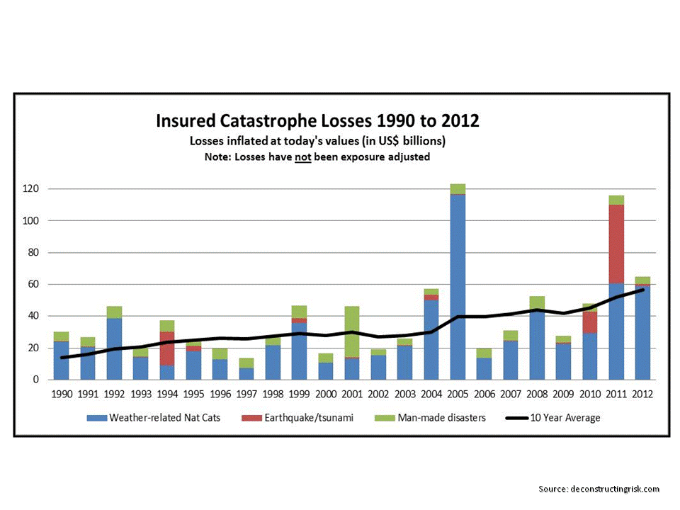
Any investor in this space must form their own view on the likelihood of major catastrophes when determining their own risk appetite. When assessing the probabilities of historical events reoccurring, care must be taken to ensure past events are viewed on the basis of existing exposures. Irrespective of whether you are a believer in the impact of climate changes (which I am), graphs such as the one below (based off Swiss Re data inflated to 2012) are often used in industry. They imply an increasing trend in insured losses in the future.
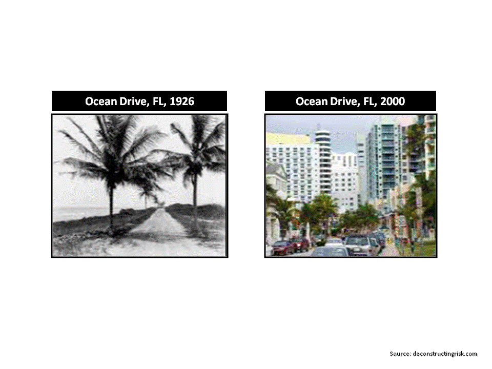
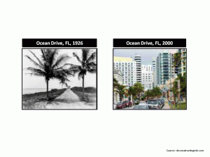
Historical Insured Losses (click to enlarge)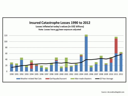 The reality is that as the world population increases resulting in higher housing density in catastrophe exposed areas such as coast lines the past needs to be viewed in terms of todays exposures. Pictures of Ocean Drive in Florida in 1926 and in 2000 best illustrates the point (click to enlarge).
There has been interesting analysis performed in the past on exposure adjusting or normalising US hurricane losses by academics most notably by Roger Pielke (as the updated graph on his blog shows). Historical windstorms in the US run through commercial catastrophe models with todays exposure data on housing density and construction types shows a similar trend to those of Pielke’s graph. The historical trend from these analyses shows a more variable trend which is a lot less certain than increasing trend in the graph based off Swiss Re data. These losses suggest that the 1970s and 1980s may have been decades of reduced US hurricane activity relative to history and that more recent decades are returning to a more “normal” activity levels for US windstorms.
In conclusion, reviewing PMLs disclosed by reinsurers provides an interesting insight into potential exposures to specific events. However, the disclosures are only as good as the underlying methodology used in their calculation. Hopefully, in the future, further detail will be provided to investors on these PML calculations so that real and meaningful comparisons can be made. Notwithstanding what PMLs may show, investors need to understand the potential for catastrophic events and adapt their risk appetite accordingly.