Tag Archives: reinsurance rates

Lancashire is looking unloved

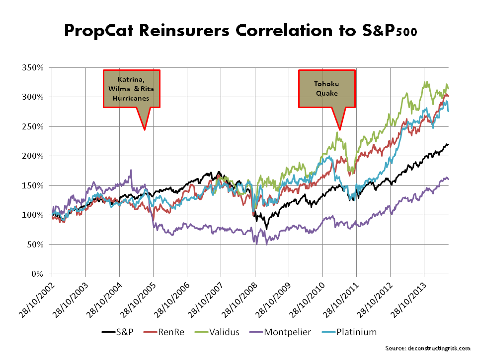
With exposure adjusted rates in the specialty insurance and reinsurance sector continually under pressure and founder/former CEO, Richard Brindle, making an unseemly quick exit with a generous pay-out, Lancashire’s stock has been decidedly unloved with the price trading well below the key £7 threshold highlighted in my last post on the subject in February. Although we remain in the middle of the US hurricane season (and indeed the Napa earthquake is a reminder that its always earthquake season), I thought it was a good time to have a quick look over Lancashire’s figures again, particularly as the share price broke below the £6 threshold earlier this month, a level not seen since early 2011. The stock has clearly now lost its premium valuation compared to others in the London market as the graph below shows.

click to enlargeLondon Market Specialty Insurers Tangible Book Value Multiples August 2014

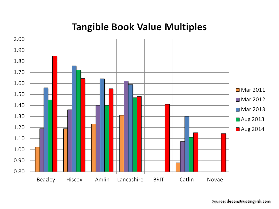
Results for H1-2014, which include full numbers from the November 2013 acquisition of Cathedral, show a continuing trend on the impact of rate reductions on loss ratios, as per the graph below.

click to enlargeLancashire Historical Combined Loss 2006 to H12014

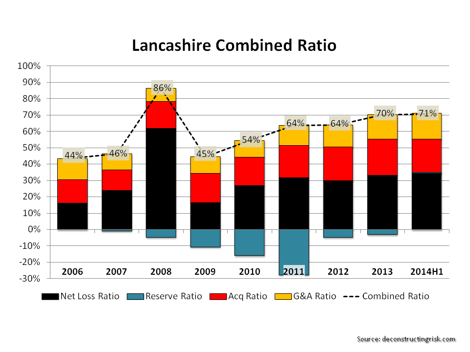
The impact of the Cathedral deal on reserve levels are highlighted below. The graph illustrates the consistent relative level of IBNR to case reserves compared to the recent past which suggests a limited potential for any cushion for loss ratios from prior year reserve releases.

click to enlargeLancashire Historical Net Loss Reserves

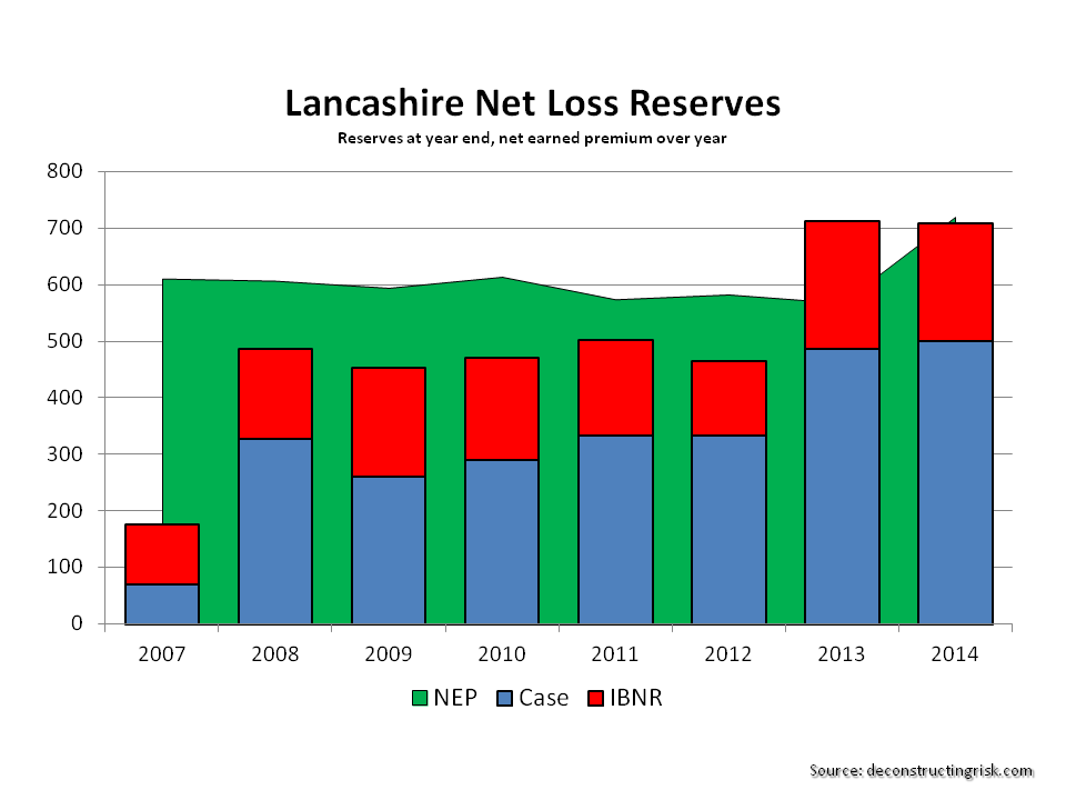
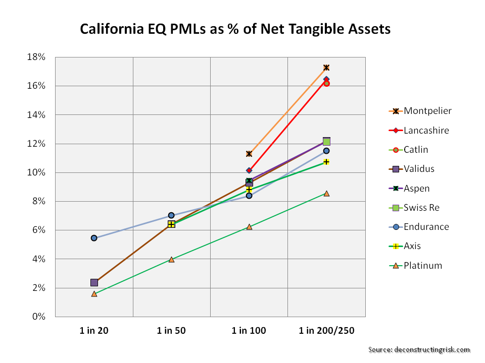
The management at Lancashire have clearly stated their strategy of maintaining their discipline whilst taking advantage of arbitrage opportunities “that allow us to maintain our core insurance and reinsurance portfolios, whilst significantly reducing net exposures and enhancing risk adjusted returns”. In my last post, I looked at post Cathedral gross and net PMLs as a percentage of earned premiums against historical PMLs. More applicable figures as per July for each year, against calendar year gross and net earned premiums (with an estimate for 2014), are presented below. They clearly show that the net exposures have reduced from the 2012 peak. It is important to note however that the Gulf of Mexico net 1 in 100 figures are high at 35%, particularly compared to many of its peers.

click to enlargeLancashire PMLs July 2010 to July 2014

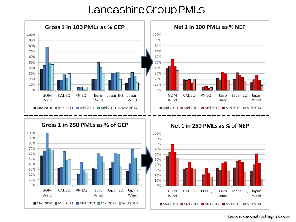
There is of course always the allure of the special dividend. Lancashire has indicated that in the absence of attractive business opportunities they will look at returning most, if not all, of their 2014 earnings to shareholders. Assuming the remainder of 2014 is relatively catastrophe free; Lancashire is on track to make $1-$1.10 of EPS for the full year. If they do return, say, $1 to shareholders that represents a return of just below 10% on today’s share price of £6.18. Not bad in today’s environment! There may be a short term trade there in October after the hurricane season to take advantage of a share pick-up in advance of any special dividend.

Others in the sector are also holding out the prospect of special dividends to reward patient shareholders. The fact that other firms, some with more diverse businesses and less risky risk profiles, offer potential upside through special dividends may also explain why Lancashire has lost its premium tangible book multiple, as per the first graph in this post.

Notwithstanding that previously Lancashire was a favorite of mine due to its nimble and focused approach, I cannot get past the fact that the sector as a whole is mired in an inadequate risk adjusted premia environment (the impact of which I highlighted in a previous post). In the absence of any sector wide catalyst to change the current market dynamic, my opinion is that it is expedient to pass on Lancashire here, even at this multi-year low.

The game of chicken that is unfolding across this sector is best viewed from the side-lines in my view.

Uncorrelated CaT capital “is the cheapest”

One of the reasons given by market participants for competitive pricing in the ILS markets is the lower cost of capital required by such instruments due to the uncorrelated nature of the underlying exposure with other classes. I previously posted on the lower risk return for an ILS fully collaterised portfolio against a similar portfolio written by a mono-line property catastrophe reinsurer. The ILS investor may be prepared to accept a lower return due to the uncorrelated nature of the exposure. It is nonetheless resulting in lower prices for risk which has always ended badly in the past.

Twelve Capital are a well known ILS investment manager and recently published a white paper on the impact of ILS capital on the reinsurance industry. I liked the way they described the lower cost of capital issue, as below:

“Equity is the most expensive form of capital for the (re)insurance industry. Thanks to its diversification benefits, ILS is the cheapest. The most popular form of investment for those looking to enter the reinsurance market was, prior to the birth of ILS, equity offered by traditional reinsurers. However, returns on equity are eroded by company management costs and the tendency of reinsurers to diversify into less profitable lines of business. In addition, financial market investments on the asset side of the balance sheet expose reinsurance shareholders to additional financial market risks. A listed reinsurance stock thus has the disadvantage of being highly correlated to equity markets in general.

So, what ought to be a fundamentally uncorrelated investment gets transformed into a correlated investment, and the diversification benefit is lost. The investor is also exposed to the risk that the management of reinsurance companies might not always act in the best interests of shareholders.

As insurance investors focus on those lines of business that are favourably priced and soundly modelled, reinsurance companies might end up losing their most profitable lines to the ILS market. And it is this source of profit that reinsurers have traditionally relied upon to support and cross-subsidise substantial volumes of business that generally only break even. With profitable lines taken away by more efficient investors, reinsurance companies are left with business models that cannot sustain conventional cross-subsidisation.”

The comment on reinsurer’s management is a bit below the belt! The impact of the loss of the low frequency/high severity business to the traditional market is a valid one though. However, the long histories of the largest tier 1 reinsurers with large diverse portfolios and the ability to provide products and services across most business lines and jurisdictions indicate more robust business models than the commentary suggests in my opinion.

My previous post looked at the capital return of a fully collaterised provider such as an ILS fund against a mono-line catastrophe provider such as a property cat reinsurer. To see if the commentary above on a correlated investment is reflective of actual experience, the graph below shows the S&P500 against the share prices of the property catastrophe reinsurers Renaissance Re, Validus Re, Montpelier Re and Platinum Re since late 2002. Excluding Montpelier Re, which obviously had some company specific issues after the 2005 wind losses, the R2 for the other firms is remarkably similar around 65%. This suggests investing in the equity of these firms has indeed been a correlated investment in the past.

click to enlargePropCaT Reinsurers correlated to SP500

It emphasises that the traditional reinsurance market needs to focus on reducing such correlation, whether real or wrongly perceived, to compete better for this cheap capital.

US Hurricane Follow-up

Following up on the topic of the last post, I previously discussed the importance of looking at historical experience adjusted for today’s exposure. Roger Pielke Jr is one source that has looked to “normalise” historical hurricane insured losses through the prism of today’s building types and densities and I highlighted Pielke’s work in my June 2013 post.

Another market expert is Karen Clark who used to work for one of the main catastrophe modelling firms, AIR Worldwide, and who now runs a consultancy firm. In August 2012, her firm published a report on the exposure adjusted insured cost of historical storms that would cost $10 billion or more. The graph below reproduces the results of the report showing the cost per year for hurricanes greater than $10 billion up to 2011, with the 20 year average loss cost.

click to enlargeHistorical US Hurricanes greater than $10 billion Karen Clark

The graph below, also from the Karen Clark report, shows where the storms hit.

click to enlargeLandfall Points of Historical US Hurricanes Karen Clark

Roger Pielke continues to issue interesting insights on his blog and in a recent post he stated:

“We shouldn’t let the past 9 years of abnormally low hurricane activity lull us into a sense of complacency.  It is only a matter of time before the long streak with no US Cat 3+ and Florida hurricanes is broken.”

That is a message that the current reinsurance market is happily ignoring.

Arthur opens the US Hurricane Season

After Hurricane Arthur briefly made landfall in North Carolina on Thursday night, a weakened storm is now heading north. I thought this would be good time to have a look at the probable maximum losses (PMLs) published as at the Q1 2014 results by a sample of specialist (re)insurers, first presented in a post in June 2013. That post went into some detail on the uncertainties surrounding the published PMLs and should be read as relevant background to the figures presented here.

Despite predictions of an above average 2013 Atlantic hurricane season, the number of named hurricanes was the lowest since 1982. Predictions for the 2014 season are for a below average number of hurricanes primarily due to cooler sea temperatures in the Atlantic due to the transition to El Niño (although that is now thought to be slower than previously anticipated). The graph below includes the 2014 predictions.

click to enlargeHistorical Atlantic Storms & Hurricanes I like to look at PMLs as a percentage of net tangible assets (NTA) on a consistent basis across firms to assess exposures from a common equity viewpoint. Many firms include subordinated debt or other forms of hybrid debt in capital when showing their PMLS. For example, Lancashire has approximately $330 million of sub-debt which they include in their capital figures and I have show the difference with and without the sub-debt in the percentages for Lancashire in the graph below on US wind PMLs to illustrate the comparison.

Whether hybrid debt comes in before equity or alongside equity depends upon the exact terms and conditions. The detail of such instruments will determine whether such debt is classified as tier 1, 2 or 3 capital for regulatory purposes under Solvency II (although there are generous transitional timeframes of up to 10 years for existing instruments). The devil is often in the detail and that is another reason why I prefer to exclude them and use a consistent NTA basis.

As per the June 2013 post, firms often classify their US wind exposures by zone but I have taken the highest exposures for each (which may not necessarily be the same zone for each firm).

click to enlargeUS Wind PMLs Q1 2014 These exposures, although expressed as percentages of NTAs, should be considered net of potential profits made for 2014 to assess the real impact upon equity (provided, of course, that the expected profits don’t all come from property catastrophe lines!). If for example we assume a 10% return on NTA across each firm, then the figures above have to be adjusted.

Another issue, also discussed in the previous post, is the return period for similar events that each firms present. For example, the London market firms present Lloyds’ realistic disaster scenarios (RDS) as their PMLs. One such RDS is a repeat of the 1926 Miami hurricane which is predicted to cost $125 billion for the industry if it happened today. For the graph above, I have assumed a 1 in 200 return period for this scenario. The US & Bermudian firms do not present scenarios but points on their occurrence exceedance probability (OEP) curves.

As it is always earthquake season, I also include the PMLs for a California earthquake as per the graph below.

click to enlargeCalifornia EQ PMLs Q1 2014 In terms of current market conditions, the mid-year broker reports are boringly predictable. John Cavanagh, the CEO of Willis Re, commented in their report that “the tentacles of the softening market are spreading far and wide, with no immediate signs of relief. We’ve seen muted demand throughout 2014 and market dynamics are unlikely to change for some time to come. The current market position is increasingly challenging for reinsurers.” Aon Benfield, in their report, stated that “the lowest reinsurance risk margins in a generation stimulate new growth opportunities for insurers and may allow governments to reduce their participation in catastrophe exposed regions as insurance availability and affordability improves”. When people start talking about low pricing leading to new opportunities to take risk, I can but smile. That’s what they said during the last soft market, and the one before that!

Some commentators are making much of the recent withdrawal of the latest Munich Re bond on pricing concerns as an indicator that property catastrophe prices have reached a floor and that the market is reasserting discipline. That may be so but reaching a floor below the technical loss cost level sounds hollow to me when talking about underwriting discipline.

To finish, I have reproducing the graph on Flagstone Re from the June 2013 post as it speaks a thousand words about the dangers of relying too much on the published PMLs. Published PMLs are, after all, only indicators of losses from single events and, by their nature, reflect current (group) thinking from widely used risk management tools.

click to enlargeFlagstone CAT losses Follow-on: It occurred to me after posting that I could compare the PMLs for the selected firms as at Q1 2014 against those from Q1 2013 and the graph below shows the comparison. It does indicate that many firms have taken advantage of cheap reinsurance/retrocession and reduced their net profiles, as highlighted in this post on arbitrage opportunities. Some firms have gone through mergers or business model changes. Endurance, for example, has been changed radically by John Charman (as well as being an aggressive buyer of coverage). Lancashire is one of the only firms whose risk profile has increased using the NTA metric as a result of the Cathedral acquisition and the increase in goodwill.

click to enlargeUS Wind PMLs Q1 2013 vrs 2014

Computer says yes

Amlin reported their Q1 figures today and had some interesting comments on their reinsurance and retrocession spend that was down £50 million on the quarter (from 23% of gross premiums to 18%). Approx £20 million was due to a business line withdrawal with the remainder due to “lower rates and improved cover available on attractive terms”.

Amlin also stated “with the assistance of more sophisticated modelling, we have taken the decision to internalise a proportion of a number of programmes. Given the diversifying nature of many of our insurance classes, this has the effect of increasing mean expected profitability whilst only modestly increasing extreme tail risk.

The use by insurers of their economic capital models for reinsurance/retrocession purchases is a trend that is only going to increase as we enter into the risk based solvency world under Solvency II. Current market conditions have resulted in reinsurers being more open to offering multi-line aggregate coverage which protect against both frequency and severity with generous exposure inclusions.

It will only be a matter of time, in my opinion, before reinsurers underwrite coverage directly based upon a insurer’s own capital model, particularly when such a model has been approved by a firm’s regulator or been given the blessing of a rating agency.

Also in the future I expect that firms will more openly disclose their operating risk profiles. There was a trend a few years ago whereby firms such as Endurance (pre- Charman) and Aspen did include net risk profiles, such as those in the graphs below, in their investor presentations and supplements (despite the bad blood in the current Endurance-Aspen hostile take-over bid, at least it’s one thing they can say they have in common!).

click to enlargeOperating Risk Distributions

Unfortunately, it was a trend that did not catch on and was quickly discontinued by those firms. If insurers and reinsurers are increasingly using their internal capital models in key decision making, investors will need to insist on understanding them in more detail. A first step would be more public disclosure of the results, the assumptions, and their strengths and weaknesses.