Tag Archives: uncertainty

Confounding correlation

Nassim Nicholas Taleb, the dark knight or rather the black swan himself, said that “anything that relies on correlation is charlatanism”.  I am currently reading the excellent “The signal and the noise” by Nate Silver. In Chapter 1 of the book he has a nice piece on CDOs as an example of a “catastrophic failure of prediction” where he points to certain CDO AAA tranches which were rated on an assumption of a 0.12% default rate and which eventually resulted in an actual rate of 28%, an error factor of over 200 times!.

Silver cites a simplified CDO example of 5 risks used by his friend Anil Kashyap in the University of Chicago to demonstrate the difference in default rate if the 5 risks are assumed to be totally independent and dependent.  It got me thinking as to how such a simplified example could illustrate the impact of applied correlation assumptions. Correlation between core variables are critical to many financial models and are commonly used in most credit models and will be a core feature in insurance internal models (which under Solvency II will be used to calculate a firms own regulatory solvency requirements).

So I set up a simple model (all of my models are generally so) of 5 risks and looked at the impact of varying correlation from 100% to 0% (i.e. totally dependent to independent) between each risk. The model assumes a 20% probability of default for each risk and the results, based upon 250,000 simulations, are presented in the graph below. What it does show is that even at a high level of correlation (e.g. 90%) the impact is considerable.

click to enlarge5 risk pool with correlations from 100% to 0%

The graph below shows the default probabilities as a percentage of the totally dependent levels (i.e 20% for each of the 5 risks). In effect it shows the level of diversification that will result from varying correlation from 0% to 100%. It underlines how misestimating correlation can confound model results.

click to enlargeDefault probabilities & correlations

The imperfect art of climate change modelling

The completed Group I report from the 5th Intergovernmental Panel on Climate Change (IPCC) assessment was published in January (see previous post on summary report in September). One of the few definite statements made in the report was that “global mean temperatures will continue to rise over the 21st century if greenhouse gas (GHG) emissions continue unabat­ed”. How we measure the impact of such changes is therefore incredibly important. A recent article in the FT by Robin Harding on the topic which highlighted the shortcomings of models used to assess the impact of climate change therefore caught my attention.

The article referred to two academic papers, one by Robert Pindyck and another by Nicholas Stern, which contained damning criticism of models that integrate climate and economic models, so called integrated assessment models (IAM).

Pindyck states that “IAM based analyses of climate policy create a perception of knowledge and precision, but that perception is illusory and misleading”. Stern also criticizes IAMs stating that “assumptions built into the economic modelling on growth, damages and risks, come close to assuming directly that the impacts and costs will be modest and close to excluding the possibility of catastrophic outcomes”.

These comments remind me of Paul Wilmott, the influential English quant, who included in his Modeller’s Hippocratic Oath the following: “I will remember that I didn’t make the world, and it doesn’t satisfy my equations” (see Quotes section of this website for more quotes on models).

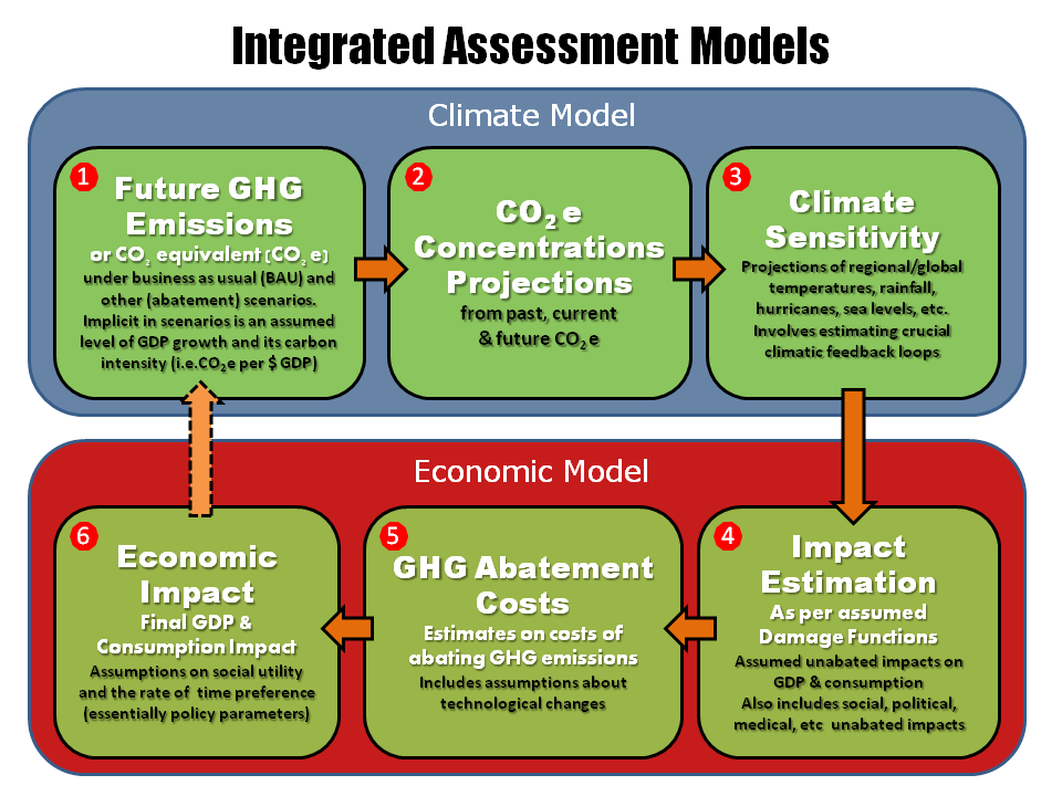
In his paper, Pindyck characterised the IAMs currently used into 6 core components as the graphic below illustrates.

click to enlargeIntegrated Assessment Models

Pindyck highlights a number of the main elements of IAMs which involve a considerable amount of arbitrary choice, including climate sensitivity, the damage and social welfare (utility) functions. He cites important feedback loops in climates as difficult, if not impossible, to determine. Although there has been some good work in specific areas like agriculture, Pindyck is particularly critical on the damage functions, saying many are essentially made up. The final piece on social utility and the rate of time preference are essentially policy parameter which are open to political forces and therefore subject to considerable variability (& that’s a polite way of putting it).

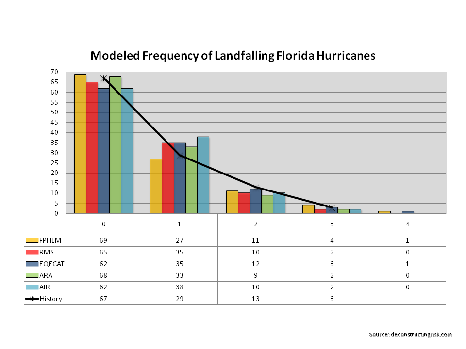
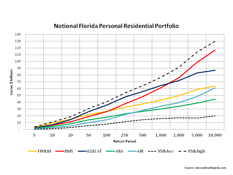
The point about damage functions is an interesting one as these are also key determinants in the catastrophe vendor models widely used in the insurance sector. As a previous post on Florida highlighted, even these specific and commercially developed models result in varying outputs.

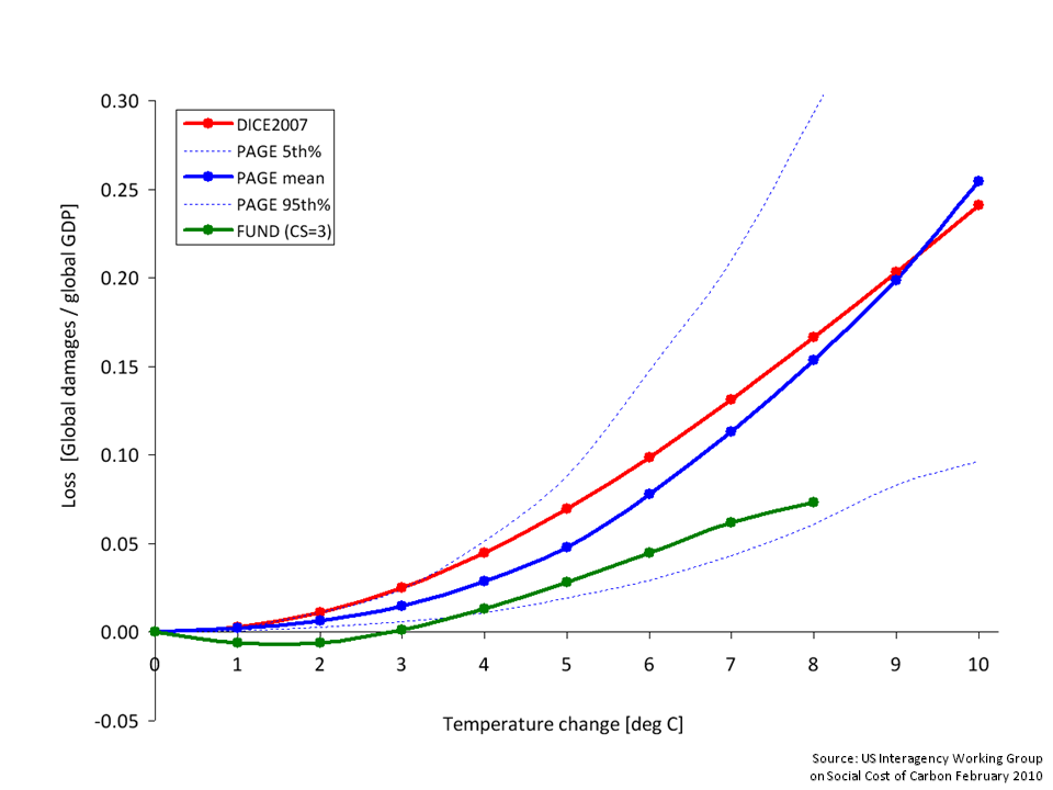
One example of IAMs directly influencing current policymakers is those used by the Interagency Working Group (IWG) which under the Obama administration is the entity that determines the social cost of carbon (SCC), defined as the net present damage done by emitting a marginal ton of CO2 equivalent (CO2e), used in regulating industries such as the petrochemical sector. Many IAMs are available (the sector even has its own journal – The Integrated Assessment Journal!) and the IWG relies on three of the oldest and most well know; the Dynamic Integrated Climate and Economy (DICE) model, the Policy Analysis of the Greenhouse Effect (PAGE) model, and the fun sounding Climate Framework for Uncertainty, Negotiation, and Distribution (FUND) model.

The first IWG paper in 2010 included an exhibit, reproduced below, summarizing the economic impact of raising temperatures based upon the 3 models.

click to enlargeClimate Change & Impact on GDP IWG SCC 2010

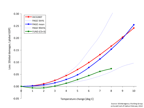
To be fair to the IWG, they do highlight that “underlying the three IAMs selected for this exercise are a number of simplifying assumptions and judgments reflecting the various modelers’ best attempts to synthesize the available scientific and economic research characterizing these relationships”.

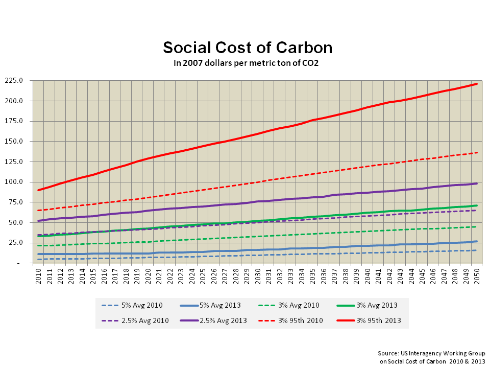
The IWG released an updated paper in 2013 whereby revised SCC estimates were presented based upon a number of amendments to the underlying models. Included in these changes are revisions to damage functions and to climate sensitivity assumptions. The results of the changes on average and 95th percentile SCC estimates, at varying discount rates (which are obviously key determinants to the SCC given the long term nature of the impacts), can be clearly seen in the graph below.

click to enlargeSocial Cost of Carbon IWG 2010 vrs 2013

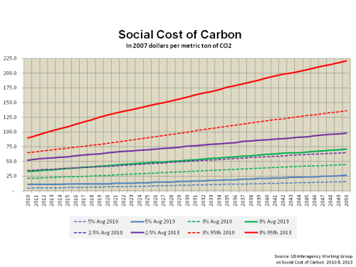
Given the magnitude of the SCC changes, it is not surprising that critics of the charges, including vested interests such as petrochemical lobbyists, are highlighting the uncertainty in IAMs as a counter against the charges. The climate change deniers love any opportunity to discredit the science as they demonstrated so ably with the 4th IPCC assessment. The goal has to be to improve modelling as a risk management tool that results in sensible preventative measures. Pindyck emphasises that his criticisms should not be an excuse for inaction. He believes we should follow a risk management approach focused on the risk of catastrophe with models updated as more information emerges and uses the threat of nuclear oblivion during the Cold War as a parallel. He argues that “one can think of a GHG abatement policy as a form of insurance: society would be paying for a guarantee that a low-probability catastrophe will not occur (or is less likely)”. Stern too advises that our focus should be on potential extreme damage and that the economic community need to refocus and combine current insights where “an examination and modelling of ways in which disruption and decline can occur”.

Whilst I was looking into this subject, I took the time to look over the completed 5th assessment report from the IPCC. First, it is important to stress that the IPCC acknowledge the array of uncertainties in predicting climate change. They state the obvious in that “the nonlinear and chaotic nature of the climate system imposes natu­ral limits on the extent to which skilful predictions of climate statistics may be made”. They assert that the use of multiple scenarios and models is the best way we have for determining “a wide range of possible future evolutions of the Earth’s climate”. They also accept that “predicting socioeconomic development is arguably even more difficult than predicting the evolution of a physical system”.

The report uses a variety of terms in its findings which I summarised in a previous post and reproduce below.

click to enlargeIPCC uncertainty

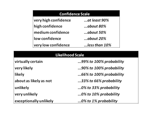
Under the medium term prediction section (Chapter 11) which covers the period 2016 to 2035 relative to the reference period 1986 to 2005, a number of the notable predictions include:

  • The projected change in global mean surface air temperature will likely be in the range 0.3 to 0.7°C (medium confidence).
  • It is more likely than not that the mean global mean surface air temperature for the period 2016–2035 will be more than 1°C above the mean for 1850–1900, and very unlikely that it will be more than 1.5°C above the 1850–1900 mean (medium confidence).
  • Zonal mean precipitation will very likely increase in high and some of the mid-latitudes, and will more likely than not decrease in the subtropics. The frequency and intensity of heavy precipitation events over land will likely increase on average in the near term (this trend will not be apparent in all regions).
  • It is very likely that globally averaged surface and vertically averaged ocean temperatures will increase in the near term. It is likely that there will be increases in salinity in the tropical and (especially) subtropical Atlantic, and decreases in the western tropical Pacific over the next few decades.
  • In most land regions the frequency of warm days and warm nights will likely increase in the next decades, while that of cold days and cold nights will decrease.
  • There is low confidence in basin-scale projections of changes in the intensity and frequency of tropical cyclones (TCs) in all basins to the mid-21st century and there is low confidence in near-term projections for increased TC intensity in the North Atlantic.

The last bullet point is especially interesting for the insurance sector involved in providing property catastrophe protection. Graphically I have reproduced two interesting projections below (Note: no volcano activity is assumed).

click to enlargeIPCC temperature near term projections

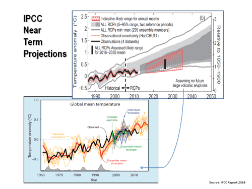
Under the longer term projections in Chapter 12, the IPCC makes the definite statement that opened this post. It also states that it is virtually certain that, in most places, there will be more hot and fewer cold temperature extremes as global mean temper­atures increase and that, in the long term, global precipitation will increase with increased global mean surface temperature.

I don’t know about you but it seems to me a sensible course of action that we should be taking scenarios that the IPCC is predicting with virtual certainty and applying a risk management approach to how we can prepare for or counteract extremes as recommended by experts such as Pindyck and Stern.

The quote “it’s better to do something imperfectly than to do nothing perfectly” comes to mind. In this regard, for the sake of our children at the very least, we should embrace the imperfect art of climate change modelling and figure out how best to use them in getting things done.

ILS Fund versus PropertyCat Reinsurer ROEs

Regular readers will know that I have queried how insurance-linked securities (ILS) funds, currently so popular with pensions funds, can produce a return on equity that is superior to that of a diversified property catastrophe reinsurer given that the reinsurer only has to hold a faction of its aggregate limit issued as risk based capital whereas all of the limits in ILS are collaterised. The recent FT article which contained some interesting commentary from John Seo of Fermat Capital Management got me thinking about this subject again. John Seo referred to the cost advantage of ILS funds and asserted that reinsurers staffed with overpaid executives “can grow again, but only after you lay off two out of three people”. He damned the traditional sector with “these guys have been so uncreative, they have been living off earthquake and hurricane risks that are not that hard to underwrite.

Now, far be it from me to defend the offshore chino loving reinsurance executives with a propensity for large salaries and low taxation. However, I still can’t see that the “excessive” overheads John Seo refers to could offset the capital advantage that a traditional property catastrophe reinsurer would have over ILS collateral requirements.

I understood the concept of ILS structures that provided blocks of capacity at higher layers, backed by high quality assets, which could (and did until recently) command a higher price than the traditional market. Purchasers of collaterised coverage could justify paying a premium over traditional coverage by way of large limits on offer and a lower counterparty credit risk (whilst lowering concentration risk to the market leading reinsurers). This made perfect sense to me and provided a complementary, yet different, product to that offered by traditional reinsurers. However, we are now in a situation whereby such collaterised reinsurance providers may be moving to compete directly with traditional coverage on price and attachment.

To satisfy my unease around the inconsistency in equity returns, I decided to do some simple testing. I set up a model of a reasonably diversified portfolio of 8 peak catastrophic risks (4 US and 4 international wind and quake peak perils). The portfolio broadly reflects the market and is split 60:40 US:International by exposure and 70:30 by premium. Using aggregate exceedance probability (EP) curves for each of the main 8 perils based off extrapolated industry losses as a percentage of limits offered across standard return periods, the model is set up to test differing risk premiums (i.e. ROL) for each of the 8 perils in the portfolio and their returns.  For the sake of simplicity, zero correlations were assumed between the 8 perils.

The first main assumption in the model is the level of risk based capital needed by the property catastrophe reinsurer to compete against the ILS fund. Reviewing some of the Bermudian property catastrophe players, equity (common & preferred) varies between 280% and 340% of risk premiums (net of retrocessions). Where debt is also included, ratios of up to 400% of net written premiums can be seen. However, the objective is to test different premium levels and therefore setting capital levels as a function of premiums distorts the results. As reinsurer’s capital levels are now commonly assessed on the basis of stressed economic scenarios (e.g. PMLs as % of capital), I did some modelling and concluded that a reasonable capital assumption for the reinsurer to be accepted is the level required at a 99.99th percentile or a 1 in 10,000 return period (the graph below shows the distribution assumed). As the graph below illustrates, this equates to a net combined ratio (net includes all expenses) of the reinsurer of approximately 450% for the average risk premium assumed in the base scenario (the combined ratio at the 99.99th level will change as the average portfolio risk premium changes).

click to enlargePropCAT Reinsurer Combined Ratio Distribution

So with the limit profile of the portfolio is set to broadly match the market, risk premiums per peril were also set according to market rates such that the average risk premium from the portfolio was 700 bps in a base scenario (again broadly where I understand the property catastrophe market is currently at).

Reviewing some of the actual figures from property catastrophe reinsurer’s published accounts, the next important assumption is that the reinsurer’s costs are made up of 10% acquisition costs and 20% overhead (the overhead assumption is a bit above the actual rates seen by I am going high to reinforce Mr Seo’s point about greedy reinsurance executives!) thereby reducing risk premiums by 30%. For the ILS fund, the model assumes a combined acquisition and overhead cost of just 10% (this may also be too light as many ILS funds are now sourcing some of their business through brokers and many reinsurance fund managers share the greedy habits of the traditional market!).

The results below show the average simulated returns for a reinsurer and an ILS fund writing the same portfolio with the expense levels as detailed above (i.e 30% versus 10%), and with different capital levels (reinsurer at 99.99th percentile and the ILS fund with capital equal to the limits issued). It’s important to stress that the figures below do not included investment income so historical operating ROEs from property catastrophe reinsurers are not directly comparable.

click to enlargePropCAT Reinsurer & ILS Fund ROE Comparison

So, the conclusion of the analysis re-enforces my initial argument that the costs savings cannot compensate for the leveraged nature of a reinsurer’s business model compared to the ILS fully funded model. However, this is a simplistic comparison. Why would a purchaser not go with a fully funded ILS provider if the product on offer was exactly the same as that of a reinsurer? As outlined above, both risk providers serve different needs and, as yet, are not full on competitors (although this may be the direction of the changes underway in the market currently).

Also, many ILS funds likely do use some form of leverage in their business model whether by way of debt or retrocession facilities. And competition from the ILS market is making the traditional market look at its overhead and how it can become more cost efficient. So it is likely that both business models will adapt and converge (indeed, many reinsurers are now also ILS managers).

Notwithstanding these issues, I can’t help conclude that (for some reason) our pension funds are the losers here by preferring the lower returns of an ILS fund sold to them by investment bankers than the higher returns on offer from simply owning the equity of a reinsurer (admittedly without the same operational risk profile). Innovative or just cheap risk premia? Go figure.

QE effects and risks: McKinsey

McKinsey had an interesting report on the impact of QE and ultra low interest rates. There was nothing particularly earth shattering about what they said but the report has some interesting graphs and commentary on the risks of the current global monetary policies.

The main points highlighted included:

  • By the end of 2012, governments in the US, the UK, and the Eurozone had collectively benefited by $1.6 trillion (through reduced debt service costs and increased central bank profits) whilst households have lost $630 billion in net interest income (impacting those more dependent upon fixed income returns).
  • Non-financial companies across the US, the UK, and the Eurozone have benefited by $710 billion through lower debt service costs. This boosted corporate profits by about 5%, 3% and 3% for the US, UK and Eurozone respectively. The 5% US boost accounted for approx 25% of profit growth for US corporates.
  • Effective net interest margins for Eurozone banks have declined significantly and their cumulative loss of net interest income totalled $230 billion between 2007 and 2012. Banks in the US have experienced an increase in effective net interest margins by $150 billion as interest paid on deposits and other liabilities has declined more than interest received on loans and other assets. The experience of UK banks falls between these two extremes.
  • Life insurance companies, particularly in several European countries where guaranteed returns are the norm (e.g. Germany), are being squeezed by ultra-low interest rates. If the low interest-rate environment were to continue for several more years, many insurers who offered guaranteed returns would find their survival threatened.
  • The impact of ultra-low rate monetary policies on financial asset prices is ambiguous. Bond prices rise as interest rates decline and, between 2007 and 2012, the value of sovereign and corporate bonds in the US, the UK, and the Eurozone increased by $16 trillion.
  • Little conclusive evidence that ultra-low interest rates have boosted equity markets was found.
  • At the end of 2012, house prices may have been as much as 15 percent higher in the US and the UK than they otherwise would have been without ultra-low interest rates.

Some interesting graphs from the report are reproduced below:

click to enlargeCentral Bank Balance Sheets 2007 to Q2 2013

click to enlargeImpact of lower interest rates 2007 to 2012

 click to enlargeEffective Bank Margins 2007 to 2012

click to enlargeImplied Real Cost of Equity US 1964 to 2013

If the current low rate environment were to continue, McKinsey highlight European life insurers and banks as being under stress and believe that each will need to change their business models to survive. Defined-benefit pension schemes would be another area under continuing stress. A continuation of the search for yield for investors may lead to increased leverage (and we know how that ends!).

Increases in interest rate would have “important implications for different sectors in advanced economies and for the dynamics of the global capital market.” Not least, many working in investment firms and banks will never have experienced an era of increased rates in their careers to date! The first impact is likely to be an increase in volatility. Such volatility combined with market price reductions in interest sensitive assets may have an impact across the market and asset classes. McKinsey state that “a risk that volatility could prove to be a headwind for broader economic growth as households and corporations react to uncertainty by curtailing their spending on durable goods and capital investment.

click to enlargeS&P movement to tapering

The report highlight the average maturity on sovereign debt has lengthened with 5.4 years, 6.5 years, 6 years and 14.6 years for the US, Germany, Eurozone and the UK. Higher interest rates will obviously mean higher interest payments for governments. A 3% increase in US 10 year rates would mean $75 billion more in repayments or 23% higher than 2012. If, as seems likely, rates increase in the US first, the impact of capital outflows on other governments could be material, particularly in the Eurozone. A resulting Euro depreciation is highlighted (although I am not sure this would be too unwelcome currently in Europe).

click to enlargeImpact of 1% rate increase on household income

Mark to market losses on fixed income portfolios will follow. Some, such as many non-life insurers have purposely run a short asset:liability mismatch in anticipation of rates increasing. Others such as life insurers or banks may not be in such a fortunate position. Hopefully, the impact of improved economies which is assumed to have accommodated the rise in interest rates will solve all ills.

CAT models and fat tails: an illustration from Florida

I have posted numerous times now (to the point of boring myself!) on the dangers of relying on a single model for estimating losses from natural catastrophes. The practise is reportedly widespread in the rapidly growing ILS fund sector. The post on assessing probable maximum losses (PMLs) outlined the sources of uncertainty from such models, especially the widely used commercial vendors models from RMS, AIR and EqeCat.

The Florida Commission on Hurricane Loss Projection Methodology (FCHLPM) was created in 1995 as an independent panel of experts to evaluate computer models used for setting rates for residential property insurance. The website of the FCHLPM contains a treasure trove of information on each of the modelling firms who provide detailed submissions in a pre-set format. These submissions include specifics on the methodology utilised in their models and the output from their models for specified portfolios.

In addition to the three vendor modellers (RMS, AIR, EqeCat), there is also details on two other models approved by FCHLPM, namely Applied Research Associates (ARA) and the Florida Public Hurricane Loss Model (FPHLM)developed by the Florida International University.

In one section of the mandated submissions, the predictions of each of the models on the number of annual landfall hurricanes for a 112 year period (1900 to 2011 is the historical reference period) are outlined. Given the issue over the wind speed classification of Super-storm Sandy as it hit land and the use of hurricane deductibles, I assume that the definition of landfall hurricanes is consistent between the FCHLPM submissions. The graph below shows the assumed frequency over 112 years of 0,1,2,3 or 4 landfall hurricanes from the five modellers.

click to enlargeLandfalling Florida Hurricanes

As one of the objectives of the FCHLPM is to ensure insurance rates are neither excessive nor inadequate, it is unsurprising that each of the models closely matches known history. It does however demonstrate that the models are, in effect, limited by that known history (100 odd years in terms of climatic experiences is limited by any stretch!). One item to note is that most of the models have a higher frequency for 1 landfall hurricane and a lower frequency for 2 landfall hurricanes when compared with the 100 year odd history. Another item of note is that only EqeCat and FPHLM have any frequency for 4 landfall hurricanes in any one year over the reference period.

Each of the modellers are also required to detail their loss exceedance estimates for two assumed risk portfolios. The first portfolio is set by FCHLPM and is limited to 3 construction types, geocodes by ZIP code centroil (always be wary of anti-selection dangers in relying on centroil data, particularly in large counties or zones with a mixture of coastal and inland exposure), and specific policy conditions. The second portfolio is the 2007 Florida Hurricane Catastrophe Fund aggregate personal and commercial residential exposure data. The graphs below show the results for the different models with the dotted lines representing the 95th percentile margin of error around the average of all 5 model outputs.

click to enlarge

Modelled Losses Florida Notional Residential PortfolioModelled Losses FHCF Commercial Residential Portfolio

As would be expected, uncertainty over losses increase as the return periods increase. The tail of outputs from catastrophe models clearly need to be treated will care and tails need to be fatten up to take into account uncertainty. Relying solely on a single point from a single model is just asking for trouble.